re:publica 19
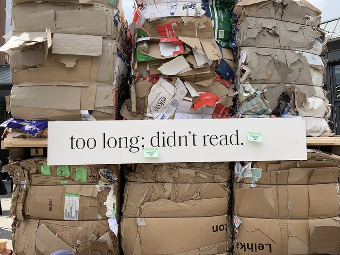
Saol and FF Super Grotesk are the typefaces used for re:publica19. The thirteenth edition of Europe’s biggest conference for the digital society took place in May. This year’s theme was tl;dr – too long; didn’t read.
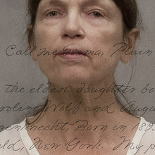
The type-centric identity was designed by Berlin-based studio fertig design. In a tongue-in-cheek reference to the theme, many of the items like T‑shirts, lanyards, or tote bags featured longish self-referential description texts. Norman Palm of fertig design comments on the type choices:
FF Super Grotesk is re:publica’s brand typeface. For the first time ever, we combined it with another typeface. We looked for something that immediately evokes literature, and yet has a contemporary feel. After all, it’s not about old books, but about reading and long-form text in general. Some of the texts were to be printed at huge sizes, that’s why we needed a typeface distinguished by stunning details, with both gravitas and fine elements. Very soon we fell in love with Saol! In addition to Saol Text, there’s also Saol Display, a special version made for larger sizes. This feature came in handy when we designed the wayfinding system.
Both typefaces are local creations: FF Super Grotesk is a revival of a 1930s geometric sans made by HdK (since 2001: UdK) graduate and Eboy cofounder Svend Smital, and released by Berlin-based FontFont in 1999. Saol was designed by Schick Toikka, a type design studio with offices in Berlin and Helsinki. The serif typeface with Victorian traits was made available in 2017.
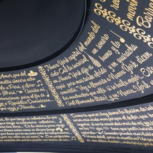
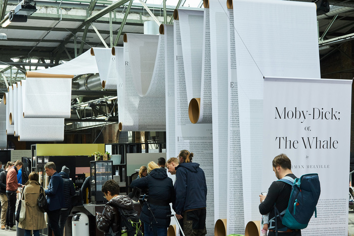
At the heart of the re:publica19 venue at Station Berlin was an installation with a 450 m long paper web. It held the complete text of Moby Dick, “a book which few have read but many think they know what it is about”, according to fertig design.
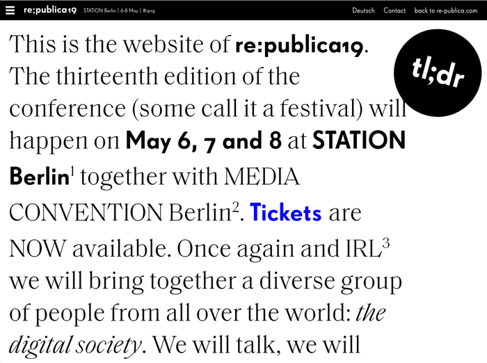
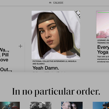
Homepage of the English website version.
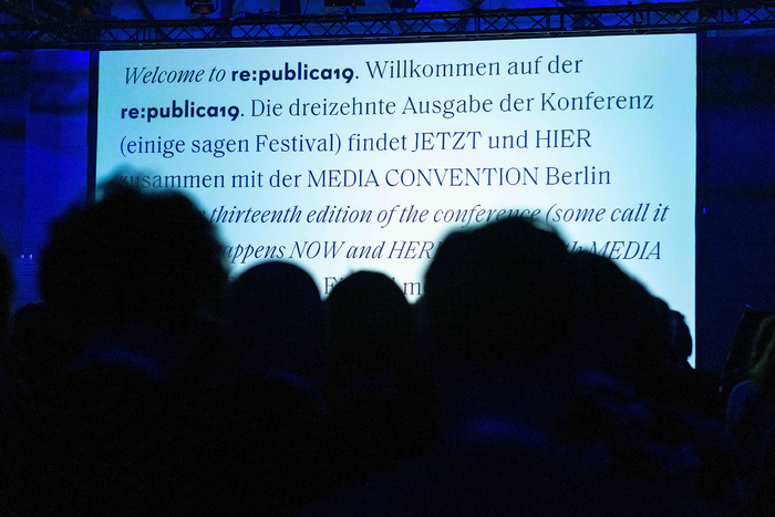
Welcome screen in German and English.

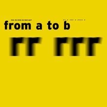
Stage decoration with self-referential text.
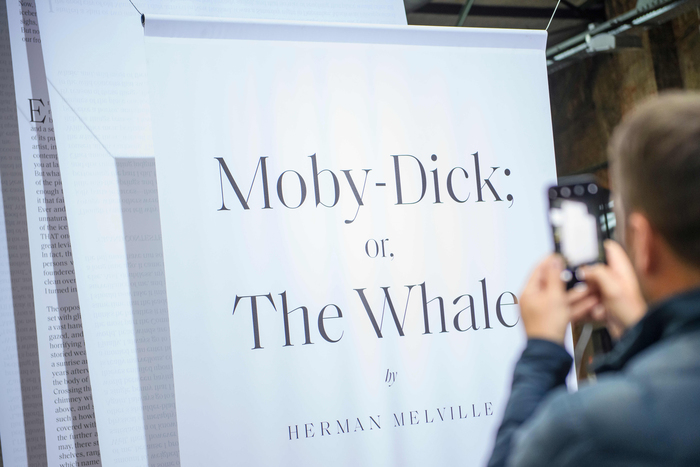
Title page, or rather the top end of the 450 m long paper web.
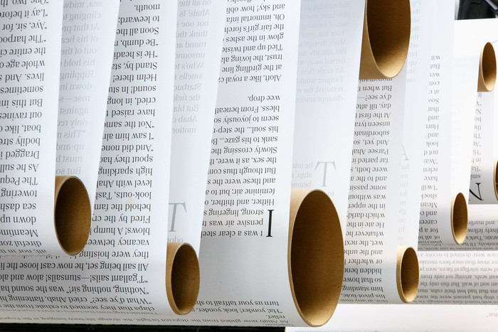
The text of Herman Melville’s famous novel is set in Saol. Section beginnings are marked by drop caps.
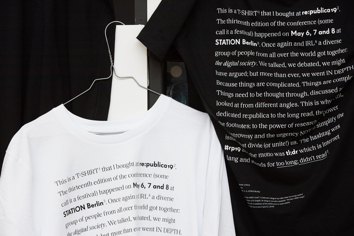
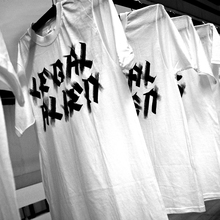
T-shirts in white and black designs.
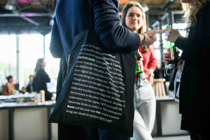
Tote bag
Identity by fertig design. In collaboration with Mathias Lücking, Pia Steinhardt (architecture), JUTOJO (motion design), and Owen Lloyd (sound design).
Typefaces
Formats
- Web (3271)
- Object/Product (703)
- Branding/Identity (4724)
- Exhibition/Installation (645)
Topics
- Event (1804)
- Technology (891)
Designers/Agencies
- fertig design (9)
Tagged with
- conferences (89)
- tech conferences (23)
- re:publica (4)
- identities (805)
- typeface combinations (2090)
- optical sizes (211)
- longform text (80)
- self-referential (15)
- multilingual (1155)
- English (language) (1060)
- German (language) (1308)
- wayfinding (216)
- high profile (511)
- Moby Dick (4)
- Herman Melville (6)
- tl;dr (1)
- hashtags (54)
- local type (141)
- stage graphics (57)
- drop caps (248)
- lanyards (7)
- T-shirts (313)
- tote bags (269)
- black and white (1459)
- reversed type (1932)


