

Black Mother movie poster
Contributed by Yves Peters on May 22nd, 2019. Artwork published in
.
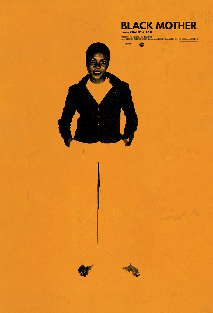
Key art by Midnight Marauder.
Midnight Marauder tried two very different approaches for Khalik Allah’s loving and lyrical ode to Jamaica: a richly textured collage akin to Peter Beard’s art and the striking, pared-down design using League Spartan that eventually won out. Read more in Screenfonts’ inaugural episode in Adobe Create magazine.

Source: www.caribbeancreativity.nl License: All Rights Reserved.
Detail.


 movie posters")


 movie poster")


")
")


")


4 Comments on “Black Mother movie poster”
Note that the Spartan Bold version by The League of Moveable Type is different from the original Spartan Bold weight in some details in the lowercase. Unlike the original, it has a t with a foot, and diagonally cut terminals in e and g.
True. There are more differences, also in the uppercase (e.g. CQS) numerals. The metal Spartan stays much closer to Futura.
I think we may want to create a separate entry for League Spartan given all these changes.
Check. I’ve updated the link in the post.
Yeah, aside from the name and Futura equse look I’d consider them completely different fonts.