
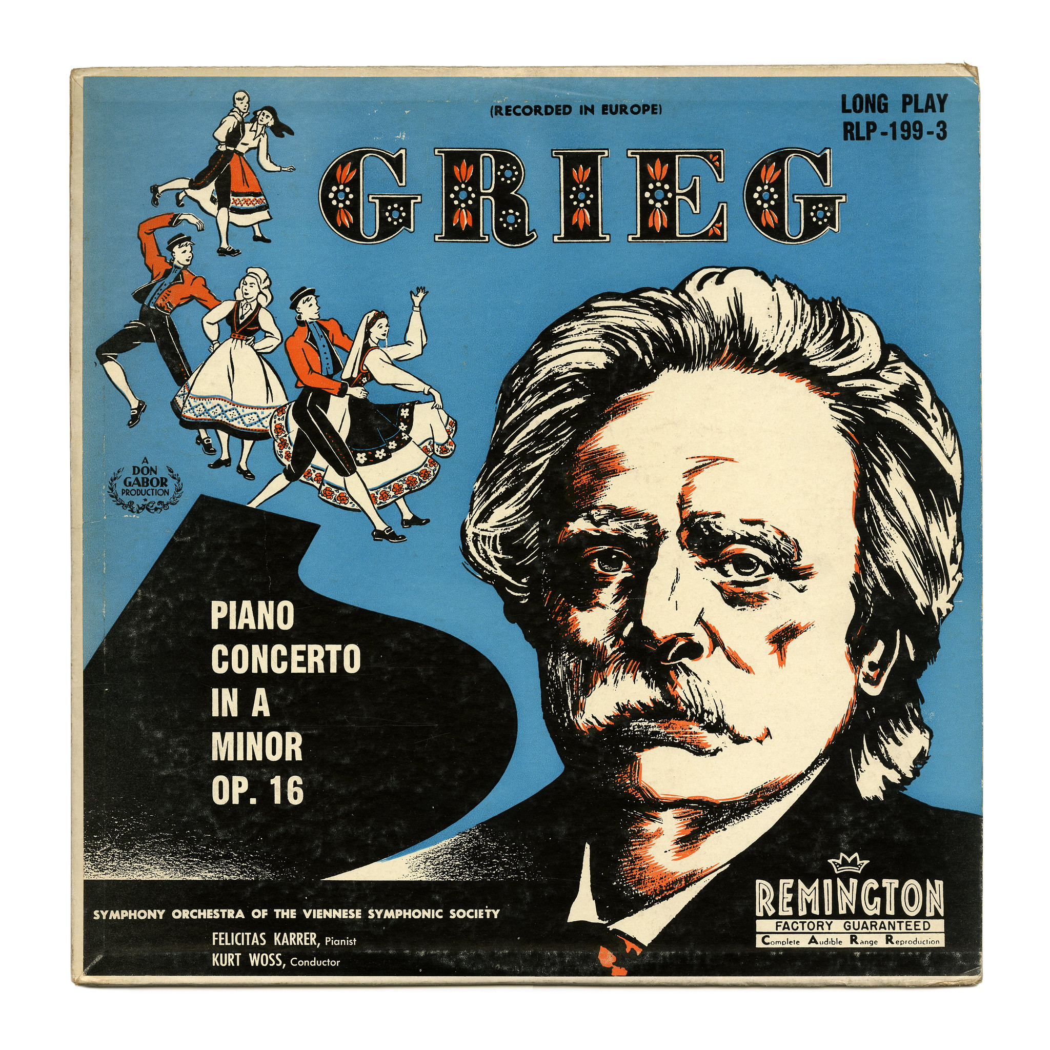
Grieg: Piano Concerto In A Minor Op. 16
Source: www.flickr.com Uploaded to Flickr by Bart Solenthaler and tagged with “cavanaghdahlia”. License: All Rights Reserved.
This recording of Grieg’s Piano Concerto In A Minor Op. 16 was performed by the Symphony Orchestra of the Viennese Symphonic Society, featuring pianist Felicitas Karrer and conducted by Kurt Wöss. It was released by Remington Records in 1951.
The trichromatic caps on the cover are from Dahlia, an ornamented Fat Face drawn by lettering artist John Albert Cavanagh (1888–?) for Photo-Lettering, Inc. in New York.

Florian Hardwig. License: CC BY-NC-SA.
One-line sample for Cavanagh Dahlia from PLINC’s Alphabet Thesaurus Vol. 2.


")


")

")

6 Comments on “Grieg: Piano Concerto In A Minor Op. 16”
Letterform Archive recently posted several photos from Hobart & Robbins, Specimens of Printing Types and Ornaments, from the New England Type & Stereotype Foundery, Boston, Massachusetts, 1851 – including this page showing several ornamented caps.
In Dahlia, J. Albert Cavanagh referenced Victorian faces like these. In fact, the Antique English Ornamented in line 5 has a fairly similar floral pattern.
I was recently looking for layered or colour fonts in this attractive style–there aren’t many but Eckhart is one. It’s similar to traditional canal boat lettering, but that generally puts floral patterns around the letters, not within them.
Thanks for pointing out Eckhart, Blythwood! That’s a good addition, and indeed comes close in feel.
I have my quibbles with the typographic color (weight distribution, spacing), but this kind of style is best used for single letters (initials, drop caps) anyway, where the rhythm of “black” and white is less of a concern.
Agreed–it has its eccentricities, but I don’t know anything else available that compares, so I bought it. To me it feels like a style that really stands to profit from the move to colour fonts, since getting all the layers in place and the right colour (and really for this style you often want a drop shadow too) takes time unless you have a script to do it. (I’m a bit surprised Dala Prisma doesn’t offer separate fonts for the different stripes–maybe they thought that was going to encourage excessive use of it…)
The unidentified condensed sans-serif grotesk could be a Gothic No. 13.
Thanks, Jay! That’s a good suggestion. Judging from the samples shown in Mac McGrew’s American Metal Typefaces of the Twentieth Century, I’d say it’s Ludlow’s Medium Condensed Gothic. It’s very similar to Linotype’s Gothic No. 13, but has a lighter diagonal in N, and the right 1.