An independent archive of typography.
Made possible by sponsors like Monotype
to participate.
Topics
Formats
Typefaces

Maison&Objet – Trend Mook 2019

Contributed by Emilie Rigaud on Sep 10th, 2019. Artwork published in
circa January 2019
.
    5
Maison&Objet – Trend Mook 2019 1
Source: devalence.net deValence. License: All Rights Reserved.

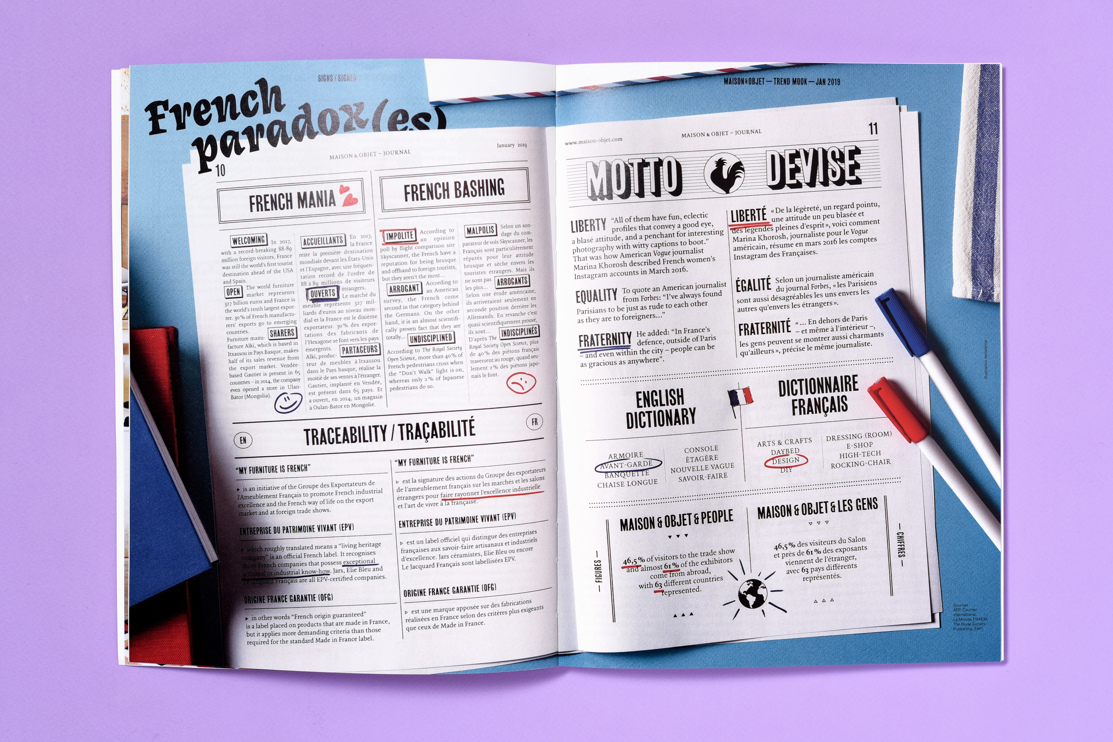
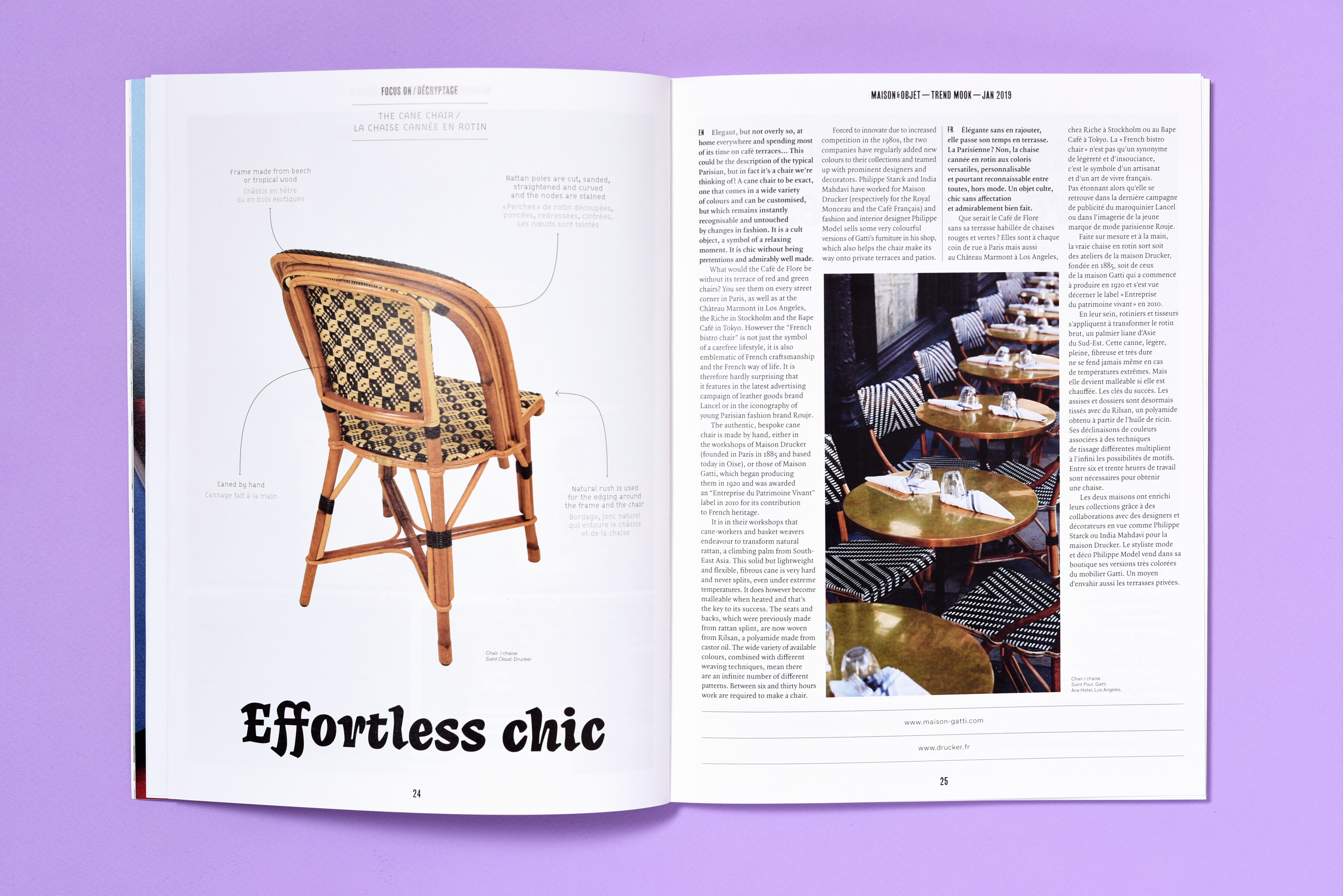
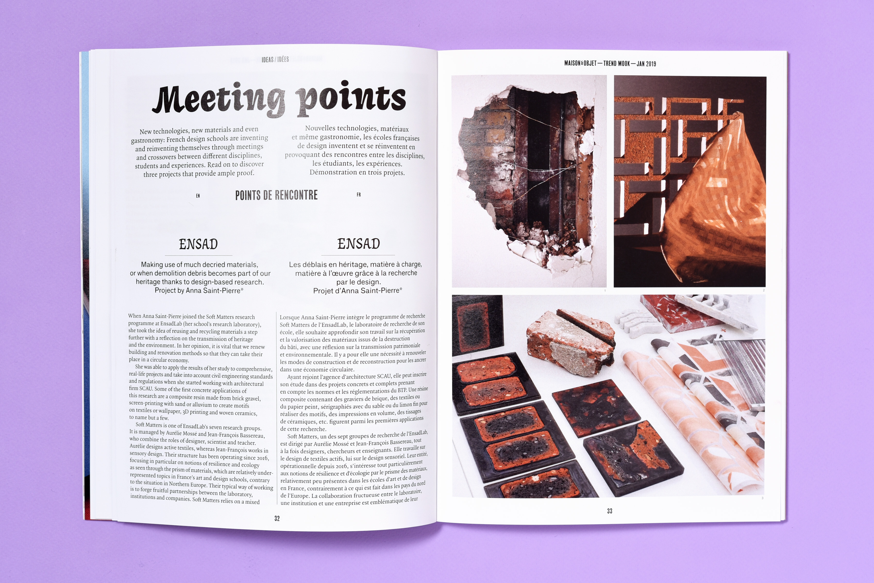
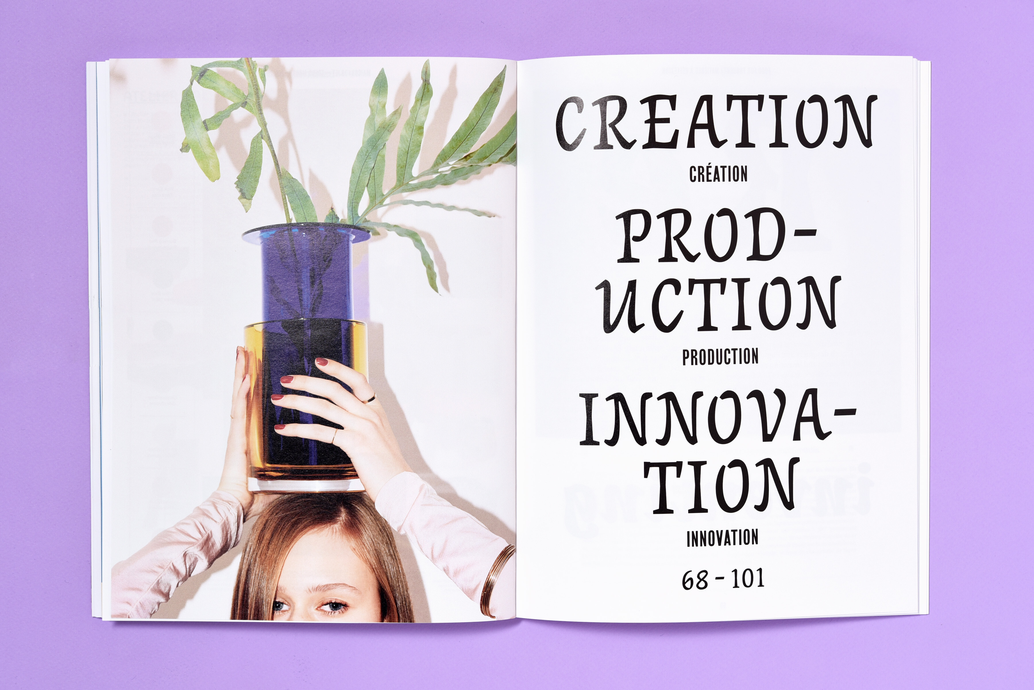
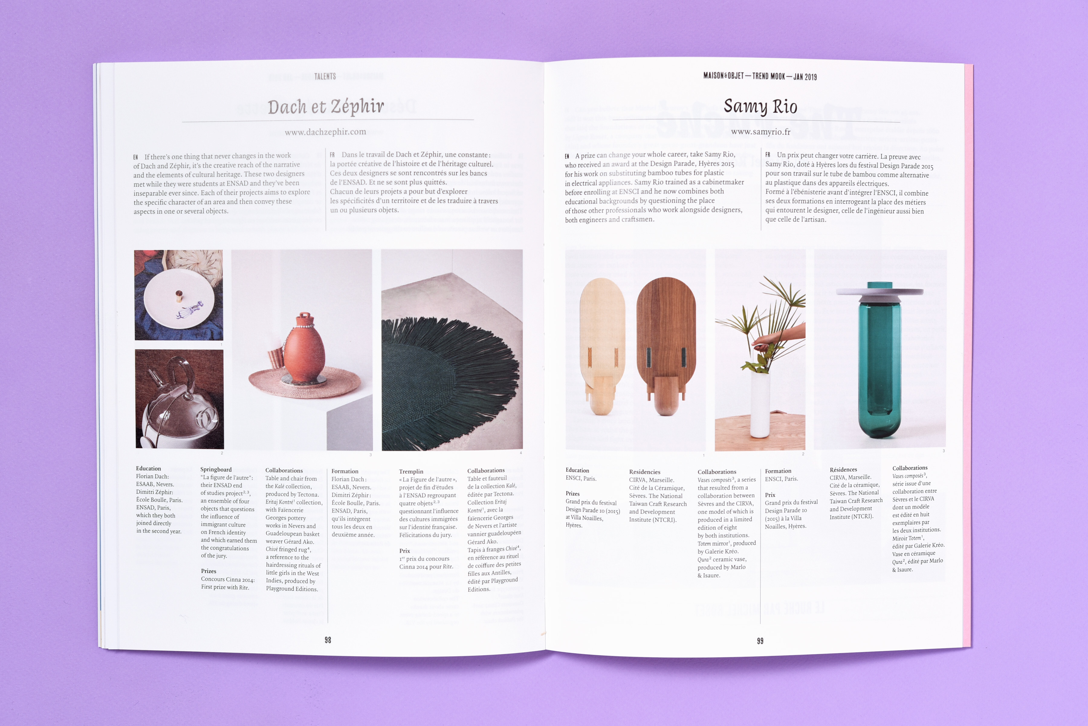
French studio deValence designed the Trend Mook for this year’s edition of the Maison&Objet design fair in Paris. The publication serves both as the magazine of the event and as trend book for objects of daily use. The illustrations have been made by Jochen Gerner and Jeremy Perrodeau. The expressive Coline Extrême is used for titles, sometimes even exclusively in capitals – which is uncommon for this type of cursive font –, balanced with the condensed Girott. The text typefaces include Quadraat and an unidentifed sans serif.

Maison&Objet – Trend Mook 2019 2
Source: devalence.net deValence. License: All Rights Reserved.
Maison&Objet – Trend Mook 2019 3
Source: devalence.net deValence. License: All Rights Reserved.
Maison&Objet – Trend Mook 2019 4
Source: devalence.net deValence. License: All Rights Reserved.
Maison&Objet – Trend Mook 2019 5
Source: devalence.net deValence. License: All Rights Reserved.
Maison&Objet – Trend Mook 2019 6
Source: devalence.net deValence. License: All Rights Reserved.
Maison&Objet – Trend Mook 2019 7
Source: devalence.net deValence. License: All Rights Reserved.
Maison&Objet – Trend Mook 2019 8
Source: devalence.net deValence. License: All Rights Reserved.
Maison&Objet – Trend Mook 2019 9
Source: devalence.net deValence. License: All Rights Reserved.

3 Comments on “Maison&Objet – Trend Mook 2019

  1. The “unidentified sans serif” looks a lot like Charles Mazé's revival of Mercator…

  2. Or is it simply Moderat ?

  3. Thanks for your suggestions, Stéphane! Neither appears to be a match. Here’s a close-up:

    Edit: It’s F Grotesk.

Post a comment

Rich Text Editor, comment_text

Fonts In Use, Sponsor View Counter