
Gage & Tollner was a beloved landmark of Brooklyn’s fine dining scene for over a century, an oyster and steak restaurant operating continuously from 1879 to 2004. In the decade after it closed, the space fell into disrepair and was occupied by a clothing store, a TGI Fridays, and an Arby’s.
In a successful 2018 crowdfunding effort, restaurateurs Sohui Kim, Ben Schneider, and St. John Frizell raised enough money to restore the space in hopes of reviving the restaurant. After the meticulous restoration of the space and development of a menu honoring the restaurant’s history, the new incarnation of Gage & Tollner had its soft opening in February 2020, before temporarily closing due to the pandemic. It reopened fully in April 2021.
Order designed a broad-ranging identity system for the restaurant, paying homage to its long history. They write in their case study:
From the outset, we decided that we wanted to try and bring back the original feeling of the restaurant’s branding, but updated for the 21st century.
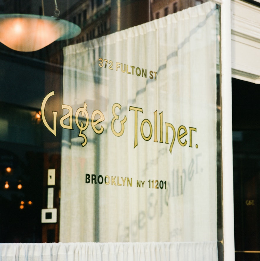
Over the years Gage & Tollner used several different logos. The original window lettering was distinctive, but was not found on any other materials. Our research showed the oldest printed logo the restaurant used was set in a typeface named Art Gothic.
Rather than working with one of the lumpy digital versions of Art Gothic currently available, Order commissioned custom lettering from Jesse Ragan of XYZ Type for the logotype. The crisp digital rendering of the typeface was drawn from scratch based on specimens from American Type Founders, its ampersand significantly re-proportioned while retaining the structure of the original.
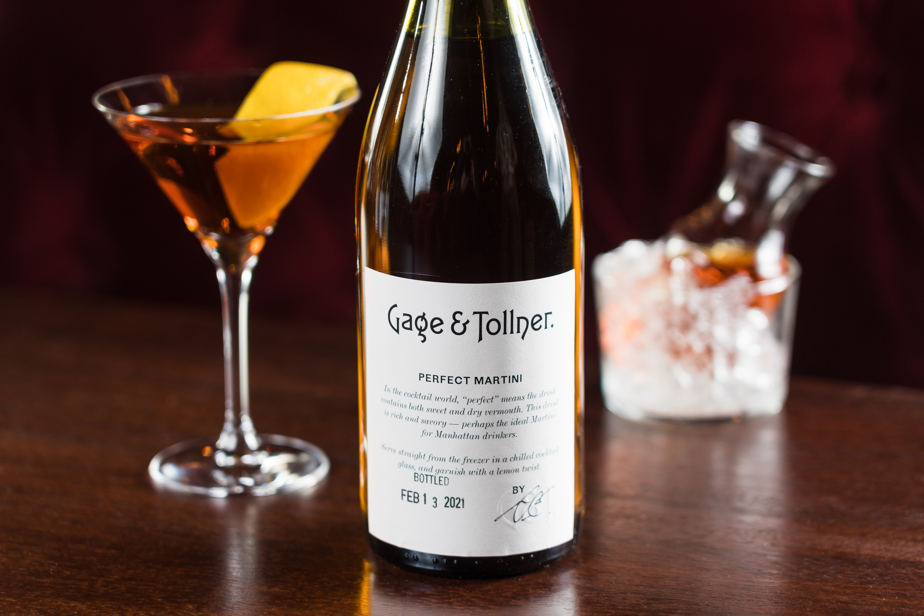
Continuing the homage to period typography, Order chose a serif and sans pairing for extensive use:
The 1890 menu served as a starting point for the new typographic system.
De Vinne, based on Bruce Foundry No. 11 c. 1860 was chosen as a “Modern” typeface that resembled the fonts used in the early menus.
Proto Grotesk from Production Type was selected to be used when bolder type was needed. Its forms are reminiscent of turn of the century sans serifs that oscillate between an Egyptian and Modern.
Order’s extensive case study of the project includes greater context and images of the historical menus and signage.


Wine cellar numbers are set in Proto Grotesk’s alternate numerals


Travis Fitzsimmons of Travis Signs applied the logo to the restaurant window in gold leaf—see a time lapse here.


")


<span></span>")


")


")

2 Comments on “Gage & Tollner”
For comparison, here’s a printed sample of Art Gothic from the restaurant’s history, the new logotype, and URW’s digitization of Art Gothic. In the original metal fonts, the letterform proportions and details vary significantly at different point sizes.
Congrats, Ben and Jesse! What a lovely project, thanks for sharing. And kudos for adding the comparison in the comments – that was the image I was hoping to see.