
Insurgent Empire. Anticolonial Resistance and British Dissent by Priyamvada Gopal (Verso Books)
Contributed by Florian Hardwig on Nov 26th, 2019. Artwork published in
June 2019
.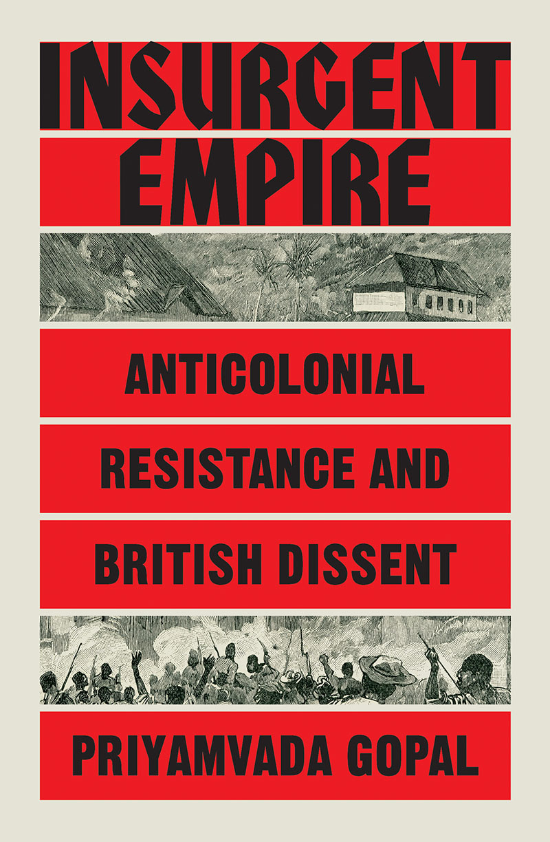
Strong type in an uncompromising layout for the cover of Priyamvada Gopal’s latest book. All text is set in black caps from the ambiguous ITC Honda and the no-nonsense Gothic No. 13. The stack of red bars is interrupted twice to open the view to the depiction of an uprising.
Insurgent Empire shows how Britain’s enslaved and colonial subjects were active agents in their own liberation. What is more, they shaped British ideas of freedom and emancipation back in the United Kingdom. — Verso Books


")


")


2 Comments on “Insurgent Empire. Anticolonial Resistance and British Dissent by Priyamvada Gopal (Verso Books)”
This has such a strong 1970s academic vibe that I did a double take when I saw the publish date.
I see what you mean, J.D.! Honda is hard to pinpoint. Not only does it fall between the blackletter and sans serif stools. It’s oscillating in terms of periods, too. To some extent, Honda obviously shows its 1970 origin, but at the same time, it wouldn’t look out of place in a piece of work from the 1930s, compare Fanfare (1927), Wallau (1930), or Valiant and Samson (1940). The two-color combo of red and black was popular in the interwar years as well.