
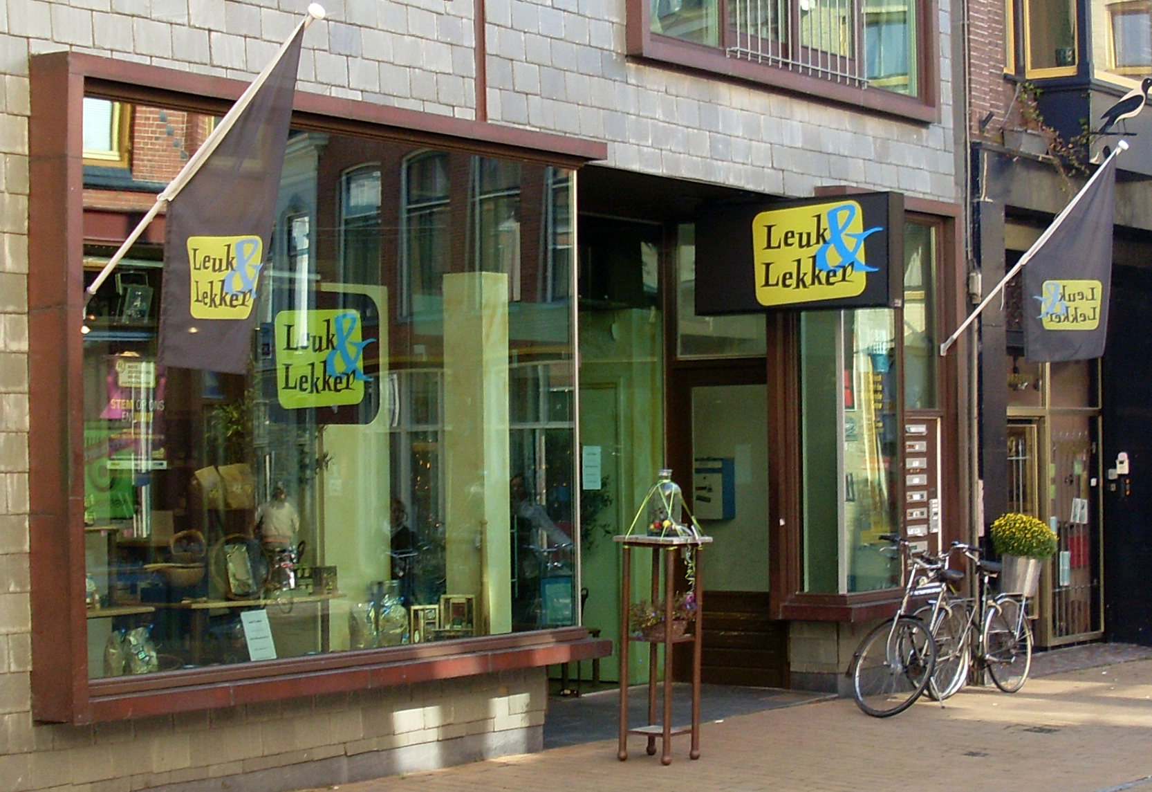
Leuk & Lekker, Groningen
This December, letter spotter Christopher Bergmann (@isoletters) runs an advent calendar with a daily dosis of interesting letterforms:
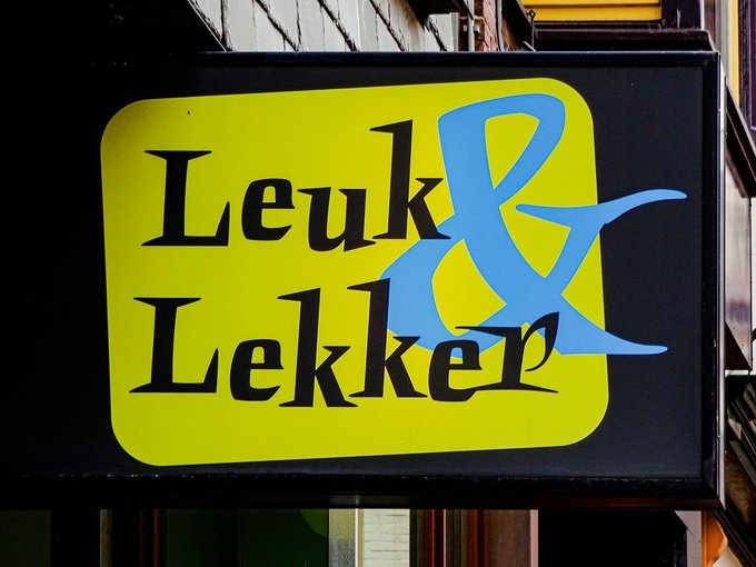
There are typefaces I see every other day. And there are typefaces I’ve seen in use exactly once. This sign from Groningen, representing ‘L’ in the #AlphabetCalendar, shows one of the latter: Punten by @FontFabrik. Bonuspunten for using at least one glyph from each style.
The spiky Punten is one of several fun alphabets drawn by Luc(as) de Groot. Conceived in 1993, it was made into a full typeface and released by LucasFonts in 2002. The shop sign and flags of the Leuk & Lekker (“Nice & Tasty”) deli indeed combine glyphs from all three styles. While most letters are taken from the moderate Punten Straight, the ampersand is from Punten Extremo, and the r from the hilarious Punten Rondom (Dutch for “all around”). In the latter, “each character is entangled by its own swashes – almost a parody of the seventeenth-century mannerist calligraphy that [de Groot’s] teacher Gerrit Noordzij is so fond of”, says Jan Middendorp in Dutch Type.


")


