An independent archive of typography.
to participate.
Topics
Formats
Typefaces

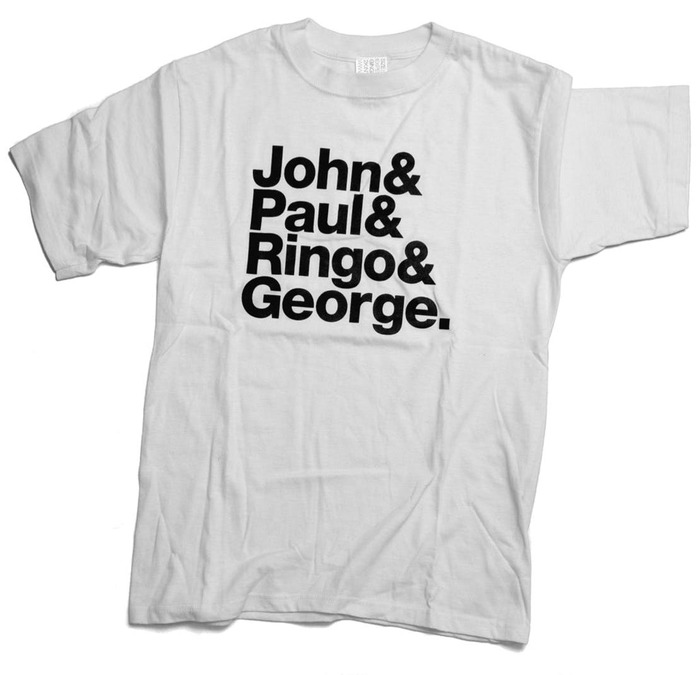
John & Paul & Ringo & George / &&& T-shirt

Experimental Jetset’s archetypical band shirts have become a referential meme, inspiring countless adaptations for text-based abstraction.

Contributed by Nick Sherman on Dec 14th, 2019. Artwork published in .
    John & Paul & Ringo & George / &&& T-shirt 1
    Source: walkerart.org License: All Rights Reserved.

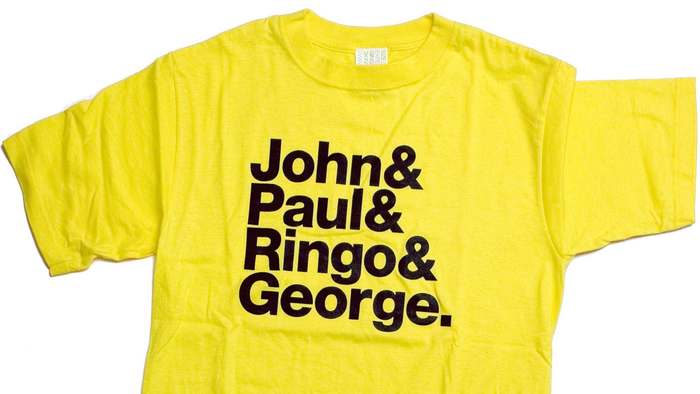
    Experimental Jetset designed the original John & Paul & Ringo & George T-shirt (referencing the names of the Beatles) in 2001 for Yoshi Kawasaki at the Japanese apparel company 2K/Gingham. The format for the shirt, which has since inspired many imitations, is fairly simple:

    • Make a list of related words with one item per line
    • Follow each item with an ampersand, using little or no space between
    • Follow the final item with a period instead of an ampersand
    • Set it all in a bold sans-serif with tight letterspacing and linespacing

    The typeface on the original shirts is Neue Helvetica Heavy with manual adjustments to the font’s default kerning.

    According to Experimental Jetset’s description of the shirts, the ampersands were added for visual reasons:

    When we put the four names under each other, without the ampersands, we thought the name ‘George’ was sticking out too much, as this word was the longest. We solved this by putting the name ‘George’ at the bottom on the list, and adding ampersands to all the other names. This way, the list of names looked more even. That’s how the ampersands were introduced in the design.

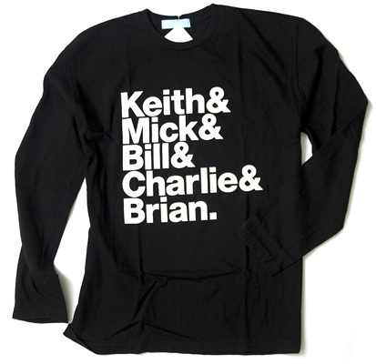
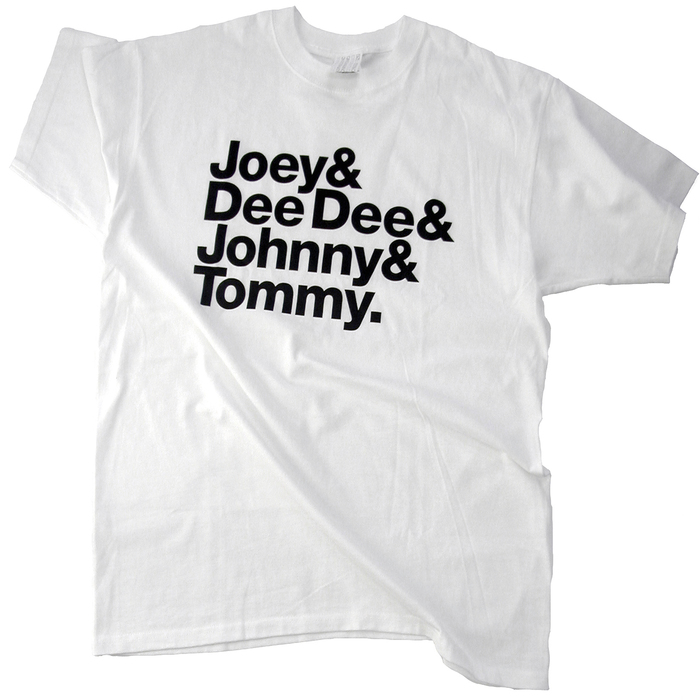
    A few months after designing the first shirt, they applied the concept to two other iconic rock bands: Keith & Mick & Bill & Charlie & Brian (the Rolling Stones) and Joey & DeeDee & Johnny & Tommy (the Ramones).

    The new shirts demonstrated how the format was an inherently adaptable method for abstraction. As they explain it:

    What we tried to do with those two other shirts was to remove the focus from the idea of one specific band: we wanted to show that the ‘John & Paul & Ringo & George’ shirt was not specifically about one particular band, but more about a certain method. By applying this method to two other bands, we wanted to make the underlying idea clearer: pop-cultural imagery ‘abstracted’ through text.

    Indeed, the format of the design has been appropriated and reappropriated countless times, referencing almost every topic imaginable – it has become a meme in the true sense of the word. Experimental Jetset has a collection of examples, and discuss their amazement to see the format spread so wide:

    We have been often wondering why our shirt became such a popular subject. Our way of designing is actually quite closed and hermetic: we never think in terms of target audiences, we never try to guess what will be popular or not. We just concentrate on the aesthetical/conceptual integrity of the design itself, and we always try to fully focus on the inner-logic of the designed object. […] It’s amazing to see that the ‘John & Paul & Ringo & George’ shirt has become a format, a standard, for other people to work with. (To us, it proves an important point: that a popular design doesn’t have to be made with populist intentions).

    They aren’t too upset about people copying the shirts though. In a 2010 interview for Typo-Graphical, when asked about websites that focus specifically on selling knock-offs of the design, they said:

    We’re pretty zen about it, actually. We don’t find it the most interesting side of the whole phenomenon. We’re much more into the concept of home-made, DIY bootlegs. We like the idea of fans making their own shirts, at home, using our shirt as their inspiration. The whole concept of building a sort of commercial ‘print-on-demand’ industry around it seems not very interesting to us.

    In a 2018 interview for Walker Art Center’s The Gradient they elaborated:

    When it comes to bootlegging, we can speak from both perspectives: that of the bootlegger, and that of the bootlegged. […] Fact is, we are very much the products of fanzine culture: all three of us come from a post-punk/DIY background. So to see all these people using the &&& format as a platform for fandom—as a low-fi way to announce their love for bands, teams, groups, collectives, political causes—most of the time (with only a few exceptions) that’s quite a thrill to behold.

    Those interested in buying properly authorized versions of the John & Paul & Ringo & George shirts can get them from Publik (the company Yoshi Kawasaki started after leaving 2K/Gingham), or from the Walker Art Center Shop (the exclusive vendor of the shirt in the USA).

    John & Paul & Ringo & George / &&& T-shirt 2
    Source: www.experimentaljetset.nl License: All Rights Reserved.
    John & Paul & Ringo & George / &&& T-shirt 3
    Source: www.smh.com.au License: All Rights Reserved.
    John & Paul & Ringo & George / &&& T-shirt 4
    Source: www.experimentaljetset.nl License: All Rights Reserved.
    John & Paul & Ringo & George / &&& T-shirt 5
    Source: www.halvorbodin.com License: All Rights Reserved.

    Typefaces

    • Neue Helvetica

    Formats

    Topics

    Designers/Agencies

    Artwork location

    9 Comments on “John & Paul & Ringo & George / &&& T-shirt”

    1. In a recent email with Experimental Jetset they elaborated on the selection of the Heavy weight from Neue Helvetica:

      We have no idea why, at that time (2001), we decided to use Heavy (as Bold seems to be so much better, shape-wise). But for reasons now lost in the mists of time, we did use Heavy. In those few cases in which we recently referred to these three shirts (in shameless acts of self-exploitation, mostly for good causes, charities, etc.), we actually used Bold, as we couldn’t get ourselves to use Heavy again. An example of a recent Bold version is this poster that we designed a while ago for Fur-Free Fashion, an animal rights group.

      Fur Free Fashion poster designed by Experimental Jetset
      Image courtesy of Experimental Jetset

    2. There are indeed countless rip-offs (or quotations, homages, derivations, etc.) of the original “J&P&R&G.” t-shirt. One of my favourites (because the choice of typeface is deadly accurate, and also I’m a huge Beach Boys fan) is this one:

    3. In 2005, the Offenbach type collective TypeOff made a version featuring type designers with a relation to the city and the local foundry Gebr. Klingspor or their predecessor Rudhard’sche Gießerei:
      Walter&
      Otto&
      Karlgeorg&
      Rudolf.

      You can still see the T-shirt on Dan Reynolds’ website. Here’s Chris Lozos wearing a red shirt:

    4. This is such a fun format!

      My friend and I are working on a citizen science project on developing a new kind of antibiotic using viruses, and I printed a couple of shirts using this format about eradicating the ESKAPE pathogens (the top pathogens associated with antibiotic resistance)

    5. What about poor old Peter Behrens ?

    6. Hi Stéphane, that’s a question for TypeOff! I was about to say that, while he released his typeface designs through Klingspor, Behrens wasn’t really connected to the city otherwise, and is rather associated with Düsseldorf and Berlin. But that’s true for Eckmann and Tiemann, too – as far as I know, they didn’t live, study, or teach in Offenbach. Maybe he wasn’t included because Behrens is known for so many things, and especially for his contributions to architecture and industrial design. I’m not saying his typeface designs were insignificant, but he’s not primarily a letter person.

    7. I fear I have no satisfactory answer to your question, Stéphane! You could drop Lukas Schneider a like (IIRC, he was the one who designed the shirt; I certainly did not do that myself). I suspect that the choice of the four designers was a little random. The Klingspor foundry has so many great designers to choose from. You could put 10 on a list, but then the joke with the shirt wouldn’t have worked. And sure, as Florian mentioned, Koch just has to be there. We also knew Otmar Hoefer, Karlgeorg’s son. So even less space for other names. As for Otto, I couldn’t tell you if that is Otto Eckmann or not. Maybe it is a tribute to Otto Hupp!

    8. Doh! We put the last names of the designers on the back of the shirt 🤦 So, yeah, the Otto is Eckmann. I’m a dummy! And still a dummy without a good answer about Behrens 😆

    9. I do agree with you, Florian — Behrens was first and foremost an architect, and less of a graphic artist/typographer/type designer than the other four.
      But he was prominently featured in the Jugendstil exhibition that ran this summer at the Klingspor Museum, so all’s well that ends well.

    Post a comment