
Michelob beer
Contributed by Richard Lipton on Mar 3rd, 2020. Artwork published in
circa 2020
.
License: All Rights Reserved.
Michelob, an Anheuser-Busch brand, uses Sloop Script by Lipton Letter Design for the wordmark. On the packaging, it’s paired with a number of different typefaces, some of which appear to be custom(ized).
License: All Rights Reserved.
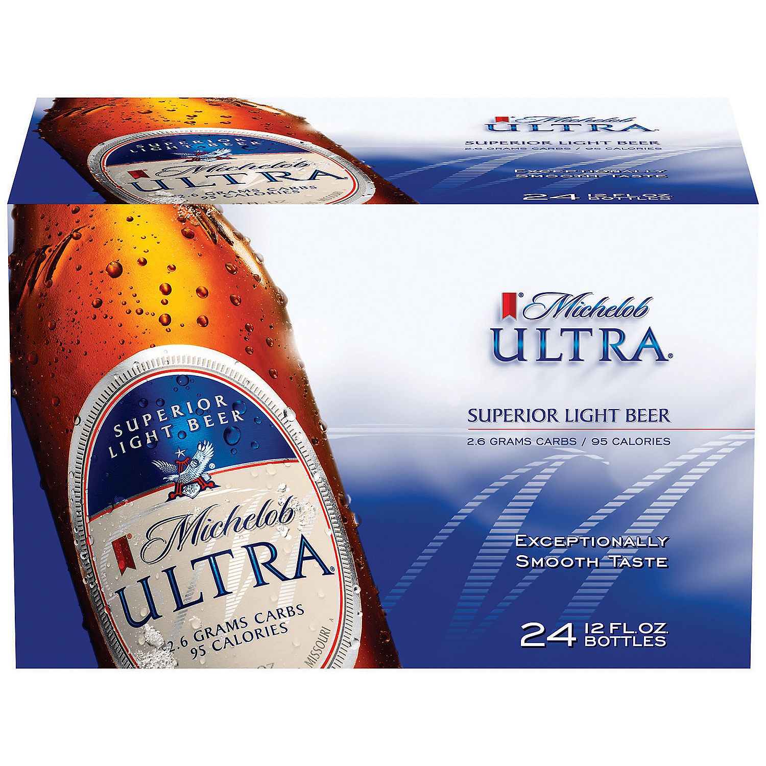
“Ultra” appears to be custom (see Cristal for a related typeface). The roman with flared stems is Baker Signet, the wide sans is Engravers Gothic or similar.
Source: www.walmart.com License: All Rights Reserved.
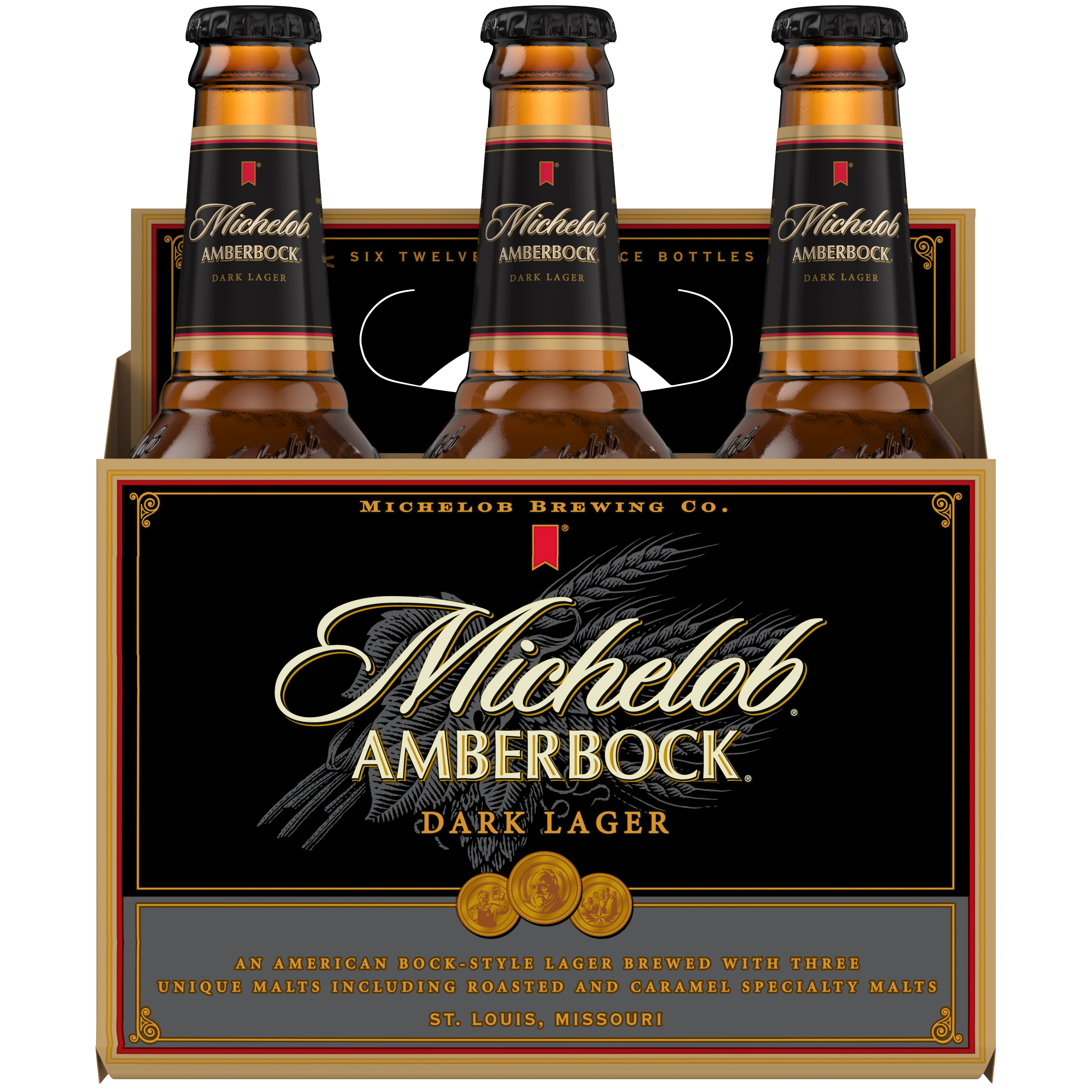
“Amberbock” is based on Optima Bold. The orange text is set in Minion and Copperplate Gothic. “Michelob Brewing Co.” is unidentified.
Source: www.walmart.com License: All Rights Reserved.
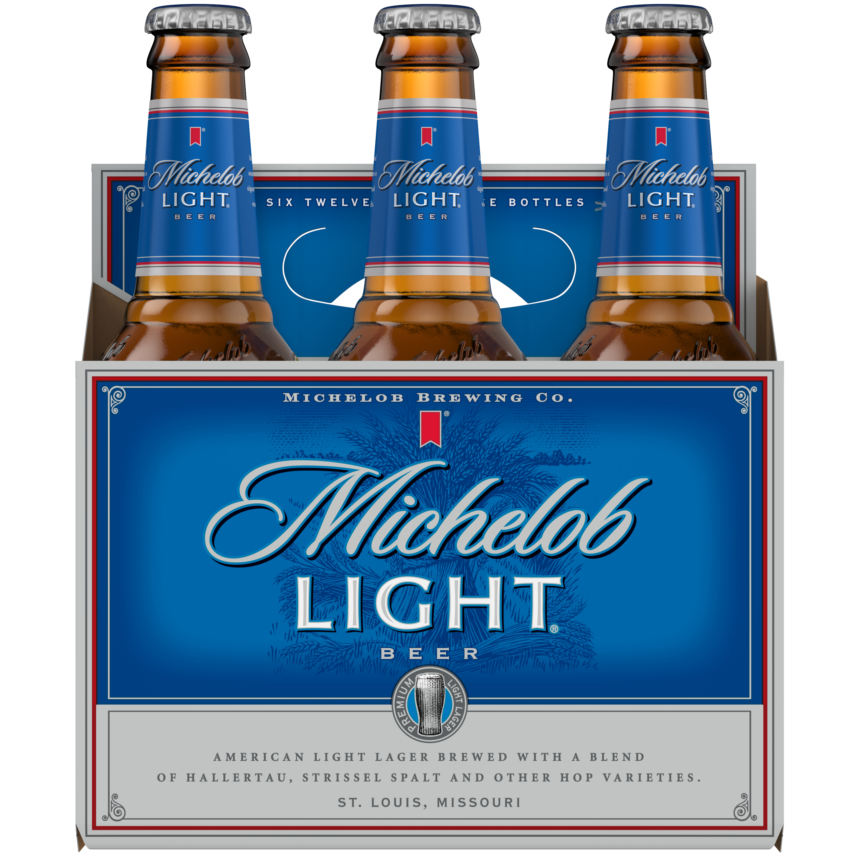
The Light pack uses the same typographic ingredients as Amberbock.


")


")


")


5 Comments on “Michelob beer”
The actual name of the Michelob type font is Jana. The YANGEL ER type font and type setting company in St. Louis developed custom by and artwork. Long before Lino- film, much less digital. The firm actually owned some different versions of Budweiser, interesting, they sold by residual, not out right yeah
Hello Steve, thank you for your comment! Do you have a visual reference for the Jana typeface you mention? It’s not included in the contemporary images shown in this post, is it? I’ve found that Michelob used to have a logo in condensed Latin caps with mid-stem thorns. Is that what you’re referring to?
What typeface is the new version of the “Ultra”?
Further, what about “golden”?
Hi Ross,
“Ultra” appears to be another custom(ized) typeface. See Copperplate Gothic and related typefaces for close matches.
The script for “Golden” rings a distant bell, but I can’t place it (and it might be custom, too). Sorry!
You could try posting your request to Font ID.