
Amplified Opera – Amplify poster series
Contributed by Michael Barker on Feb 15th, 2020. Artwork published in
.
Source: acmeartanddesign.com License: All Rights Reserved.
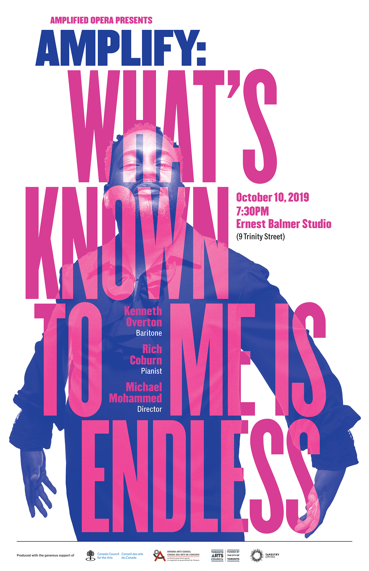
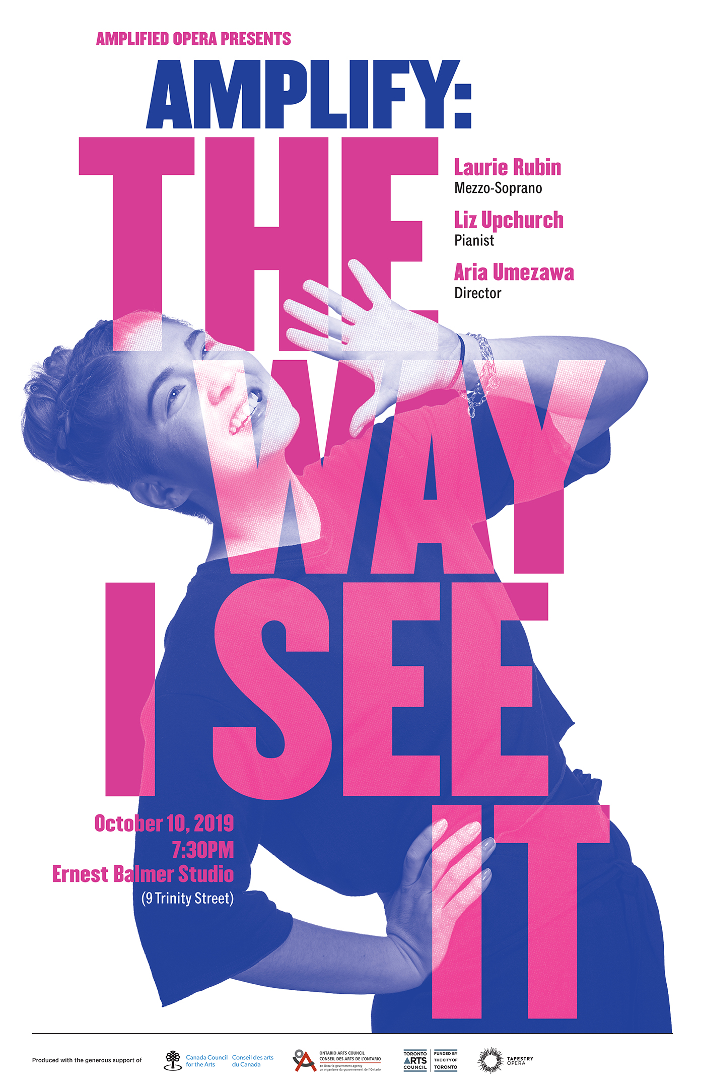
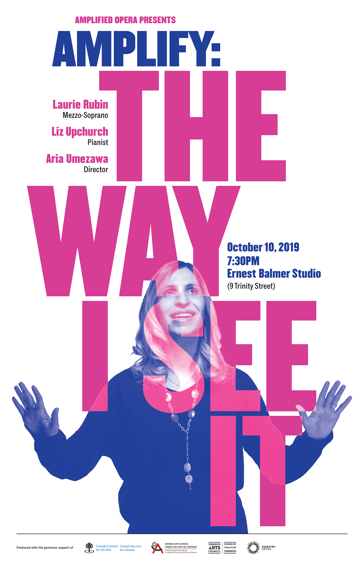
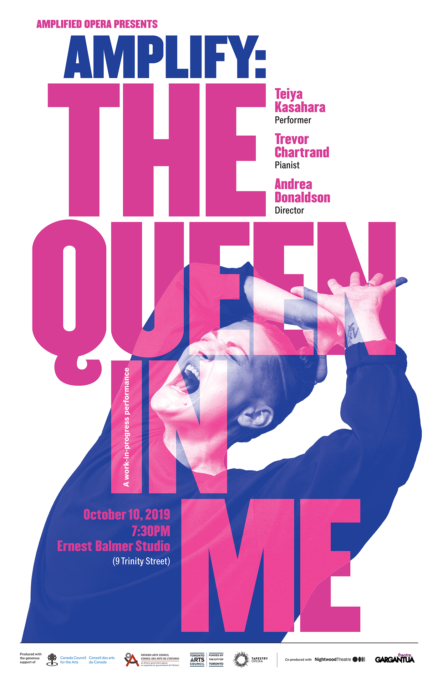
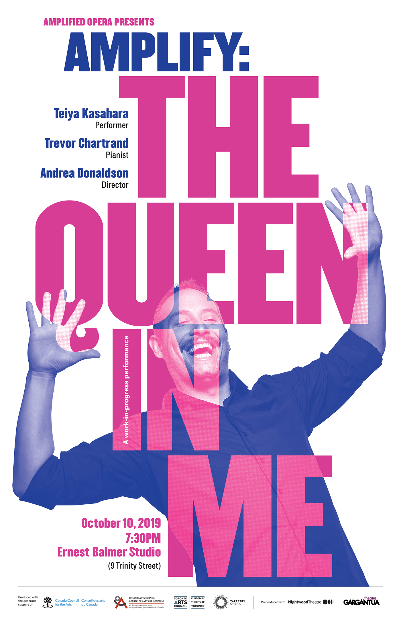
Acme Art & Design was commissioned to design the creative campaign for Amplified Opera’s inaugural 2019 concert series entitled Amplify. Formed by two Toronto-based opera artists, this new opera/theatre company is focused on providing artists from equity-seeking groups a platform to tell their stories on their own terms.
The typography uses various weights of Champion Gothic, with Classic Grotesque used for the smaller texts.
Photography: Michael Barker

Source: acmeartanddesign.com License: All Rights Reserved.
Source: acmeartanddesign.com License: All Rights Reserved.
Source: acmeartanddesign.com License: All Rights Reserved.
Source: acmeartanddesign.com License: All Rights Reserved.
Source: acmeartanddesign.com License: All Rights Reserved.


")


")


