The Carnelian Cube by L. Sprague De Camp and Fletcher Pratt (Lancer Books, 1967 and 1969)
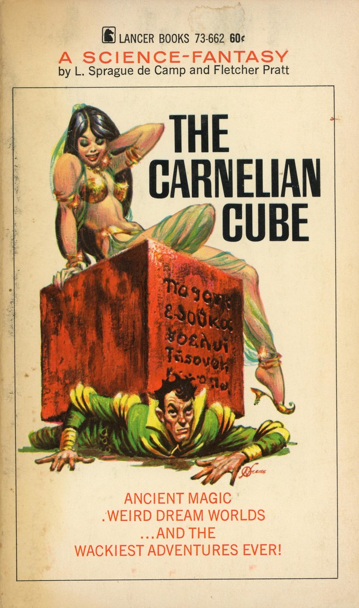
1967 printing (73–662), with Pacella Decatur for the title. The secondary typefaces are Venus and News Gothic.
The Carnelian Cube is a fantasy novel by L. Sprague de Camp and Fletcher Pratt. First published in hardcover by Gnome Press in 1948, this is the paperback edition by Lancer Books. Their first printing from 1967 combined cover art by Frank Kelly Freas with a title set in caps from Vincent Pacella’s Decatur. Two years later, Lancer Books changed the typography and switched to another face by Photo-Lettering: Craig Mierop’s Ginger Snap, which had been added to their catalog shortly before. More specifically, it’s the “C” variant with open letterforms – here filled in green, yellow, and red – and a long shade.
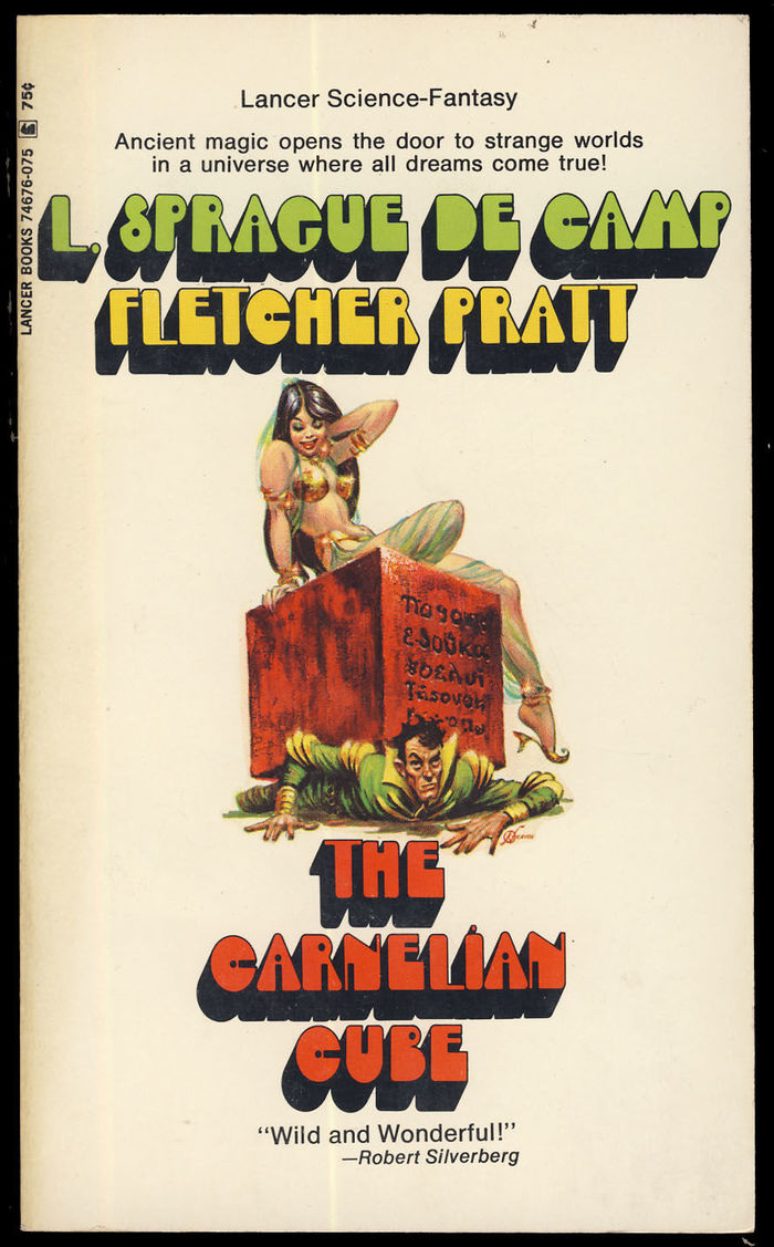
1969 printing (74676–075) with Mierop Ginger Snap (and Helvetica or similar).
Formats
- Books (4000)
Topics
- Entertainment (1006)
- Literature (1917)
Designers/Agencies
Tagged with
- Lancer Books (10)
- paperbacks/softcovers (892)
- book covers (3490)
- Fletcher Pratt (1)
- L. Sprague de Camp (3)
- fantasy (85)
- novels (348)
- 1960s (498)
- all caps (4068)
- shadow effects (703)
- long shade (59)
- chromatic (469)
- early uses (1264)
Artwork location
- United States (6383)
- New York City (1706)


