Nork magazine, vol.4, Sept 2019

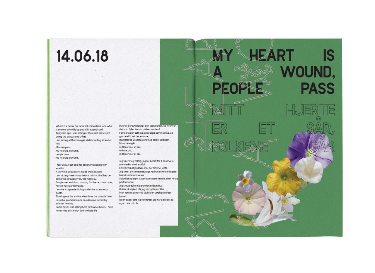
Cover and spreads from the Nork magazine vol. 4. NORK magazine , a winner of Stack Awards for best use of illustrations, is an independent Norwegian magazine published twice a year since 2017. It interests are design, art and aesthetics of Northern Norway. Branding by Bobo, graphic design by Konstantin Lobanov.
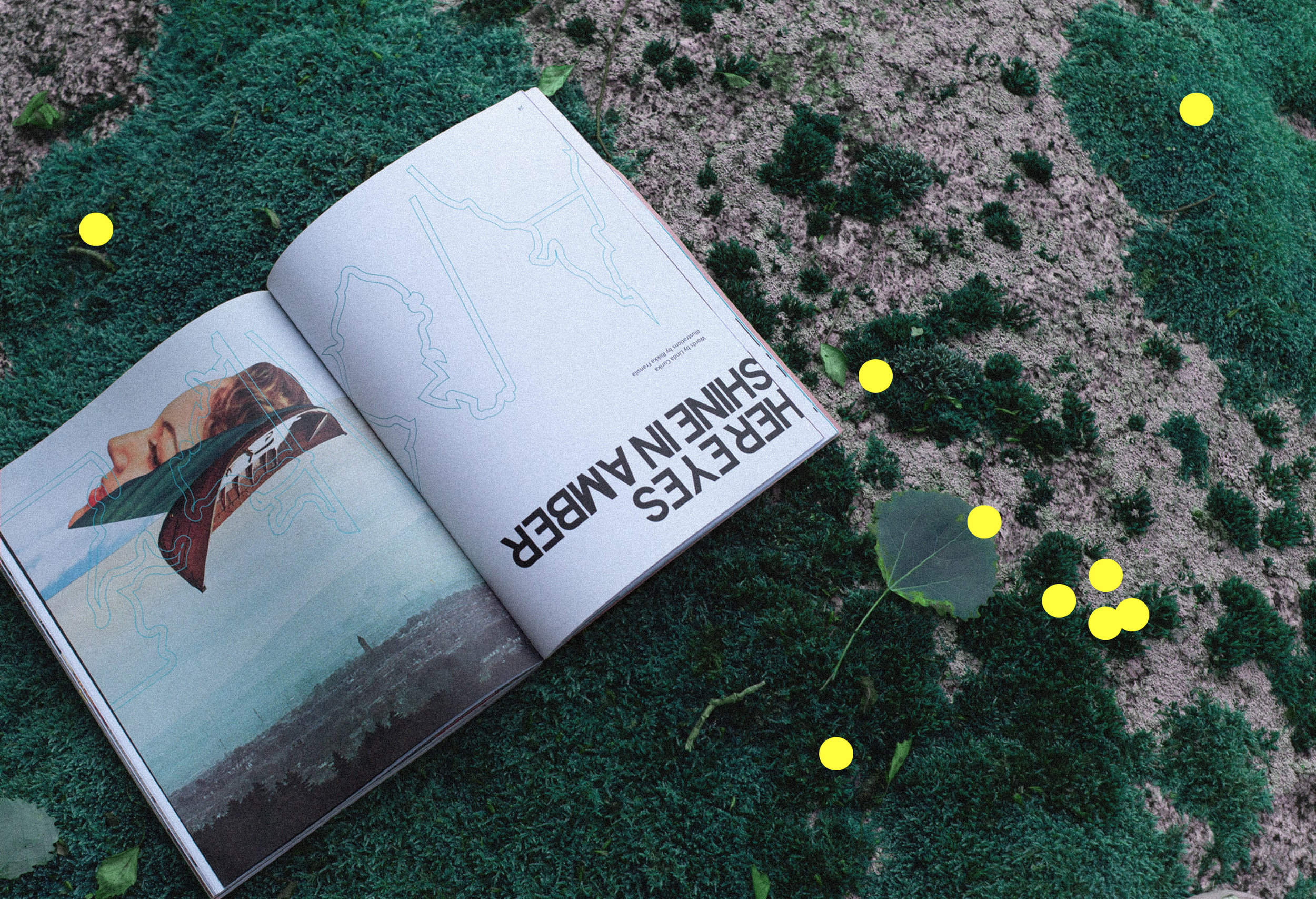
Coastline is used throughout the magazine. The typeface is based on different regions as they would appear if all the ice in the world melted. The characters appear in particularly vulnerable areas. The shape is an exaggeration, all the ice is not going to melt. However, it still displays areas who will experience a big change in their near future. Each letter carries regional information.
Coastline is paired with the capitals from Koliko by Alex Frukta for headlines and a yet unidentified grotesk used for body text.