What to the Slave is the Fourth of July?
Frederick Douglass’ reflection on the lop-sided access to freedom serves as a counterpoint to the typical celebration of Independence Day in the US.
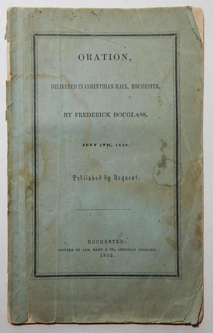
On July 5th, 1852 (168 years ago today) Frederick Douglass delivered a speech to 500–600 people in the Corinthian Hall of Rochester, New York. The speech, preceded by a reading of the United States Declaration of Independence, was the main attraction in a celebration of Independence Day in the US, organized by the Ladies’ Antislavery Sewing Society.
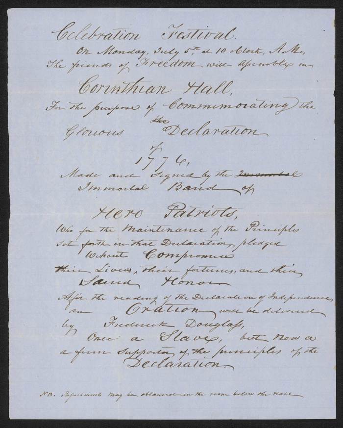
Hand-written announcement for the event, describing Douglass as: “Once a Slave, but now a
a firm supporter of the principles of the Declaration”.
Douglass was described in an announcement for the event as “a firm supporter of the principles of the Declaration”, but his now-famous speech was not celebratory, instead focusing on the hypocritical irony of celebrating freedom in a country where so many people were still suffering racist persecution – including himself, a former slave:
I am not included within the pale of this glorious anniversary! Your high independence only reveals the immeasurable distance between us. The blessings in which you, this day, rejoice, are not enjoyed in common.—The rich inheritance of justice, liberty, prosperity and independence, bequeathed by your fathers, is shared by you, not by me. The sunlight that brought life and healing to you, has brought stripes and death to me. This Fourth July is yours, not mine. You may rejoice, I must mourn. To drag a man in fetters into the grand illuminated temple of liberty, and call upon him to join you in joyous anthems, were inhuman mockery and sacrilegious irony. Do you mean, citizens, to mock me, by asking me to speak today?
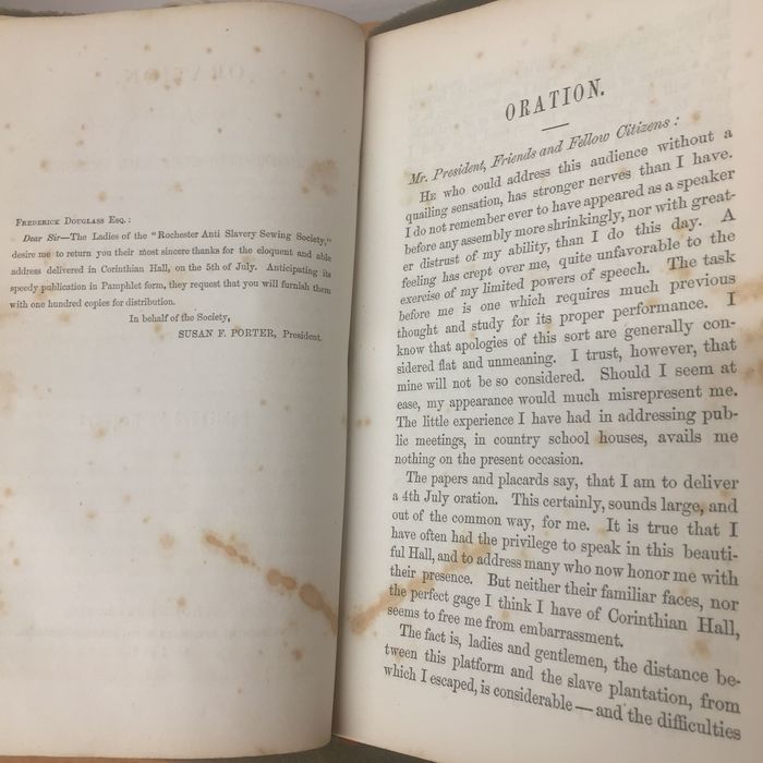
With many positive reactions to the speech, it was published in printed form, by subscription, with 700 orders placed at the event itself. The booklet was also advertised nine days later in the July 16 edition of Frederick Douglass’ Paper.
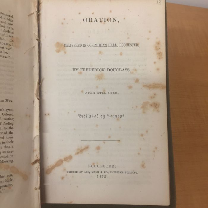
The original title of the the booklet is fairly clinical – Oration, Delivered in Corinthian Hall, Rochester by Frederick Douglass, July 5th, 1852 – but later excerpts and printings have been published under a more evocative title – What to the Slave is the Fourth of July? – adapted from a central passage in the speech:
What, to the American slave, is your 4th of July? I answer; a day that reveals to him, more than all other days in the year, the gross injustice and cruelty to which he is the constant victim. To him, your celebration is a sham; your boasted liberty, an unholy license; your national greatness, swelling vanity; your sounds of rejoicing are empty and heartless; your denunciations of tyrants, brass fronted impudence; your shouts of liberty and equality, hollow mockery; your prayers and hymns, your sermons and thanksgivings, with all your religious parade, and solemnity, are, to him, mere bombast, fraud, deception, impiety, and hypocrisy—a thin veil to cover up crimes which would disgrace a nation of savages. There is not a nation on the earth guilty of practices, more shocking and bloody, than are the people of these United States, at this very hour.
The speech is highly regarded both for its message and its rhetorical techniques. For a more detailed review of the speech and its context, there is an excellent post at The Public Domain Review and an essay with many relevant quotes from the University of Rochester Library Bulletin.
The Typography
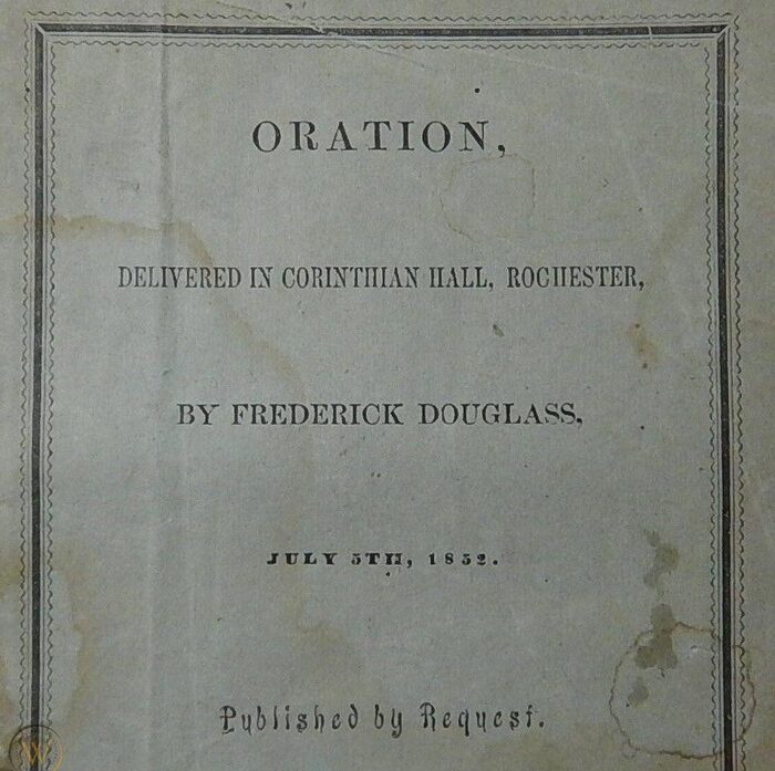
The typography for the first printing of the speech, executed by Lee, Mann & Co. in Rochester, is fairly straightforward and typical for its time. A lengthy title is broken into semantic pieces on the title page, each in a separate typeface, and finalized with what I call the “indubitable dot”: an authoritative full-stop period often used in signage, title pages, gravestones, and other formal lettering, even if the text it punctuates is not a proper sentence. Such usage of the period was very common before the 20th century, but can also be seen in more recent contexts as well, especially in advertising.
Most of the title page is set in different variations of a very typical type style often referred to as Scotch or Modern. Almost every major type foundry of the time offered their own takes on the genre, usually in a range of sizes, weights, and widths, with generic names like Roman and No. 3.
The date of the speech in the title is set in a bolder fat-face, but the most obvious departure from standard roman type is the typeface used to spell out “Published by Request.” It is a squiggly style that was also offered by several foundries, usually under the fairly generic name of Arabesque, presumably to associate it with arabesque ornamentation.
The specific date and origin of Arabesque is unclear. The earliest appearance in a type specimen I know is Boston Type Foundry’s 1860 catalog, but clearly it was sold before then since this usage was already printed in 1852.
The cover of the booklet appears to be almost identical to the title page, but printed on colored paper, with a decorative border added around the composition.
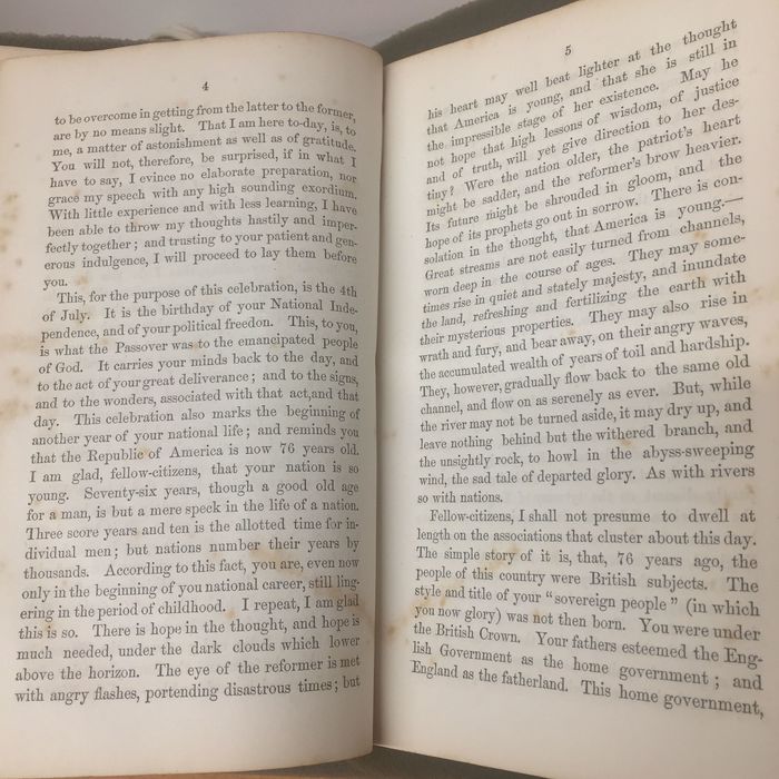
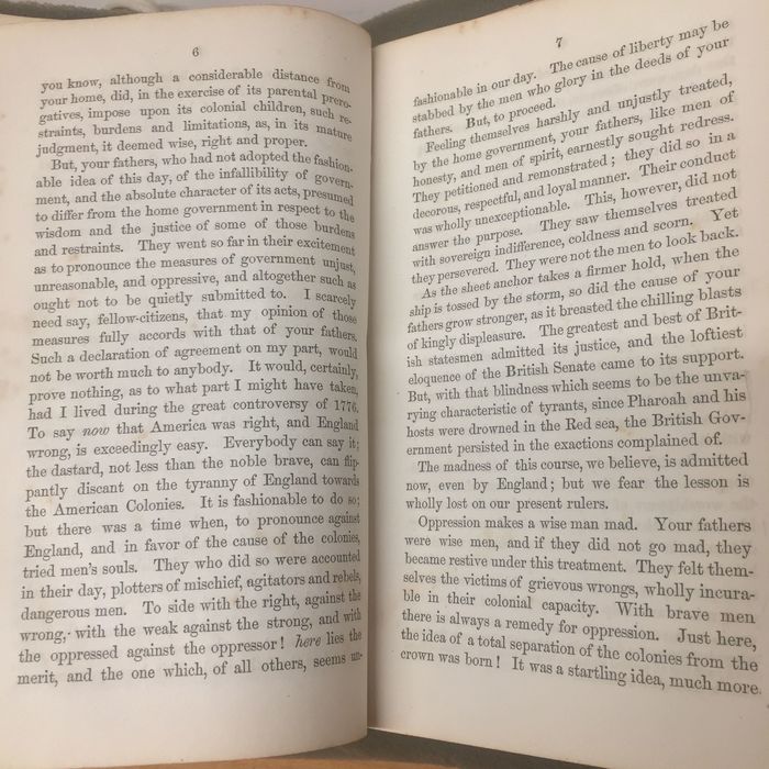
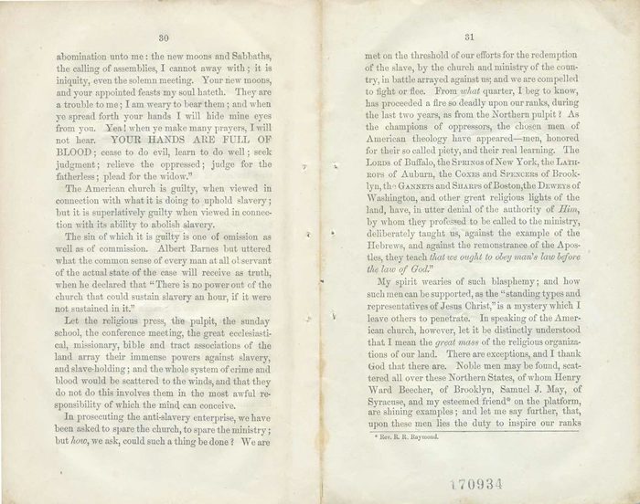
The interior of the booklet is set with justified columns and very few hyphenated line breaks. Occasional variations in size, italicization, alignment, and capitalization are used for things like section headings, footnotes, poetic quotations, emphasis, etc.
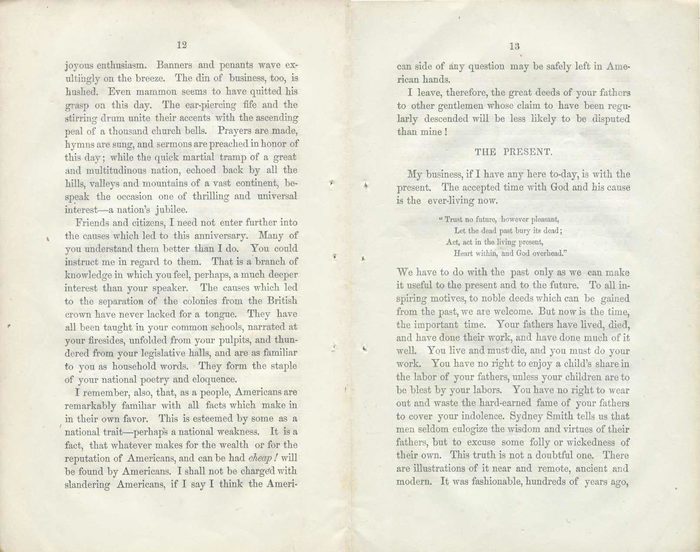
A few techniques may look peculiar to modern readers of American English, but were fairly typical in the mid-1800s. For example, sentences are trailed by fairly large spaces, much more than the single word space used today. Some punctuation like semicolons and exclamation points are also preceded with an extra word space. And while unspaced em dashes aren’t significantly less common today than spaced en dashes for setting off parenthetical content, the use of em dashes – and lots of them – is very typical for 19th-century printing.
Some of these now-dated variations in typesetting are purely stylistic, but many were also employed to ease the process of manual letterpress typesetting. Additional space between sentences and before punctuation allows for a slightly more permissive margin of error when correcting typographical errors or justifying a line to fill the full column width.
Reading the Speech
Scans of this first edition are available at the Internet Archive and a digital transcription of the speech is also available from the University of Rochester. There are also physical copies in libraries like Yale’s Beinecke Library and The American Antiquarian Society. I recommend reading the whole thing, in any format. Alternately, you can also listen to it being read by descendants of Douglass.
The speech is undeniably powerful, and even though it helped further the movement to abolish slavery, it’s painfully tragic how much of its contents are still relevant today. 168 years after Frederick Douglass gave his speech in Rochester, there is still a long way to go until freedom is even close to being equally accessible to everyone in the United States.
To borrow some of Douglass’ closing words:
I have detained my audience entirely too long already. At some future period I will gladly avail myself of an opportunity to give this subject a full and fair discussion.
Allow me to say, in conclusion, notwithstanding the dark picture I have this day presented, of the state of the nation, I do not despair of this country. There are forces in operation which must, inevitably, work the downfall of slavery. […] I, therefore, leave off where I began, with hope.
Typefaces
Formats
- Booklets/Pamphlets (1464)
Topics
- Activism (644)
- Politics (508)
- Governmental/Civic (450)
Designers/Agencies
- Lee, Mann & Co. (1)
Tagged with
- Frederick Douglass (1)
- booklets (184)
- letterpress (197)
- civil rights (21)
- paperbacks/softcovers (885)
- slavery/abolition (9)
- human rights (20)
- anti-racism (24)
- borders and rules (661)
- small caps (103)
- speeches (7)
- Ladies’ Antislavery Society (1)
- historically significant (22)
- US history (52)
- Declaration of Independence (2)
- US Independence Day (3)
- justified text (423)
- footnotes (120)
- book interiors (1906)
- book covers (3477)
- non-fiction books (201)
- essays (135)
- African American (91)
- 1850s (3)
- alternating line styles (55)
- Victorian (23)
- title pages (522)
- center-aligned text (1164)
- periods (74)
- all caps for inline emphasis (1)
Artwork location
- United States (6359)
- New York (145)
- Rochester (13)


