
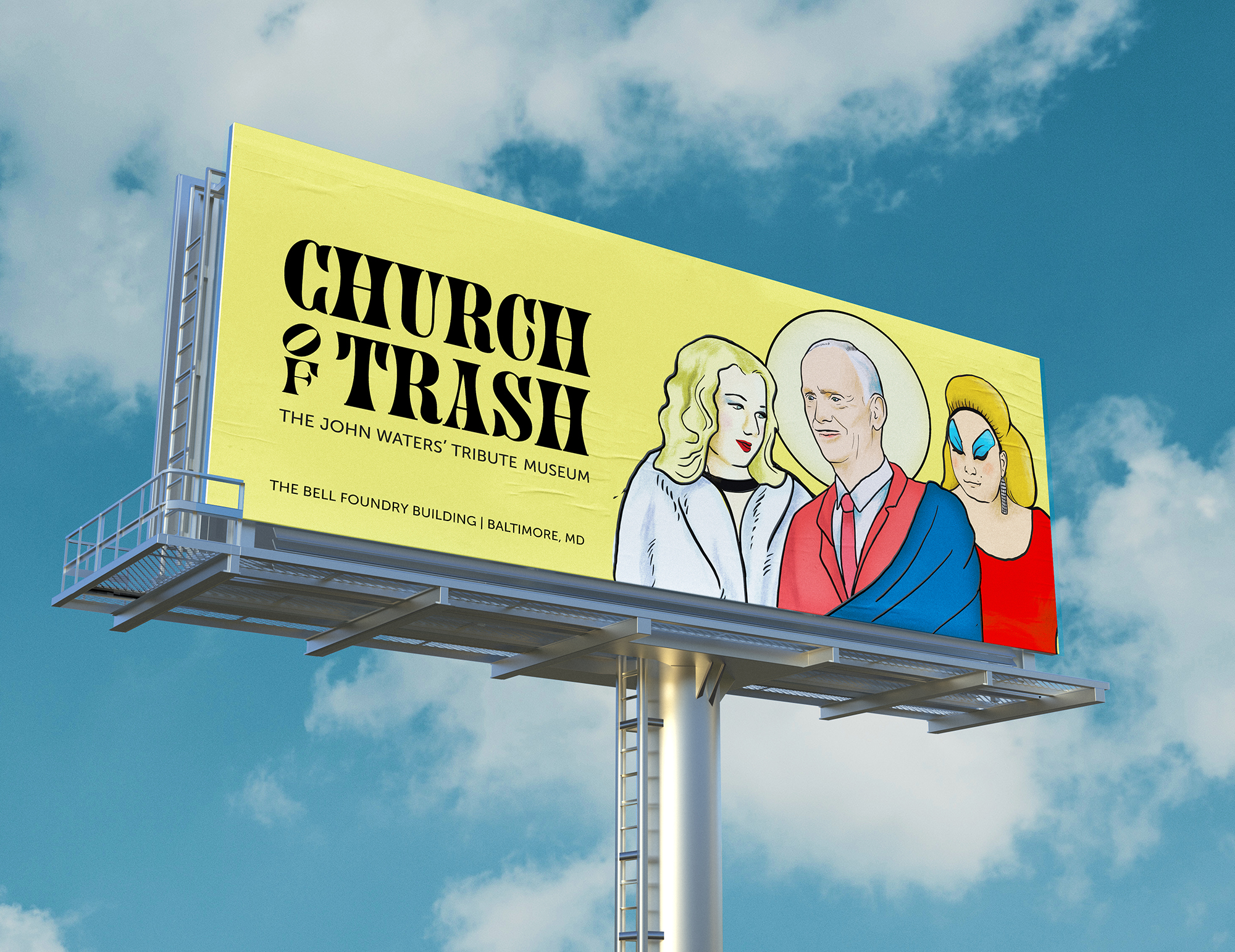
Church of Trash
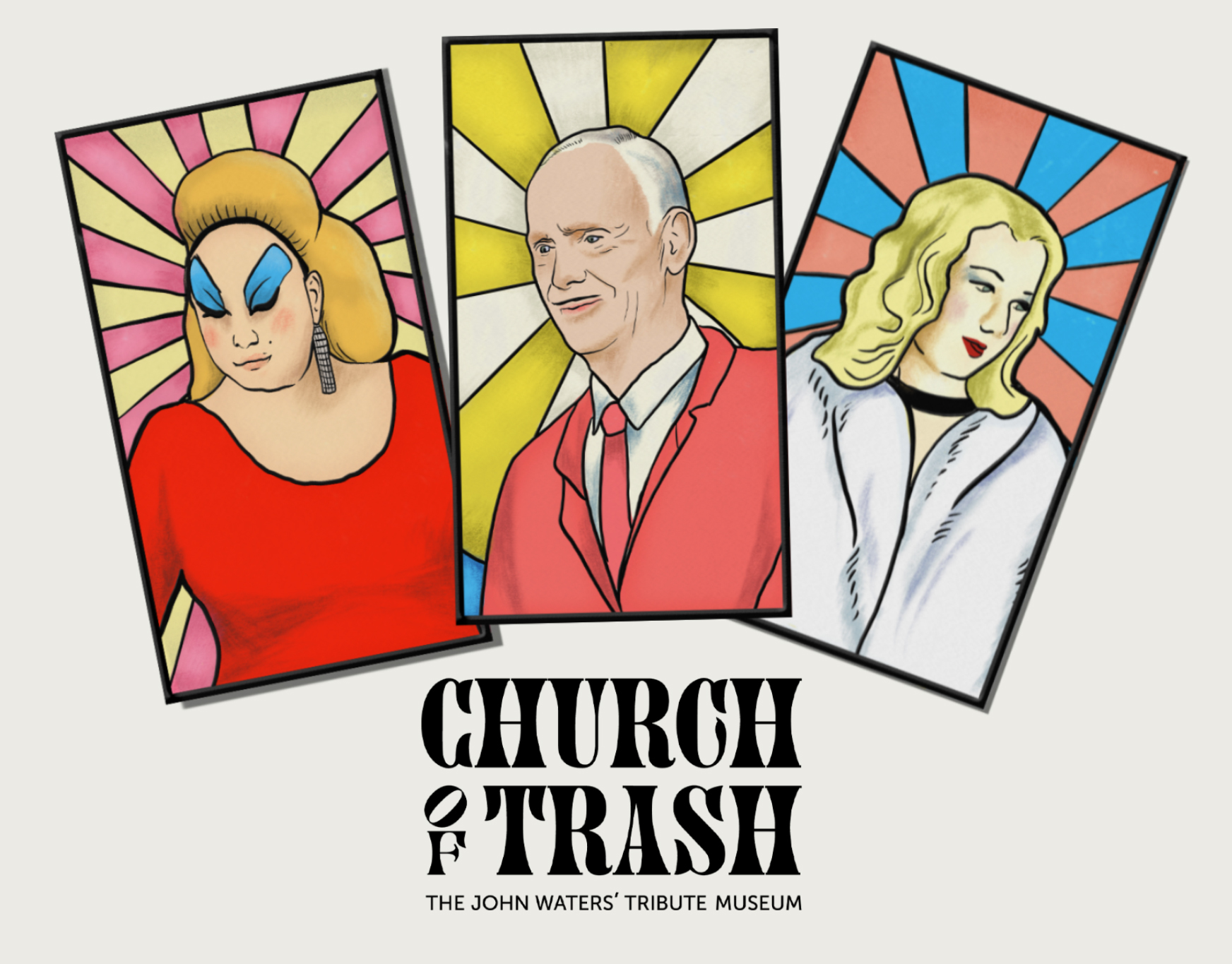
As part of the nod to the museum’s name, the identity includes illustrations in the style of stained-glass windows of Waters and some of his closer collaborators; Divine and Mary Vivian Pearce.
The Church of Trash is a branding project for an imaginary museum and exhibition celebrating John Waters’ work. The museum inhabits the Bell Foundry building in Baltimore, as the self-proclaimed pope of trash is a proud Baltimorean.
I decided to go with a somewhat unconventional typeface. After trying many display options, Juniper seemed to match how distinctive Waters’ work is. Since the logo has two C in it, I modified one of its tails to have an easter egg in the typography. As Juniper is so recognizable and has so many curves, I chose Museo Sans 500, a more traditional sans serif, to go with it.
The project was done at the Maryland Institute College of Art (MICA) for a Graduate Branding course with the mentorship of Abbott Miller and Andrew Walters. See more images on my website.


")


")


: Fin de Louis</cite>")


