
Object of Affection EP cassette
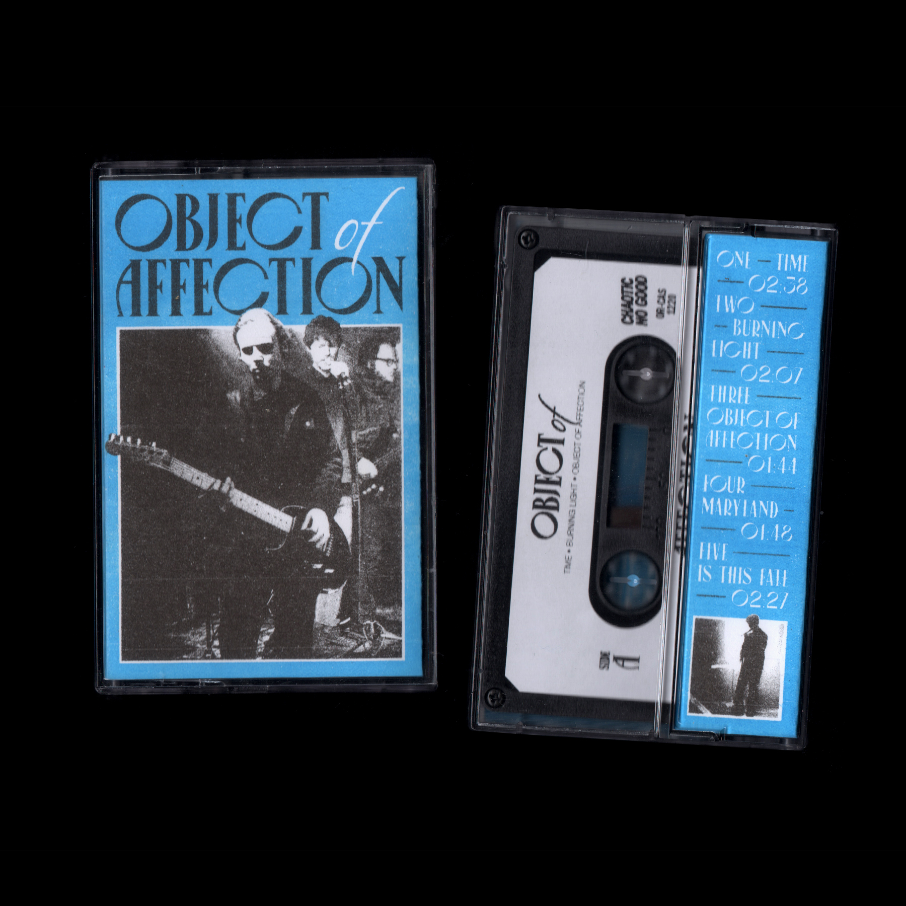
Object of Affection – a self titled EP debut from members of Southern California’s Fury (Run for Cover Records), Lock, Leather Slave, Aussie transplant Death Bells (Dais Records) and more. Out now as Chaotic No Good’s first ever original-music release. The Limited Edition cassettes feature two-color risograph printed j-cards printed by Martian Press.
The typeface used in the j-card design is Canopée. With its contrasting letterform widths, this typeface references Art Deco-style fonts like Plaza, Montecatini, and Mostra Nuova. In the 1980s there was a revival of 1920s influences in visual art that can be seen in cover art like The Passion’s “I’m in Love with a German Film Star”, New Order’s Movement, and Duran Duran’s Rio. The OOA sound is heavily influenced by this era of music so it is something I wanted to reference with the j-card design. Additionally, the contrast between the vertical and horizontal stokes of the letters gives this font a formal and sophisticated tone. The sharp serifs make it feel a bit dark and moody while still retaining a literal visual lightness due to the large counterforms of the O, C, G, and 0. The adjectives used to describe the font also lend themselves to the music with OOA’s brooding vocals and bright guitars.


