Aphex Twin – Selected Ambient Works 85–92 album art
Selected Ambient Works 85–92 was Richard D. James’s first full-length album under the Aphex Twin name, and upon its release in November 1992 on Apollo Records, a sublabel of R&S Records, changed the way we perceive and make electronic music forever. From Wikipedia:
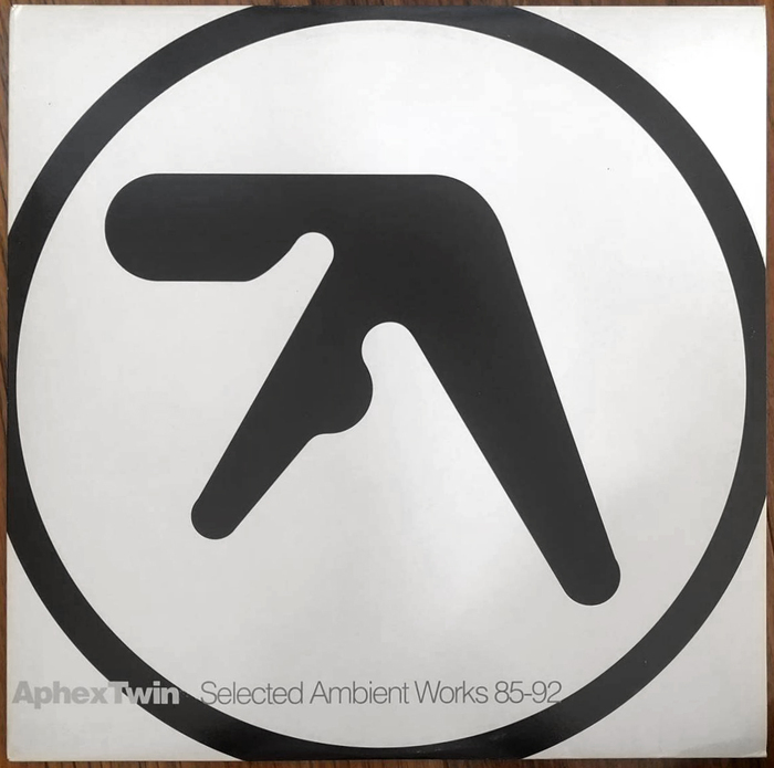
The album’s sleeve prominently displays the Aphex Twin symbol, designed by Paul Nicholson who was also a stage dancer at several of James’s live gigs. Nicholson stated that the duo’s intention for the logo was to be an “amorphic and soft form with no sharp lines”.
The album typography appears to combine two contrasting weights of Helvetica [see comments], with tightened spacing.

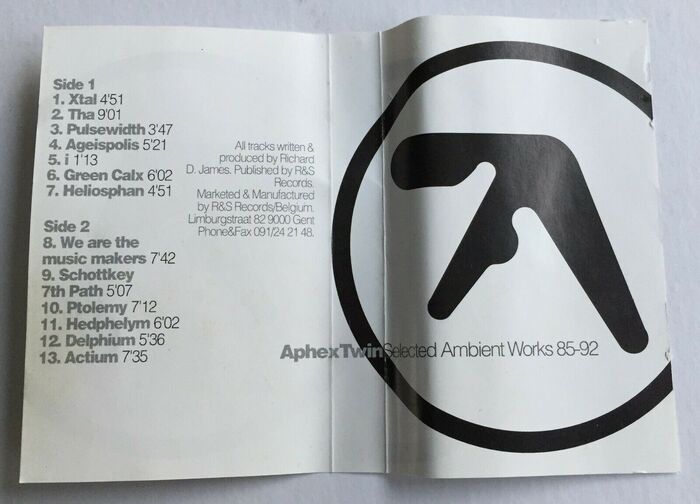
Double LP back cover (R&S Records). Headings for sides B to D are hyphenated. The prime in the duration is straight.
See preliminary and developmental sketches for the Aphex Twin logo by Paul Nicholson below.
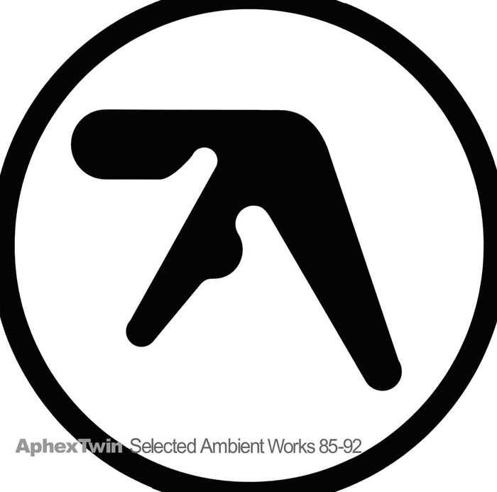
Cover of an unidentified pressing. The typeface used here is Arial, see comments.

Double LP back cover (R&S Records), probably of a later repressing.
Formats
- Album Art (2587)
Topics
- Music (3861)
Designers/Agencies
- R&S Records (1)
- Paul Nicholson (1)
Tagged with
- Aphex Twin (3)
- R&S Records (1)
- IDM (11)
- ambient music (31)
- 1990s (217)
- Apollo Records (1)
- black and white (1459)
- multiple weights (231)
- tight letterspacing (529)
- album records (1551)
- vinyl records (2227)
- back covers (927)
- track listings (532)
- contrasting weights (69)
- compact cassettes (102)
- primes (2)
Artwork location
- Belgium (256)
















2 Comments on “Aphex Twin – Selected Ambient Works 85–92 album art”
Very popular in the early 1990s (see e.g. Massive Attack). This front cover image is using Arial, although it’s hard to see at this resolution (it’s clearest on the 't’). Possibly a remake? This image uses Helvetica, as does the back cover. Haven’t been able to find a high-res image that I can be confident is of the original release and not a remake.
Blythwood, thank you for lending your eagle eye! You are right, of course. I agree that the image of the front cover in Arial likely belongs to a later repressing. I don’t know where it was taken from, maybe from the 2008 reissue (Nicolás, do you remember where you sourced this image?). I found several repressings, many of them claiming “in original artwork”. The type often has been reset, though, with small differences regarding the font, but also other details. For instance, the 2013 reissue adds space around the hyphen in “85–92”.
Discogs is usually a reliable source, as they maintain separate illustrated entries fo each version. Unfortunately, their images are a tad too small for examining the finer details. I have now added images of the front and back cover of what I believe is a pressing that corresponds to the 1992 original, cf. this Discogs entry. Here, the letterform details match Helvetica.
The image of the back cover apparently belongs to a reissue, too (cf. the version from 2013). Not only is the bold weight lighter than in the original. Here, the side headings are unhyphenated, and a curly apostrophe is used instead of a straight one for the minute sign in the duration data.
The typeface used for the 1992 release – now shown at the top of the post, in the form of the LP plus the MC, for good measure – is definitely Helvetica, not Arial. Now is it Neue Helvetica or Helvetica? Looking at the digit 3 with the short middle spur, I tend towards Helvetica (Black).