Biennale D’alexandrie 16 (16th Alexandria Biennale) catalog
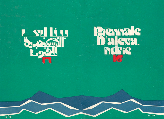
The Alexandria Biennale for Mediterranean Countries was founded in 1955, making Egypt the first African country to use the art biennial format as a political tool for national promotion. This catalog cover for the 16th Alexandria Biennale in 1987 was designed by Miriam Abdel Aleem, one of four women featured in the new book, A History of Arab Graphic Design by Bahia Shehab and Haytham Nawar. The authors presented much of the work from their book in a Letterform Archive lecture on January 26, 2021 and the recording should be posted online soon.
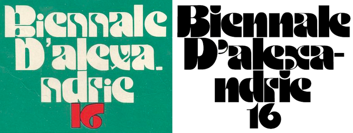
Aleem’s cover lettering compared to Motter Ombra (digital version used).
This is a dual cover with both Arabic and Latin sides. (Perhaps the catalog’s interior also reflects that duality, with Arabic content reading left-to-right, and Latin right-to-left.) The Latin title appears to be based on Othmar Motter’s Motter Ombra, but there are many differences, indicating that Aleem created original lettering based on the typeface rather than applying Letraset or phototype. The ‘B’ and ‘D’ were flipped vertically, the ‘n’ and ‘x’ were reinvented, and the ‘i’ and punctuation appear to come from other models.
Whatever criticisms one could make of the lettering execution, it’s fascinating to see how Aleem emulated Motter Ombra for the Arabic title. The entire composition, incorporating a mirrored illustration, makes for a striking cover.
Typefaces
Formats
- Booklets/Pamphlets (1462)
Designers/Agencies
Tagged with
- biennials (46)
- Alexandria Biennale (1)
- lettering derived from typeface (479)
- critique of use (81)
- green (492)
- mirror effects (48)
- rotated/upside-down glyphs (146)
- tight letterspacing (529)
- multilingual (1158)
- multiscript (439)
- Arabic (language/script) (199)
- Latin (script) (270)
- French (language) (1243)
- booklets (183)
- book covers (3474)
Artwork location
- Egypt (37)


