

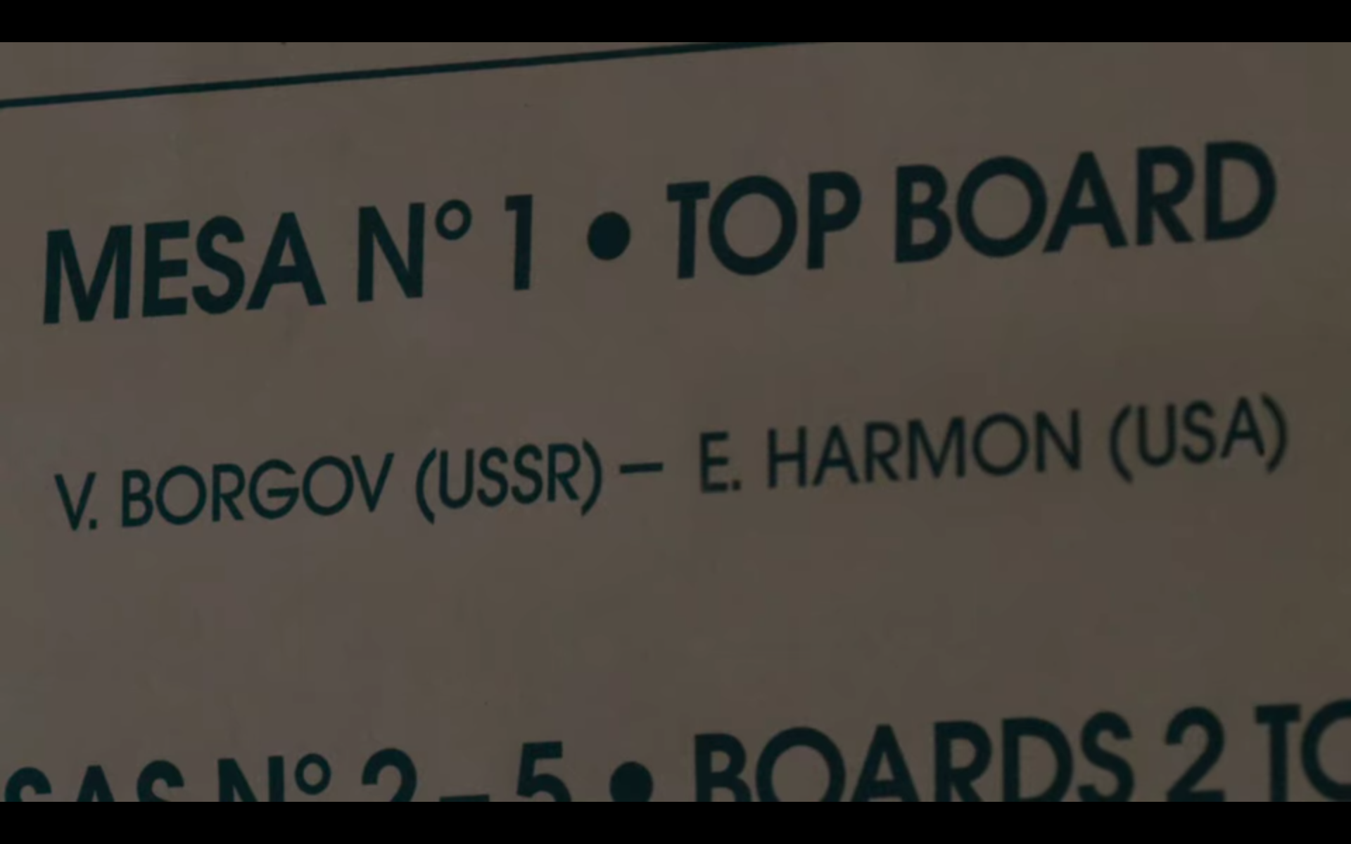
Mexico City Invitational 1966

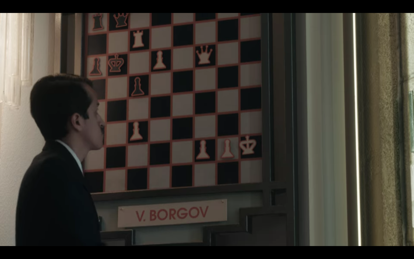
Mexico City Invitational is the central setting for “Middle Game”, the fourth episode of the miniseries The Queen’s Gambit. It’s at this (fictional) chess tournament that Beth Harmon faces her opponent, Soviet world champion Vasily Borgov aka “The Russian”.
The visual identity of the event is based on ITC Avant Garde Gothic, which can be seen in use for a wall display at the hotel venue, as well as for the tournament poster and game charts. “Mexico” is set with its hallmark alternate M and a dotted i in all caps. The geometric sans serif by Herb Lubalin and Tom Carnase was immensely popular in the 1970s, and the props convincingly look like what one would expect to see at an international event in that decade. For typophiles, the fly in the ointment is the fact that the Mexico City Invitational is supposed to take place in 1966 – four years before Avant Garde Gothic was released (and still two years before the logo for Avant Garde magazine – on which the typeface was based – had its debut).


 film promotion")


")


2 Comments on “Mexico City Invitational 1966”
Over on Twitter, Dave Rowland of Eclectotype points out that the typeface chosen for the 1968 tournament in the USSR isn’t period-correct either: It’s TT Trailers by Vika Usmanova and the TypeType Team, which was released in 2019. He adds that such typographic mistakes don’t matter to anyone but nerds, and there’s some truth to that.
Toshi Omagari of the Tabular Type Foundry caught another font flaw in the series: Myriad came out in 1992.