
Scarborough bus shelter, Toronto (1974)
Contributed by Florian Hardwig on Feb 19th, 2021. Artwork published in
.
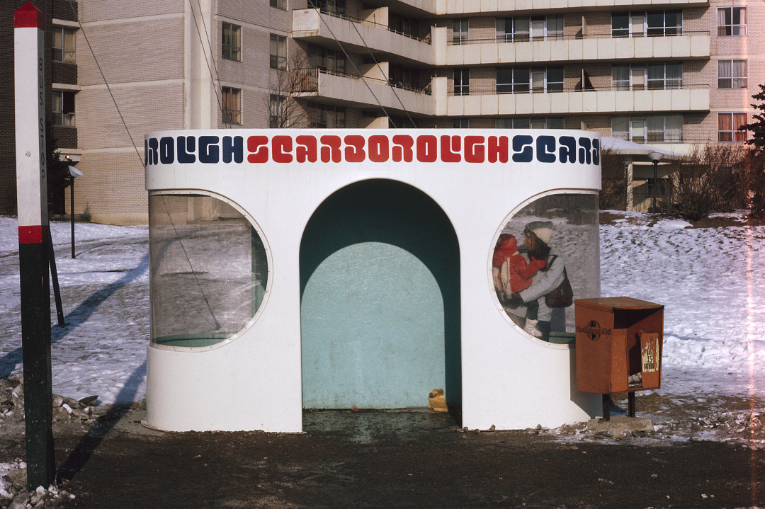
Source: www.flickr.com City of Toronto Archives, Series 1926, File 45, Item 1. Photographer unknown. License: CC BY.
“Waiting for the bus on a sunny winter day in Scarborough, January 1974” – @TorontoArchives
Only in the 1970s: Turtle (Letraset, 1971) in use for a futuristic bus shelter in Scarborough, a suburb of Toronto, Ontario. Neil Nawaz comments: “That font is so groovy, I don’t care it’s unreadable.” Comparing the letterforms to this glyph set, it looks like the designers actually redefined the counters a bit, making the letters slightly less ambiguous. This is particularly visible in C and G. Turtle’s rounded stroke endings echo the stadium shapes found in the windows, the entry, and the shelter’s footprint. I wonder whether this was a one-off design, or whether there was a whole series of these stops.


")


")


")
")


3 Comments on “Scarborough bus shelter, Toronto (1974)”
I’ve found one more image of a bus shelter in the same rounded design, used to illustrate an article by John Lorinc for Spacing Toronto. The lettering here is different, though: It looks like a hand-rendered Folio Bold, in tightly spaced lowercase letters.
What a winner! Perfect pick for the architecture.
Commuters who liked this bus shelter will also dig the Bletchley Leisure Centre walkway.