
iOS 7 Camera App
The built-in apps in Apple’s newly announced iOS 7 use Neue Helvetica almost entirely. This is not a change from previous versions of the OS (other than a system-wide switch to lighter weights), but the typeface is all the more front-and-center in iOS 7 now that the depth, chrome, and button outlines have faded away.
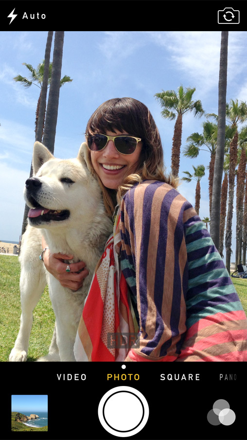
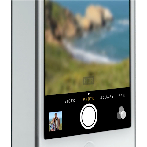
There are a couple of exceptions from this Helvetication, however. One is the Newsstand app icon, and another is in the UI for the new Camera app. While the rest of the system uses Helvetica for buttons and navigation, settings in the Camera app are conspicuously exempt from the overarching style. At the moment, the type appears to be a slightly modified DIN 1451 Mittelschrift, the mechanical typeface created as a standard for German signage and industry — though they may have based the controls on one of the other (more typographically optimized) variants of DIN.
I assume the goal here was to simulate the typical routed lettering on a classic metal-bodied camera, such as a Leica. The allusion is subtle and effective, but this is a curious departure from Apple’s new stand against skeuomorphism. Perhaps there are certain brands (like Braun and Leica) that are simply too loved by Ive and company not to be emulated.


6 Comments on “iOS 7 Camera App”
Maybe Apple should have used DIN for everything in iOS7.
Come on Apple, this is ridiculous. As if the Camera app was developed by a third party.
Overall, iOS 7’s visual design and typographic choices are dissapointing. This should demonstrate that one can’t be a great designer for everything-—Jonathat Ive might have designed great hardware, but he knows nothing about software/interaction/visual design.
“Nothing?” Not any thing? Not even just a little teeny tiny bit about software/visual/interactive design? Just this.
Jony Ive recently helped design a Leica. This further reinforces my assumption that he has an affinity for the kind of engraved metal lettering that is related to DIN. Though the style used on the Leica (much more square) seems to be custom to that brand.
It’s easy to see Jony Ive’s hand in the typography at Apple, looking at DIN in the Camera app, the Leica type (not Apple, but still Ive), and now the Apple Watch font, which is supposedly Apple’s new “Apple Sans” (which will hopefully find its way to iOS and OS X quickly; the inconsistency is already offputting to me).
I’ve always felt the Camera app’s design looks really, really good: a different take on things. The all-caps style and white-on-black condensed lettering feel very urban and neon, like signs in some expensive hotel-it’s too limited a style for an entire OS, but it has a slick, dark feel to it I like. Like a less literal take on skeuomorphism. In some ways it feels like a dry run for San Fransisco and the Apple Watch, which is interesting.
Reminds me a bit of the original design for Google Keep, which is intended to look a little like a wall of post-it notes. Similar effect: you can tell what it’s inspired by, but it’s not exactly a direct copy.