
Marvel 2099 comic books
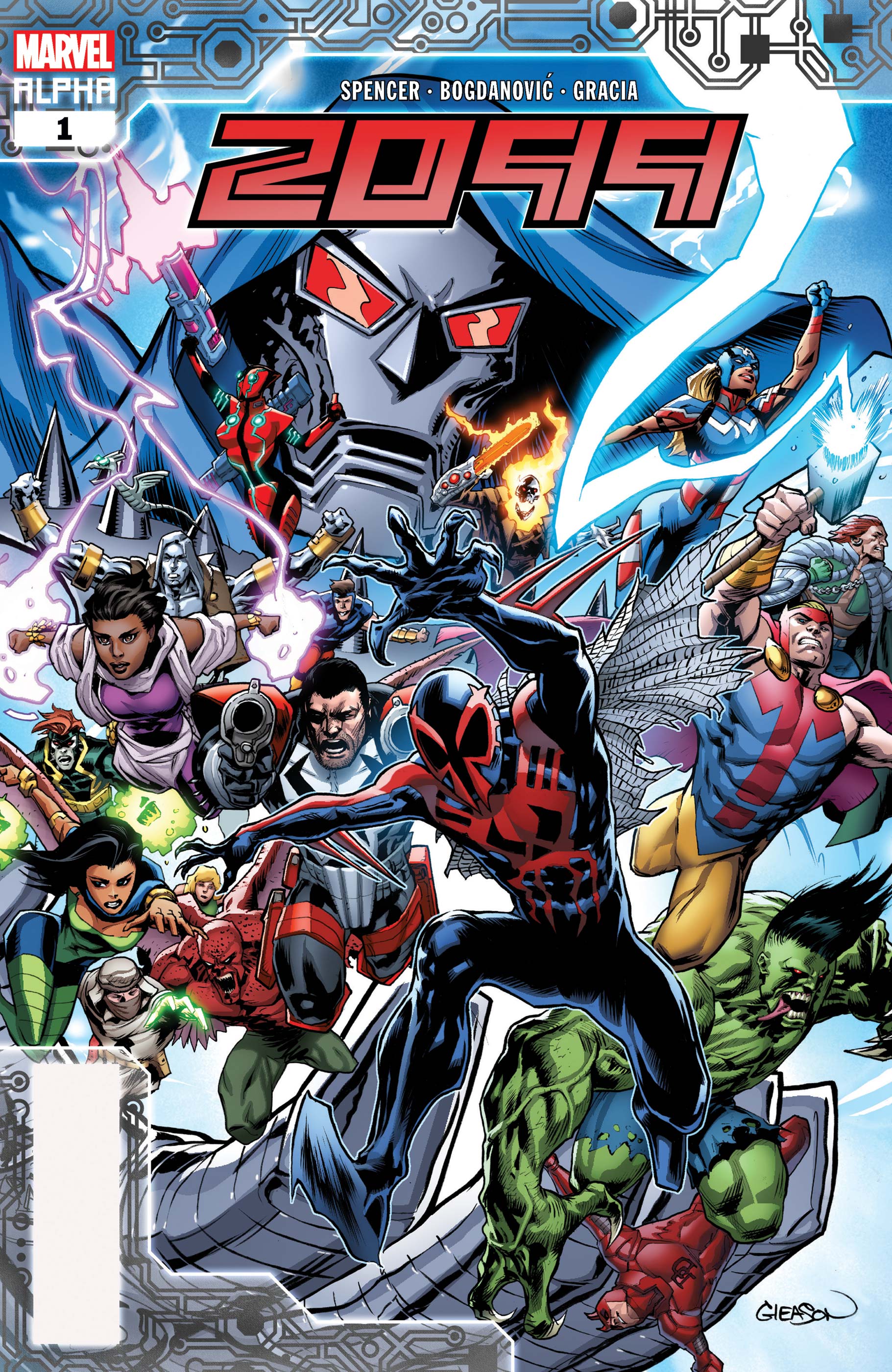
2099 Alpha #1 was published in November 2019. The artist names sitting above the logo are set in Franklin Gothic Extra Condensed.
Marvel 2099 was a Marvel Comics imprint that told stories about futuristic versions of various Marvel super heroes, set in the year 2099. The comics were first released in 1992 and continued until 1999, at which time the imprint was cancelled. The imprint was later resurrected by Marvel Comics in 2014, and sporadic comics set in the year 2099 have continued until 2020.
From Wikipedia:
Marvel 2099 […] was originally one possible future of the Marvel Universe, but later revealed in a climax of Superior Spider-Man Goblin Nation arc and Amazing Spider-Man Vol. 3 #14 to be the Earth of the prime Marvel continuity in the distant future. It was originally announced by Stan Lee in his “Stan’s Soapbox” column as a single series entitled The Marvel World of Tomorrow, which was being developed by Lee and John Byrne. This later changed to a line of books under the banner Marvel 2093 (the date being one hundred years from the year in which the titles launched) before finally being published as Marvel 2099.
Three of the initial four titles launched—Doom 2099, Punisher 2099, and Spider-Man 2099—starred futuristic takes on pre-existing characters. The fourth, Ravage 2099, featured an all-new superhero, scripted for several months by Stan Lee. The 2099 line soon expanded to include 2099 Unlimited, Fantastic Four 2099, Ghost Rider 2099, Hulk 2099, X-Men 2099, and X-Nation 2099.
The comic books for the various super heroes each have their own custom-lettered logo, but the year “2099” that’s appended to each title uses a typeface. It’s known as Zephyr or Chariot. The designer removed the line that rises up out of the counter of the number zero, and italicized the text. It’s likely that “2099” is a hand-drawn interpretation of the typeface, as comic book mastheads are typically hand-drawn.
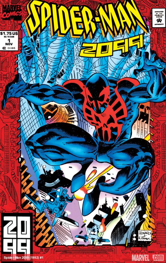
Spider-Man 2099 #1 was published in November 1992. “Spider-Man” is probably hand-drawn.

Marvel Age Magazine was a promotional magazine released periodically by Marvel Comics. This page came from an issue sometime between 1992 and 1994. Body text is set in Eurostile, with headings in Russell Square.

Doom 2009 #1 was published in January 1993. “Doom” is hand-drawn, while “2099” is set in Zephyr / Chariot.
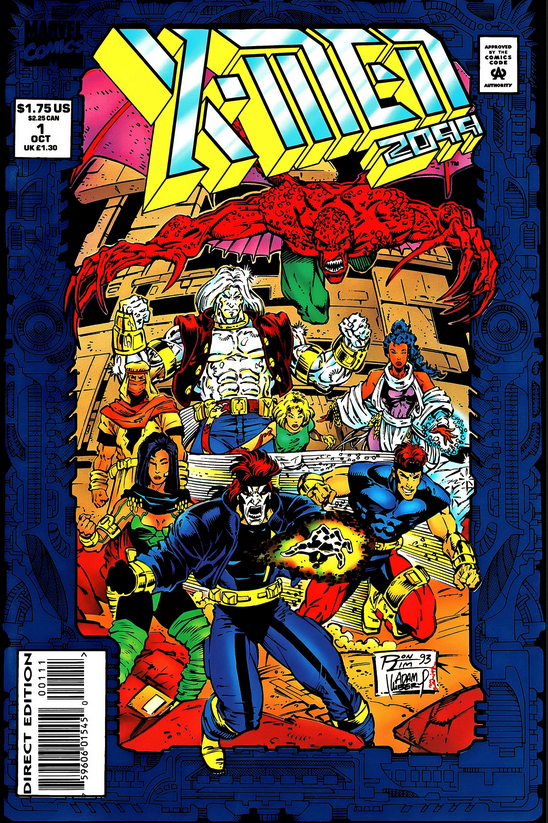
X-Men 2009 #1 was published in October 1993. “X-Men” is hand-drawn, with “2099” being modeled after Zephyr / Chariot, with a 3D effect added.

Punisher 2009 #1 was published in February 1993. “Punisher” is hand-drawn.


")


")


