Mego Micronauts toys
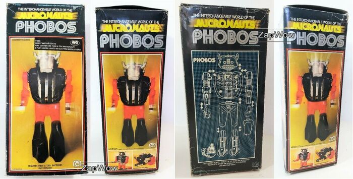
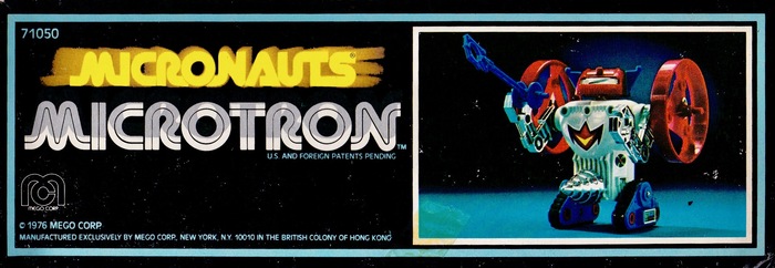
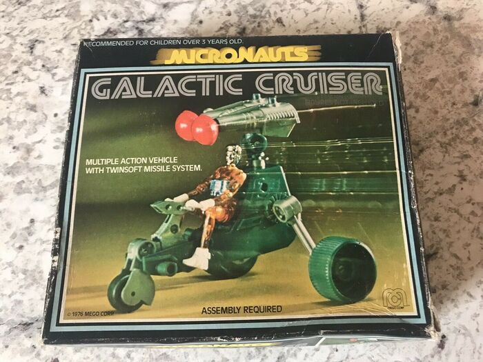
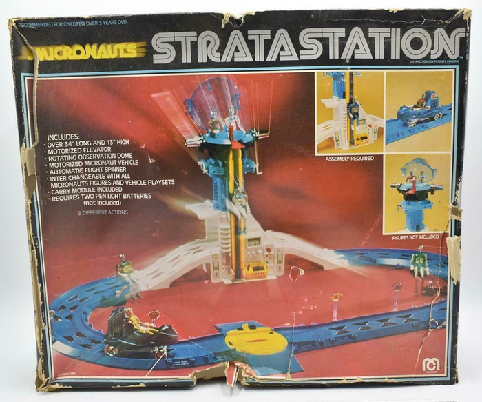
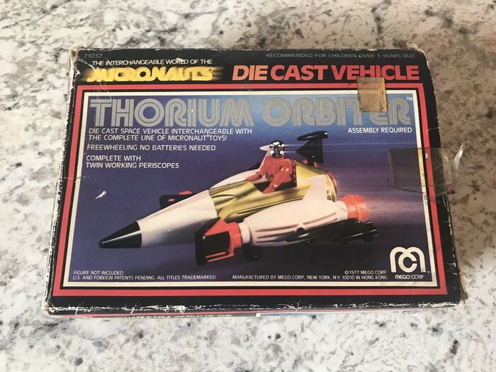
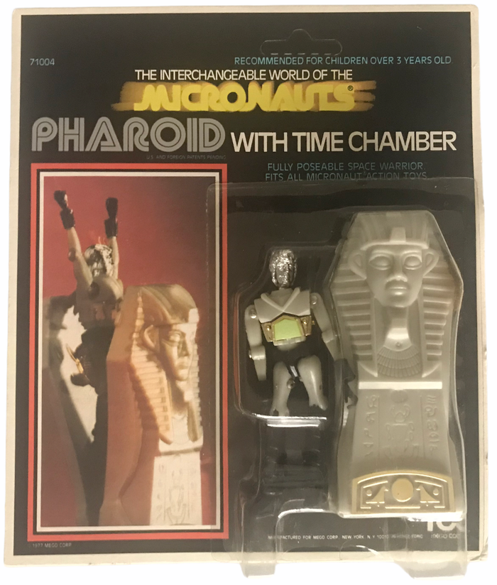
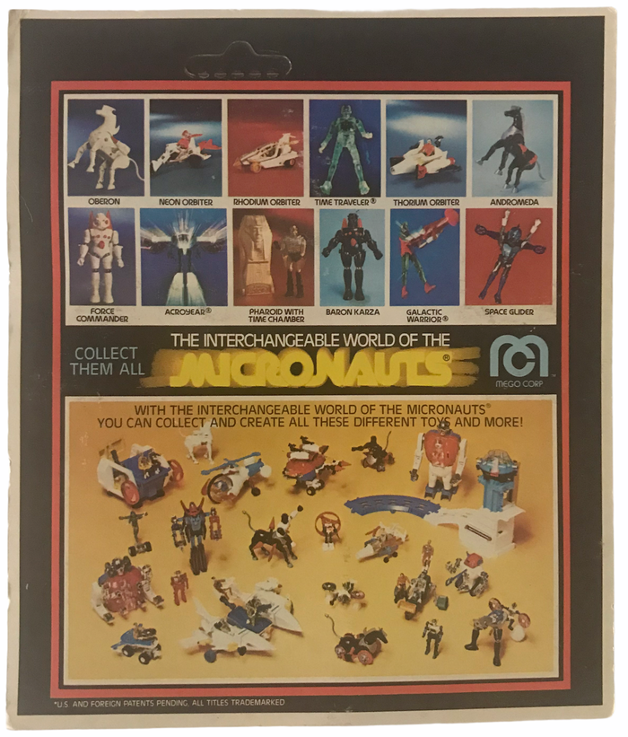
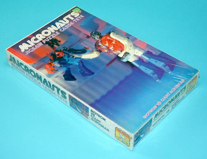
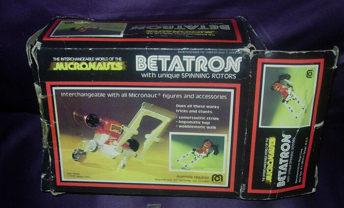
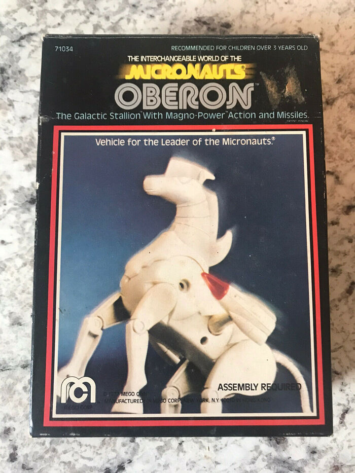
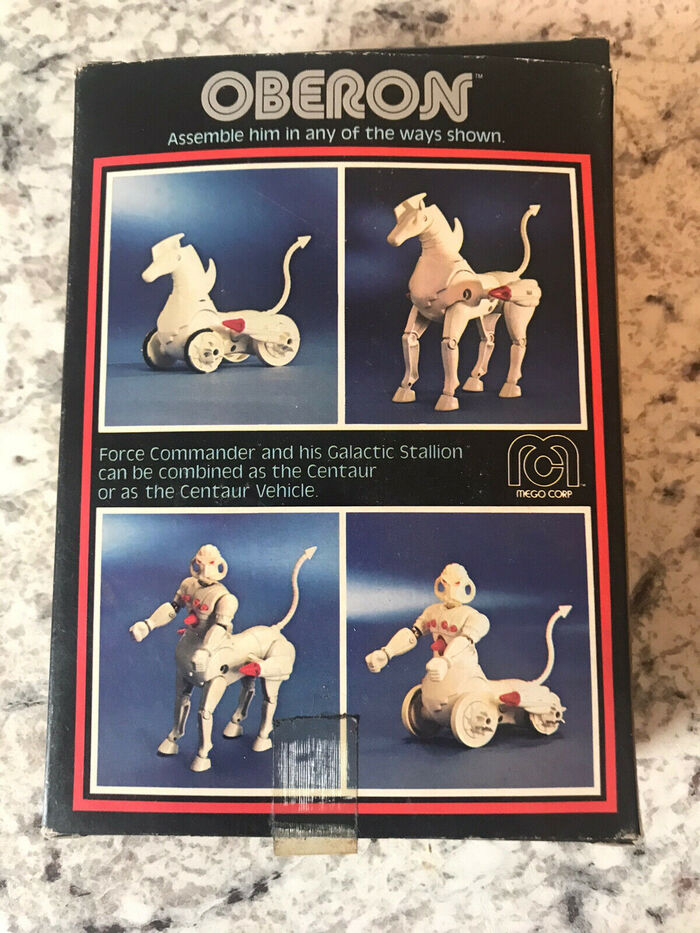
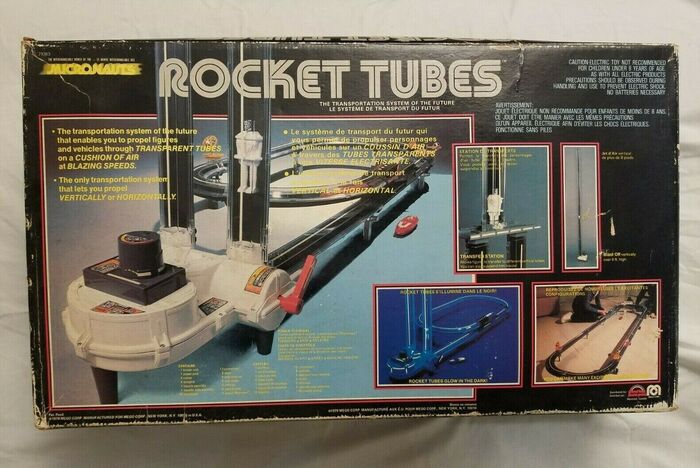
The logotype and packaging design for Micronauts is one of the more prominent in-use examples of the Yagi typeface series, apart from its use in modified form for the logos of Sega (1976) and CNN (1980). From Wikipedia:
Micronauts was a North American science fiction toyline manufactured and marketed by Mego from 1976 to 1980. The Micronauts toyline was based on and licensed from the Microman toyline created by Japanese-based toy company Takara in 1974.
While the names of the action figures, vehicles and other accompanying items are set in Yagi Double, the Micronauts logo is based on the solid Yagi Bold, in yellow on black, with an added motion blur effect. Several of Yagi’s alternate glyphs were used to link letter pairs, and unnecessary joining strokes in N and U were removed. When used in black and white – and also in some other applications – the logo is set in Yagi Double, with alternates, but without further edits. Antique Olive is the brand’s main text typeface. It serves for the slogan “The Interchangeable World of the”, but also for descriptions and other typography on the boxes.
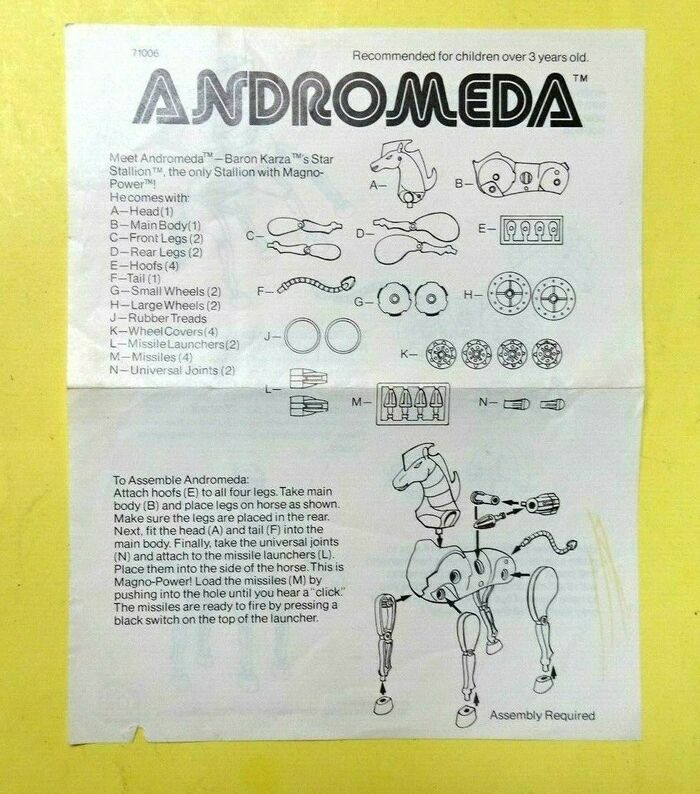
Micronauts Andromeda instruction sheet, 1977, with text set in Helvetica.
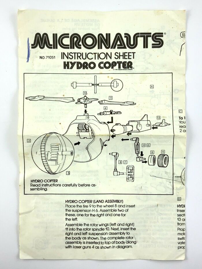
Micronauts Hydro Copter instruction sheet, with text set in ITC Avant Garde Gothic.
Typefaces
Formats
- Packaging (1399)
- Branding/Identity (4752)
- Booklets/Pamphlets (1467)
- Ephemera (782)
Topics
- Product (987)
- Entertainment (1001)
- Kids (510)
Designers/Agencies
- Mego (1)
Tagged with
- Mego (1)
- Micronauts (1)
- action figures (9)
- toys (81)
- brands (632)
- 1970s (1109)
- 1980s (432)
- series (672)
- packaging (346)
- boxes (226)
- logos (2687)
- type series (608)
- alternate glyphs (747)
- modified typeface (1144)
- all caps (4046)
- yellow (310)
- blur effect (60)
- motion effects (32)
- science fiction (264)
- cyborgs (8)
- androids (5)
- product catalogs (111)
- instruction manuals (53)
- puzzles (12)
- slogans/claims (64)
Artwork location
- Hong Kong (45)
- United States (6363)
- New York City (1705)



















1 Comment on “Mego Micronauts toys”
The original design was referenced in the 2016 reissue, see this previous contribution: