
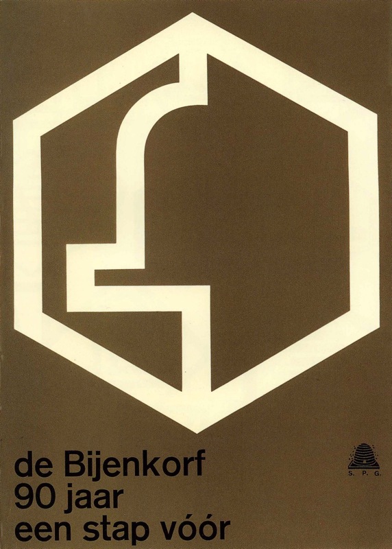
de Bijenkorf Poster
Contributed by Tânia Raposo on Jul 15th, 2013. Artwork published in
.
Source: www.flickr.com License: All Rights Reserved.
“90 years – one step ahead”
Poster for the Dutch chain of high-end department stores de Bijenkorf (“The Beehive”).


")


 movie poster")


2 Comments on “de Bijenkorf Poster”
I’ve seen the logo before knowing the name and always thought, “Oh, what a nice bell.”
It’s also funny to see how the leading looks wrong between een and 90, does this qualify as a special case of the Spiekermannsche Lehrsatz?
Haha, indeed, I had that too. Re line spacing (it looks like it’s set without leading) – you’re right that it looks weird but the Spiekermann’sche Lehrsatz is about the Murphy-Law of clashing a- and descenders in a line. Here fate was forebearing with us. In display cases like this I sometimes adjust line spacing to be optically OK, not necessarily exactly the same in all lines.