The Mystery of the Dune Font
Putting a name to the typeface that defined the visual identity of the science fiction series and its author, Frank Herbert
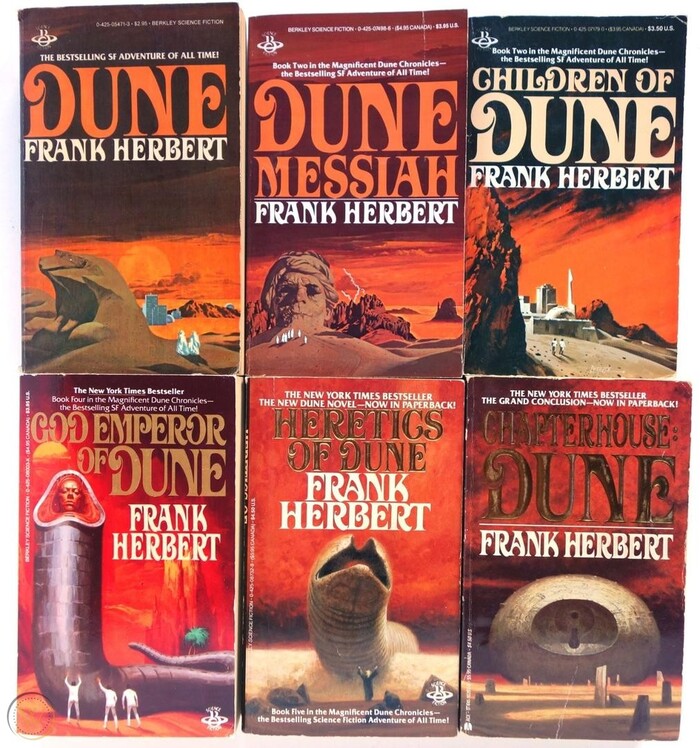
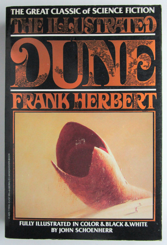
In the six decades since the publication of the original Dune novel in 1965, the science fiction franchise has gone through many different typographic identities. Notable examples include the use of Giorgio for the British paperbacks by NEL (c. 1968) and Albertus for David Lynch’s movie adaptation (1984). But another typeface has even stronger ties to Dune and its author. It appeared on the covers of dozens of books, including the classic Dune trilogy and its sequels, and also on other titles by – or about – Frank Herbert, from various imprints. Strangely enough, the name of this typeface is barely known even among die-hard fans.
![Dune (1965) and Dune Messiah (1969) as published by Berkley Medallion in September 1975. Cover art by . [More info on ISFDB about Dune and Dune Messiah]](https://assets.fontsinuse.com/static/use-media-items/157/156297/upto-700xauto/63d29591/Dune%20Berkley%20Medaillon.jpeg)
Dune (1965) and Dune Messiah (1969) as published by Berkley Medallion in September 1975. Cover art by Vincent Di Fate. [More info on ISFDB about Dune and Dune Messiah]
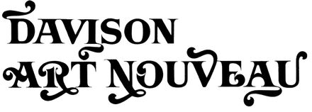
Davison Art Nouveau was drawn by lettering artist Meyer M. “Dave” Davison for Photo-Lettering (PLINC), a typesetting company in New York City. It was first shown in PLINC’s 1967 Alphabet Yearbook. Basically a bold all-caps roman with long bracketed serifs, Davison Art Nouveau comes in three variants of increasing ornamentation: Art Nouveau with Flourishes, Modified, and Ornate.
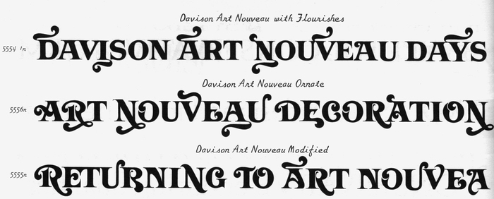
One-line samples for the three variants of Davison Art Nouveau, compiled from a page in PLINC’s Alphabet Yearbook 1967
Each variant includes additional alternates, some of which sport swashes, fox tail extensions, and curlicues that reach above and below the line. Depending on which glyphs are selected, the look of words set in Davison Art Nouveau ranges from sober to discreetly flowery to full-blown carnivalesque. That’s one reason this face isn’t easy to track down – it can take on so many different appearances. The other reason is that it was exclusive to PLINC. And PLINC was a service provider, not a font retailer. You couldn’t buy or license a copy of Art Nouveau. If you wanted to have some text set in this font, you had to place an order at their Manhattan office at 216 East 45th Street, in person or by phone or post.
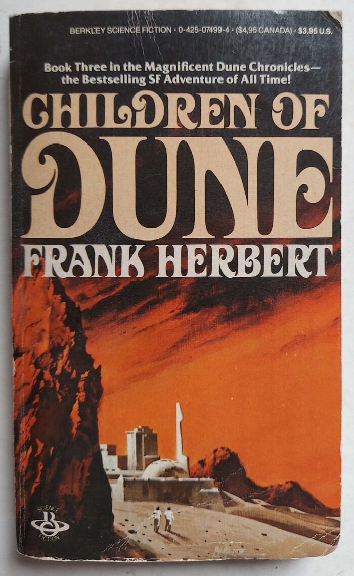
![Children of Dune, first edition by Berkley Putnam, 1976. Cover art by . [More info on ISFDB] The secondary typeface here is with its alternate long-legged R.](https://assets.fontsinuse.com/static/use-media-items/159/158950/upto-700xauto/63cc25d1/Children%20of%20Dune.png)
Children of Dune, first edition by Berkley Putnam, 1976. Cover art by Vincent Di Fate. [More info on ISFDB] The secondary typeface here is Columna Solid with its alternate long-legged R.
![Children of Dune (1976). Berkley Medallion, 1977. Cover art by . [More info on ISFDB]](https://assets.fontsinuse.com/static/use-media-items/151/150727/upto-700xauto/63cc03e2/15986226363_920f3a0eb4_b.jpeg)
Children of Dune (1976). Berkley Medallion, 1977. Cover art by Vincent Di Fate. [More info on ISFDB]
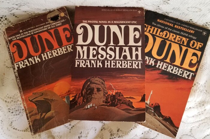
Dune, Dune Messiah, and Children of Dune, in undated paperback editions by Ace and Berkley Medallion
The liaison between Dune and Davison Art Nouveau started in September 1975, when the typeface was used by Berkley Medallion for a paperback edition of the first two novels. At the time, the Berkley imprint was owned by New York-based publisher G.P. Putnam’s Sons. When Berkley Putnam published the first hardcover edition of the third novel, Children of Dune, in 1976, the new typographic identity was applied there, too. Later on, Putnam used the typeface on the jackets for hardback editions of other, unrelated books authored (or coauthored) by Frank Herbert.
After Berkley acquired Ace Books in 1982, Ace took over as Putnam’s publisher for science fiction paperbacks. During this period, some of Herbert’s books also appeared under the Del Rey imprint. Despite the change in imprints, though, the link between Herbert and Art Nouveau lasted – that is, until around 1988. Such “author branding” was rather common, especially with science fiction and fantasy writers. Other examples on Fonts In Use include Roslyn Gothic for Philip K. Dick, Dynamo and Corporate for Arthur C. Clarke, and Pipeline for Robert Heinlein.
The uncredited typographer worked with the Modified variant – at least that’s what the A with curved bar and the E with curling middle bar shown in the limited typeface samples I’ve been able to compare suggest. The letterforms were used with varying degrees of condensation, something that was easily done with phototype. Given that Art Nouveau came with so many alternates, its use for Dune and beyond is impressively consistent. Across the dozens of applications, only a handful of variant glyphs were employed: see for example the two forms for A, one of them with a right stem that curves inward; the R with the curling terminal for “Trilogy” versus the one in “Frank Herbert” on the box set below; or the S with and without ball terminal at the top.
Right from the start, Friz Quadrata was introduced as the supporting typeface, a choice that was maintained for most of the following books.
This post showcases a considerable number of book covers and jackets featuring Art Nouveau, more or less in chronological order, without aiming for completeness. The credit for selecting Art Nouveau probably goes to an unknown art director working at the Berkley Publishing Corporation. My research didn’t turn up any names. If you have any additional insight, please leave a comment.
![Dune Trilogy: The first three books were also issued in a boxed set by Berkley Medallion, 1977. [More info on ISFDB] “The complete” is added in caps from .](https://assets.fontsinuse.com/static/use-media-items/159/158951/upto-700xauto/63cc287e/Dune%20Trilogy.png)
Dune Trilogy: The first three books were also issued in a boxed set by Berkley Medallion, 1977. [More info on ISFDB] “The complete” is added in caps from Futura.
![The Worlds of Frank Herbert (1970), Berkley Medallion, 1977. Cover art by . [More info on ISFDB]](https://assets.fontsinuse.com/static/use-media-items/157/156295/upto-700xauto/622cff4e/The%20Worlds%20of%20Frank%20Herbert.jpeg)
The Worlds of Frank Herbert (1970), Berkley Medallion, 1977. Cover art by Paul Alexander. [More info on ISFDB]
![Whipping Star (1970), Berkley Medaillon, 1977. Cover art by . [More info on ISFDB]](https://assets.fontsinuse.com/static/use-media-items/152/151109/upto-700xauto/63d008b1/5225568089_f894ae8d24_o_d.jpeg)
Whipping Star (1970), Berkley Medaillon, 1977. Cover art by Paul Alexander. [More info on ISFDB]
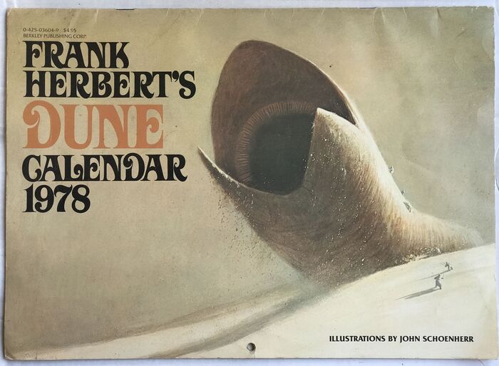
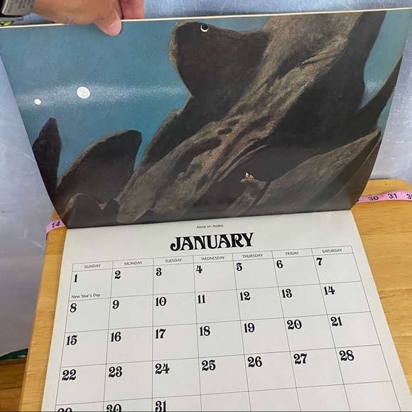
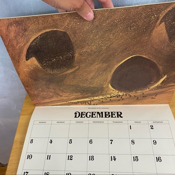
The typographic identity extended to items other than books, too. Frank Herbert’s Dune Calendar 1978 was published by Berkley in 1977, with illustrations by John Schoenherr.
![The Dosadi Experiment (1977), Berkley, 1978. Cover art by . [More info on ISFDB]](https://assets.fontsinuse.com/static/use-media-items/152/151110/upto-700xauto/63cc2a4c/6236904301_4ab276b504_o_d.jpeg)
The Dosadi Experiment (1977), Berkley, 1978. Cover art by Paul Alexander. [More info on ISFDB]
![Destination: Void (1966), Berkley, Dec. 1978. Cover art by . [More info on ISFDB]](https://assets.fontsinuse.com/static/use-media-items/151/150729/upto-700xauto/63d00923/6988275933_7127c70898_o_d.jpeg)
Destination: Void (1966), Berkley, Dec. 1978. Cover art by Paul Alexander. [More info on ISFDB]
![The Jesus Incident (1979) by Frank Herbert & Bill Ransom, Berkley, 1980. Cover art by . [More info on ISFDB]](https://assets.fontsinuse.com/static/use-media-items/151/150725/upto-700xauto/63cc0bb2/5870195288_9f4360df7e_o_d.jpeg)
The Jesus Incident (1979) by Frank Herbert & Bill Ransom, Berkley, 1980. Cover art by Paul Alexander. [More info on ISFDB]
![Soul Catcher (1972), Berkley, 1979 (this printing from 1985). Cover art by Wayne Barlowe. [More info on ISFDB]](https://assets.fontsinuse.com/static/use-media-items/183/182368/upto-700xauto/63d2776f/Soul%20Catcher.jpeg)
Soul Catcher (1972), Berkley, 1979 (this printing from 1985). Cover art by Wayne Barlowe. [More info on ISFDB]
![The Godmakers (1972), Berkley, 1981. Cover art by . [More info on ISFDB]](https://assets.fontsinuse.com/static/use-media-items/151/150731/upto-700xauto/63cc0bb2/5237935258_202dac75a9_o_d.jpeg)
The Godmakers (1972), Berkley, 1981. Cover art by Paul Alexander. [More info on ISFDB]
![God Emperor of Dune, first US edition by Putnam, 1981. Cover art by . [More info on ISFDB]](https://assets.fontsinuse.com/static/use-media-items/157/156293/upto-700xauto/63cc0bb2/God%20Emperor%20of%20Dune.jpeg)
God Emperor of Dune, first US edition by Putnam, 1981. Cover art by Brad Holland. [More info on ISFDB]
![God Emperor of Dune, Berkley, Sep. 1981. [More info on ISFDB]](https://assets.fontsinuse.com/static/use-media-items/151/150730/upto-700xauto/63cc2a6b/5237331555_ca4b904fd9_o_d.jpeg)
God Emperor of Dune, Berkley, Sep. 1981. [More info on ISFDB]
![The Book of Frank Herbert (1973), Berkley, 1981. Cover art by . [More info on ISFDB]](https://assets.fontsinuse.com/static/use-media-items/157/156299/upto-700xauto/63cc0bb3/The%20Book%20of%20Frank%20Herbert.jpeg)
The Book of Frank Herbert (1973), Berkley, 1981. Cover art by Vincent Di Fate. [More info on ISFDB]
![Under Pressure, originally titled The Dragon in the Sea (1956), Del Rey / Ballantine, 1981. Cover art by David B. Mattingly. [More info on ISFDB]](https://assets.fontsinuse.com/static/use-media-items/183/182056/upto-700xauto/63cc22c9/Under%20Pressure.jpeg)
Under Pressure, originally titled The Dragon in the Sea (1956), Del Rey / Ballantine, 1981. Cover art by David B. Mattingly. [More info on ISFDB]
![The Heaven Makers (1968), Del Rey / Ballantine, 1982. Cover art by Darrell K. Sweet [More info on ISFDB]](https://assets.fontsinuse.com/static/use-media-items/183/182055/upto-700xauto/63cc2a81/The%20Heaven%20Makers.png)
The Heaven Makers (1968), Del Rey / Ballantine, 1982. Cover art by Darrell K. Sweet [More info on ISFDB]
![The White Plague, first edition by Putnam, 1982. Cover art by . [More info on ISFDB]](https://assets.fontsinuse.com/static/use-media-items/157/156292/upto-700xauto/63cc0bb3/11824529320.jpeg)
The White Plague, first edition by Putnam, 1982. Cover art by Abe Echevarria. [More info on ISFDB]
![The Lazarus Effect by Frank Herbert and Bill Ransom, first edition by Putnam, 1983. Cover art by . [More info on ISFDB]](https://assets.fontsinuse.com/static/use-media-items/157/156291/upto-700xauto/63cc0bb3/9264498431.jpeg)
The Lazarus Effect by Frank Herbert and Bill Ransom, first edition by Putnam, 1983. Cover art by Abe Echevarria. [More info on ISFDB]
![The Dune Encyclopedia by Willis Everett McNelly (ed.), a collection of essays written as a companion to the Dune series, first edition by Berkley, 1984. [More info on ISFDB]](https://assets.fontsinuse.com/static/use-media-items/159/158012/upto-700xauto/63d009be/WaVwwHF.png)
The Dune Encyclopedia by Willis Everett McNelly (ed.), a collection of essays written as a companion to the Dune series, first edition by Berkley, 1984. [More info on ISFDB]
![Chapterhouse: Dune, first edition by Putnam, April 1985. Cover art by . [More info on ISFDB]](https://assets.fontsinuse.com/static/use-media-items/151/150728/upto-700xauto/63cc0bb4/4087283684_ee6e09ca8a_o_d.jpeg)
Chapterhouse: Dune, first edition by Putnam, April 1985. Cover art by John Schoenherr. [More info on ISFDB]
![Heretics of Dune (1984), Berkley, April 1986. Cover art by . A similar edition was published by Ace in 1987. [More info on ISFDB]](https://assets.fontsinuse.com/static/use-media-items/151/150724/upto-700xauto/63cc0bb4/4629316638_caa3fef131_o_d.jpeg)
Heretics of Dune (1984), Berkley, April 1986. Cover art by John Schoenherr. A similar edition was published by Ace in 1987. [More info on ISFDB]
![God Emperor of Dune (1981, see above), Ace, June 1987. Cover art by . [More info on ISFDB]](https://assets.fontsinuse.com/static/use-media-items/151/150723/upto-700xauto/63d009ec/5151722128_46b89a156d_o_d.jpeg)
God Emperor of Dune (1981, see above), Ace, June 1987. Cover art by Vincent Di Fate. [More info on ISFDB]
![Frank Herbert: The Maker Of Dune, edited by Tim O’Reilly, Berkley, 1987. [More info on ISFDB]](https://assets.fontsinuse.com/static/use-media-items/152/151111/upto-700xauto/63cc1fed/49231969473_a0d7c0de96_o_d.jpeg)
Frank Herbert: The Maker Of Dune, edited by Tim O’Reilly, Berkley, 1987. [More info on ISFDB]
![The Ascension Factor by Frank Herbert and Bill Ransom, first edition by Putnam, 1988. Cover art by Ron Miller. [More info on ISFDB]](https://assets.fontsinuse.com/static/use-media-items/157/156298/upto-700xauto/63cc0bb4/30082169313.jpeg)
The Ascension Factor by Frank Herbert and Bill Ransom, first edition by Putnam, 1988. Cover art by Ron Miller. [More info on ISFDB]
Davison Art Nouveau in the digital age
Photo-Lettering, Inc. didn’t make the transition to digital typesetting and went out of business in 1997. Davison Art Nouveau disappeared together with the company and thousands of other alphabet designs. In 2003, House Industries purchased the assets. The Delaware design studio partnered with Erik van Blokland and Christian Schwartz and started digitizing a number of typefaces by PLINC, with the help of friends and colleagues. These were initially made available in 2009 via a special web service that replicated the exclusive PLINC experience for the digital age. House Industries later switched to offering them for conventional licensing. At the time of writing, Davison Art Nouveau is not among the digitized designs.
In 2009, a Dune aficionado who goes by the moniker DuneFish (DFUK) and/or MEP made a digital font called Orthodox Herbertarian, “painstakingly traced from scans of the typeface that was used on the American Ace editions […] of Dune and many other Frank Herbert books”. This amateur digitization is freely available at kullwahad.com. The font is caps only (A–Z), with a basic set of punctuation characters and scaled-down caps in the lowercase. Because it’s based on the book covers (as opposed to the original typeface), it naturally adopts the narrowed proportions. Orthodox Herbertarian is a laudable effort, but it doesn’t include any of the alternates or the numerals. In 2020, Reddit user purgruv added lowercase letters and numerals to this freebie and offered it for download as Extended Herbertarian. The additions aren’t faithful to the original and unfortunately aren’t well drawn, either.
Orthodox Herbertarian arguably covers the needs of most Dune fans. Nevertheless, I hope to see a professional, fully featured digitization of Davison Art Nouveau one day.
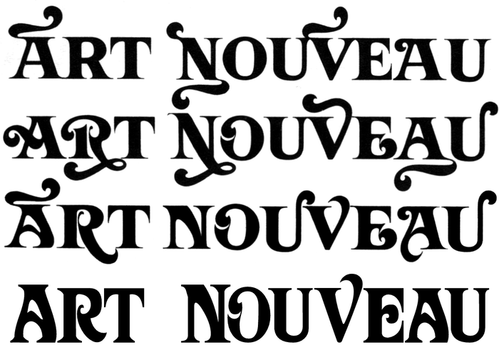
The original Davison Art Nouveau in three variants (line 1–3) with some – but not all – of its alternates, compared to the digital Orthodox Herbertarian (line 4). As a basic caps-plus-small-caps font without any extras, the freebie can do only so much. It is a decent option if you want to quickly emulate Dune’s typographic style, though.
Thanks to B., G., and Justin Hoggard, who all suggested I write an article about this use; and to Caren Litherland for the valuable edits. Kudos to the Internet Speculative Fiction Database, which helped a lot in identifying and dating the numerous editions and printings.
Typefaces
Formats
- Books (4677)
Topics
- Literature (2188)
- Science/Nature (742)
Designers/Agencies
- Vincent Di Fate (3)
- John Schoenherr (5)
- Paul Alexander (2)
- Brad Holland (1)
- Abe Echevarria (1)
- Ron Miller (2)
- Darrell K. Sweet (1)
- David B. Mattingly (1)
- Wayne Barlowe (2)
- unknown (2650)
Tagged with
- Frank Herbert (9)
- Dune (12)
- Berkley Books (14)
- Ace Books (20)
- Putnam Books (1)
- paperbacks/softcovers (1172)
- book covers (4095)
- hardcovers (802)
- book jackets (629)
- book series (394)
- science fiction (320)
- stacked and justified (510)
- alternate glyphs (902)
- swashes (489)
- stretched type (353)
- Bill Ransom (1)
- Tim O’Reilly (1)
- calendars (106)
- Del Rey (imprint) (2)
- type on a curve (715)
- embossed/debossed (406)
- gold (302)
- long-time use (108)
- iconic uses (104)
- 1970s (1228)
- 1980s (486)
- phototype (55)
Artwork location
- United States (7254)
- New York City (1998)
















21 Comments on “The Mystery of the Dune Font”
My father, Tom Dardis, was editor-in-chief at Berkley in 1965 (until 1972). I know he cared about typefaces. I don’t know what his involvement was with the design of the original Dune.
Thank you for your comment, Tony. Tom Dardis was one of several names I came across while looking for people who might have been involved in the typeface selection and typographic design. Unfortunately, this aspect – unlike the cover art – is hardly ever credited, and it’s difficult to find out any details some fifty years later. It must have been someone who was on staff in 1975, and – assumably – in the role of an art director. Your father might have known that person.
Thank you so much for this article! I have an affection for 1960s-70s/art nouveau-crossover typography and have previously searched unsuccesfully for information about this typeface. It’s amazing to have found your article just a day after you posted it.
Orthodox Herbertarian is a good freebie, but as you say, it would be great to see a full digitization of Davison Art Nouveau.
Davison Art Nouveau is one of those faces that is so strongly associated with a specific use (typecast, you could say) that it would be difficult to use it for anything else without seeming to reference Dune or Herbert.
Also, so glad you managed to identify it. I gave up years ago.
Mark, super appreciate “typecast” there mate
Thanks, Mark. I tend to agree. Then again, the covers employed only a fraction of the typeface’s possibilities. I can imagine that Davison Art Nouveau used without stretching and with some of its other letterform variants – either the straighter ones or those with the extending flourishes – wouldn’t evoke Dune or Herbert. I found a number of other uses of Davison Art Nouveau, some of which I’ll post later, but those all predate this use, suggesting that the typeface was indeed considered “taken” for a long time. Today there are younger generations who have never seen these editions. When they hear Dune, they might rather think of the typographic design made for the 2021 film.
I have a theory about the inspiration to Davison Art Nouveau. The album cover of South of the Border by Herb Alpert’s Tijuana Brass from 1964 obviously is lettering, and predates the PLINC release from 1967. I wonder, though, whether Davison got the idea to his typeface after seeing it. Or maybe he was responsible for the album lettering himself, and refined this style into Art Nouveau a few years later?
The lettering has more than a few similarities with the typeface, from the long bracketed serifs and the “roofed” A, to the H with bulging crossbar. There are also swashy extensions. Most strikingly, O and D have that bulb-shaped “internal terminal”. In the album lettering, this feature is flipped compared to Art Nouveau – the bulb there sits south of the center. The image below shows a detail of the cover, compared to selected glyphs from Davison Art Nouveau.
The cover design is credited to Apple Graphics, a company that worked on several dozen albums between around 1964 and 1971, often in collaboration with art director Peter Whorf.
Mark, I recall your blog post about this record cover, where you speculated whether the lettering might be by Ed Benguiat – Benguiat would have overseen Davison Art Nouveau in his role as PLINC’s typographic design director.
There is one outlier among the covers I didn’t include: Berkley’s editions of The Santaroga Barrier (1968) published between 1978 and 1985 use Davison Art Nouveau with various alternates. Not only that, they are here even used side by side. We get to see two forms for A, B, E, and R, plus a descending S that didn’t appear on other books by Herbert, as far as I can tell.
This is kismet. First off, you published this on my birthday. Secondly, I’m working on a Dune related art project and I’ve tried using Orthodox Herbertarian and while it is lovely, it just doesn’t work for text. Out of that frustration I just did a search that led me here. I am quite positive I have seen either the alternate versions of Davison with the swoopy serifs on 70s album covers… or I’ve seen an actual Art Nouveau typeface that inspired it. I’m digging through my art books now (in the middle of the night) seeing if I can stumble upon that reference. This is very exciting!
Ahhh! Just scrolled down and saw Rod McKuen! Of course! His books are a great reference for an italicized version!
I’ve found some potential references in Nouveau poster art. “La Passion” by Alphonse Mucha features a very similar serif typeface, and usefully has 16 lowercase letters. It is skinny more like the book covers than the blockier Davison typeface. Secondly, in his poster art, Jules Chéret often used similar hand drawn letterforms in a looser style, with many examples of lowercase letters. Another example is a poster for Cognac J. Dupond & Co. by V. Bocchino with the ascender on the N like one of the variant types.
For modern typefaces, I found that Baylac designed by Gérard Mariscalchi in 2006 has a similar feel. And the lowercase letters do resemble those of Jules Chéret’s posters. It is a licensed font so I would not propose anyone steal from it, but it shows proof of concept for a lowercase for Davison Art Nouveau. The book and album covers you have assembled should be enough to begin reconstructing the type, but just how many variant letters are there? Over half a dozen A’s alone!
The Rod McKuen book reminded me that Lonesome Cities also used the same skinny italicized version of Davison. Although sadly, his album Rod McKuen Takes a San Franscisco Hippie Trip does not.
Patreeko, thanks for your comments. Happy to hear you like the article.
Yes, Davison Art Nouveau (or Orthodox Herbertarian, for that matter) is a display typeface by all means. As a bold all-caps face, it shouldn’t be used for text, even without swashes. The designers of the covers shown above were aware that it only works in large sizes, and used Friz Quadrata for smaller lines (I wouldn’t call those “text” in the narrow sense, and Friz Quadrata isn’t a text typeface either).
The type used on the Rod McKuen cover is not a proper italic – Davison Art Nouveau didn’t have an italic style – but simply a slanted version, with all the downsides that such a treatment entails. I find it rather ugly, and wouldn’t use it as a reference for an italic.
You mentioned Mucha’s “La Passion” and Bocchino’s poster for J. Dupont & Co. These works from the Art Nouveau period feature seriffed letterforms, but that’s about where the similarities end. In both examples, the serifs are small (“flare serifs“) and the stroke contrast – the difference between thicks and thins – is barely noticeable. Davison Art Nouveau has pretty long serifs and a distinct contrast. I appreciate your effort to find possible precursors, but I’d argue that there are plenty of typefaces that come closer to these examples than Davison Art Nouveau does.
I don’t think that Dave Davison based his design on works from around 1900. Maybe he found inspiration for some details like the curved and curling crossbars in period designs. However, the basic design – shown in the first line of the specimen – minus the flourishes doesn’t strike me as particularly Art Nouveau-ish.
As I mentioned, the original PLINC assets were acquired by House Industries. These probably also include the plate(s) for Davison Art Nouveau, complete with all alternates and extras. Instead of reverse-engineering the typeface from limited and distorted samples, I’d recommend to ask House Industries if they intend to digitize Art Nouveau. If they don’t, they might be open to let someone else have a go at it, and provide the source material. Of course it’s also possible to draw an interpretation without their blessing, but I believe the right way to approach such revivals is to talk to the IP owner.
Thank you for the response. For the Mucha poster, my focus was more on the text at the bottom. And I wasn’t implying that this is a direct reference, more that it shows how the letter have been modified from the plain Roman style to these “Nouveau” styles and to give some indication of generally how lowercase letters could look. The A, E and H in “Jean Sebastian Bach” especially have similar modifications as some of the variant letters. If Davison originally never designed lowercase letters, then even an official digitization would likely still lack them. I also wonder if an official version would bother with all of the wild variant letters? Or with a true italics?
For my own project I had thought about taking Orthodox Herbertarian as a reference point for generating a thinner font that could actually be used for text, or at least for titles smaller than an inch tall. It would be something in the same “family” but be more appropriate for wider use cases. The wide variety of variants really give some fodder for the imagination!
I realised from the dates in this article that I was reading most of Frank Herbert’s books when they were first published, … because I read every paperback that the public library put in its Science Fiction section.
What about this one?
It has some cool notan play…
Yep, that one was covered in the first Dune-related post on Fonts In Use, thanks to Brian Phillips.
First edition/First printing dust jacket for Frank Herbert’s Dune, Philadelphia/New York: Chilton Books, a division of Chilton Company, 1965
The image is taken from nocloo.com’s First Edition Identification Guide.
Hi Pablo, right, that’s another iconic style associated with Dune. I didn’t add it to Fonts In Use, as the title doesn’t use a font, but is custom lettering. The author name is in Futura Extra Bold Condensed Italic and the flap text in Futura, but that’s not very interesting, typography-wise. I’d love to know who did the reverse-contrast lettering, though. I doubt it’s by John Schoenherr who’s credited for the cover art.
I’m not aware of any fonts that come particularly close. Crayonette DJR is in the same ballpark, but has neither joined letters nor such dramatic caps.
The swashed variant of Newsagent (Beasts of England, 2022) is a contemporary typeface that has a similarly floral feel as Davison Art Nouveau:
I recently ran into someone wearing this hoodie. The shapes of the letters are more like the Friend & Lover drawn letters without true serifs, but the E and F look very much like Davison Art Nouveau. The swashes resemble the ones on the Better Homes & Gardens cover, but curved instead of straight.
The “Perfect Day IPA” uses a typeface named Wonderbar 2. It was designed by Dennis Ludlow in 2020. Wonderbar 2 is bolder and has hardly any thick-thin contrast, but yes, the curling middle bars and the swashiness are traits it has in common with Davison art Nouveau.