
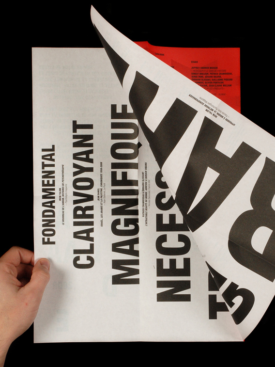
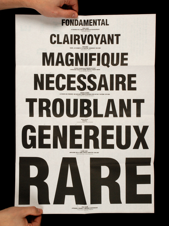
Éditions Galaade book fair brochure
Contributed by Tânia Raposo on Aug 3rd, 2013. Artwork published in
.

Source: www.heyho.fr License: All Rights Reserved.

Source: www.heyho.fr License: All Rights Reserved.
Source: www.heyho.fr License: All Rights Reserved.
Source: www.heyho.fr License: All Rights Reserved.


")
")


")


2 Comments on “Éditions Galaade book fair brochure”
This is not Akzidenz-Grotesk. If I’m not mistaken it’s Europa Grotesk Condensed.
Actually, after a close examination I think it’s just Helvetica Condensed Black, which is very similar to Europa Grotesk SH Bold Cond, but much more common and matches the contrast of these strokes. But thanks for correcting us on AG!