
Lamas Destilaria
From Gabriel Figueiredo:
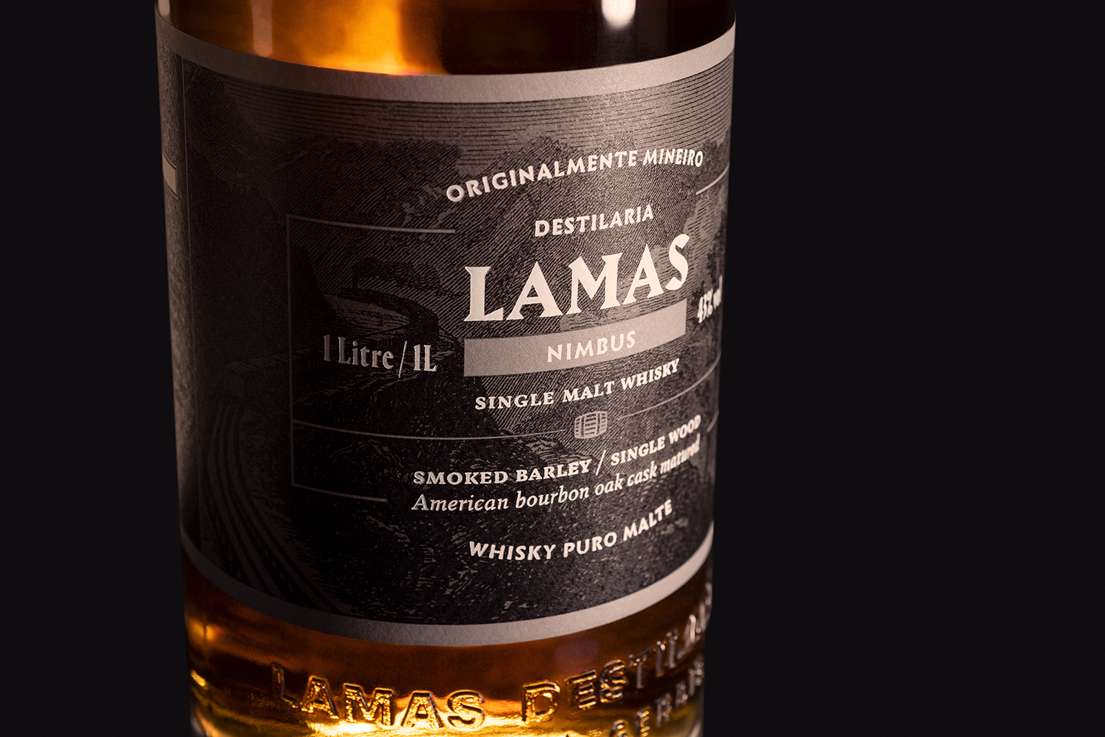
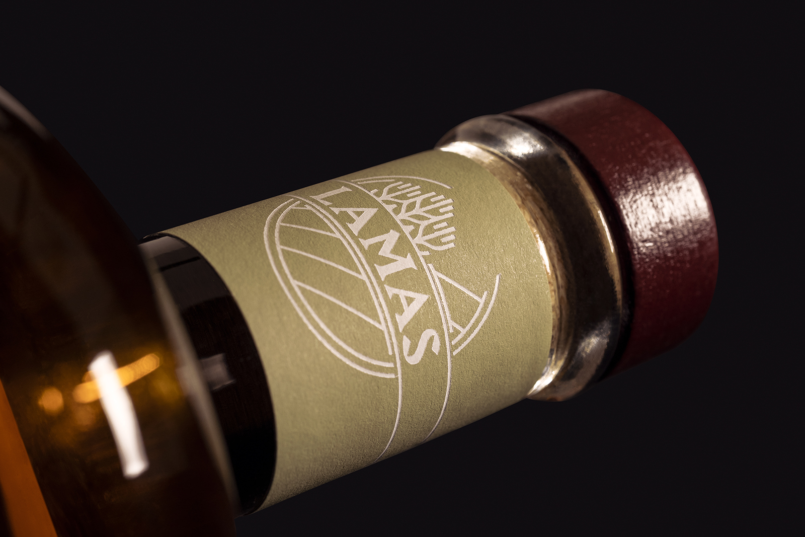
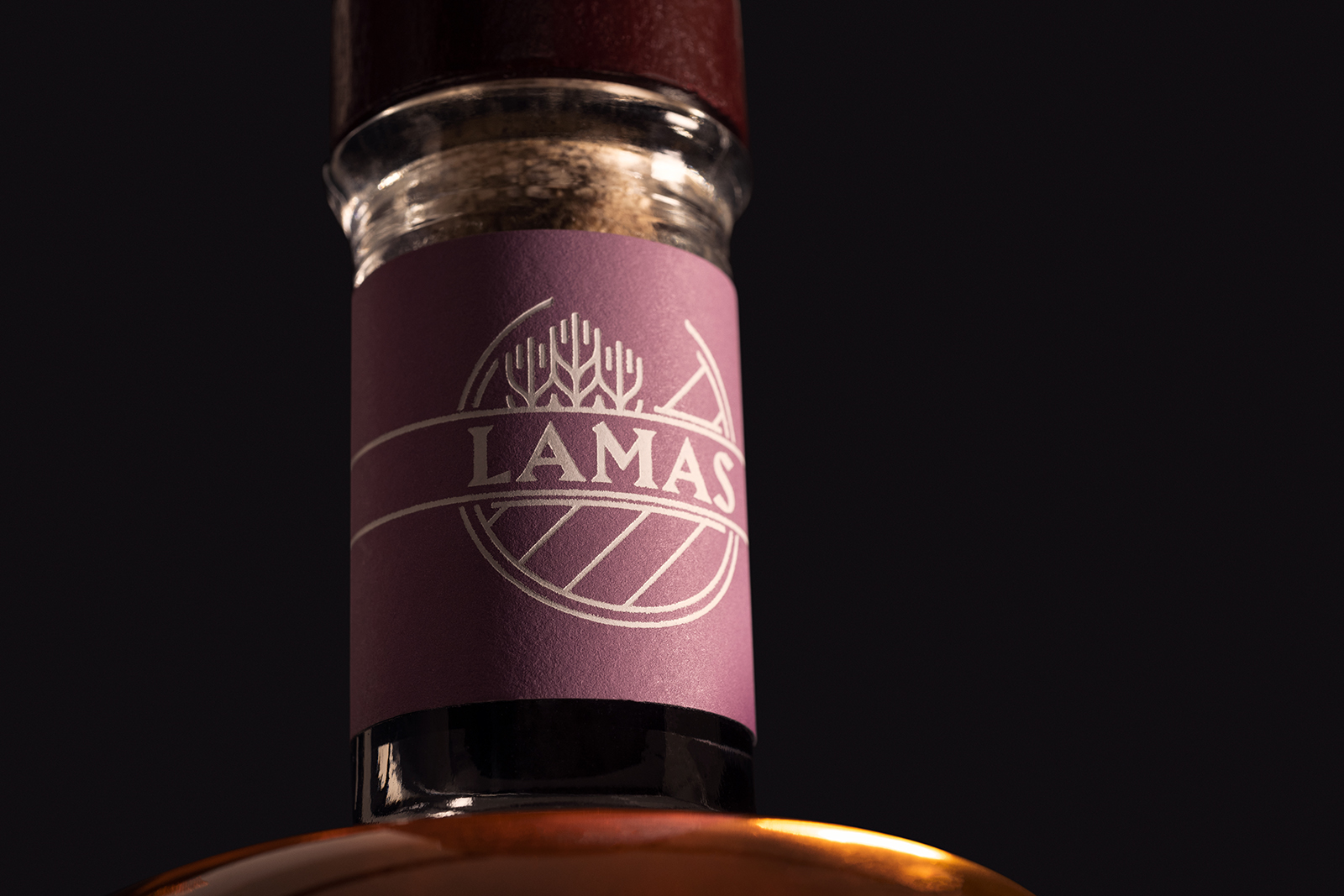
Printed in pantone, the labels use engravings printed in black and gray, as a background, in order to guarantee them a sober and elegant look. Each label, in turn, has a characteristic color, present with greater emphasis on the bottleneck, as a way of guaranteeing them a greater ease of distinction in shelves or boxes. On the pantone, the information is engraved with a white hotstamp, which gives a subtle and sophisticated highlight to the typography on the label.
To accompany the logo’s triangular serifs and prominent corners, fonts with similar characteristics were chosen to compose the complex hierarchy of information present on the label. Infini, a sans serif inspired by letters carved in stone, was used for the brand positioning titles, while Fazeta, with its very complete family that includes small caps, italics, different optical weights and sizes, was used for the whiskey’s technical information. Finally, Portrait Condensed was used for information with the minimum height required by law.
Alias Harbour is used for the logotype.


 movie posters and DVD cover")


")


