
Le Bateleur wine and vinegar
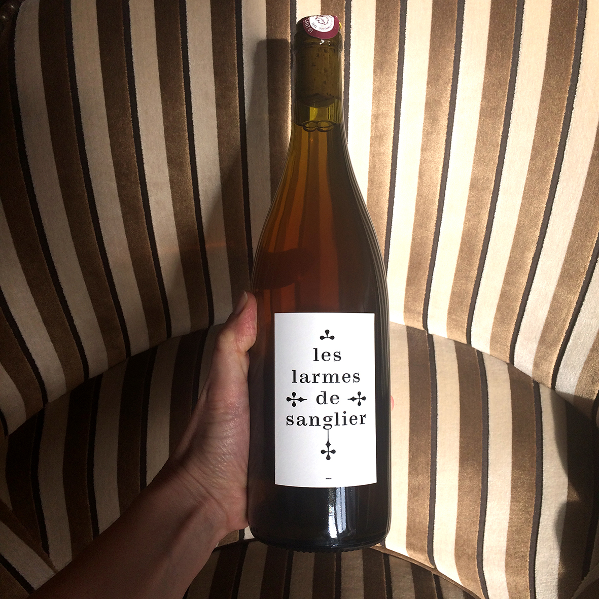
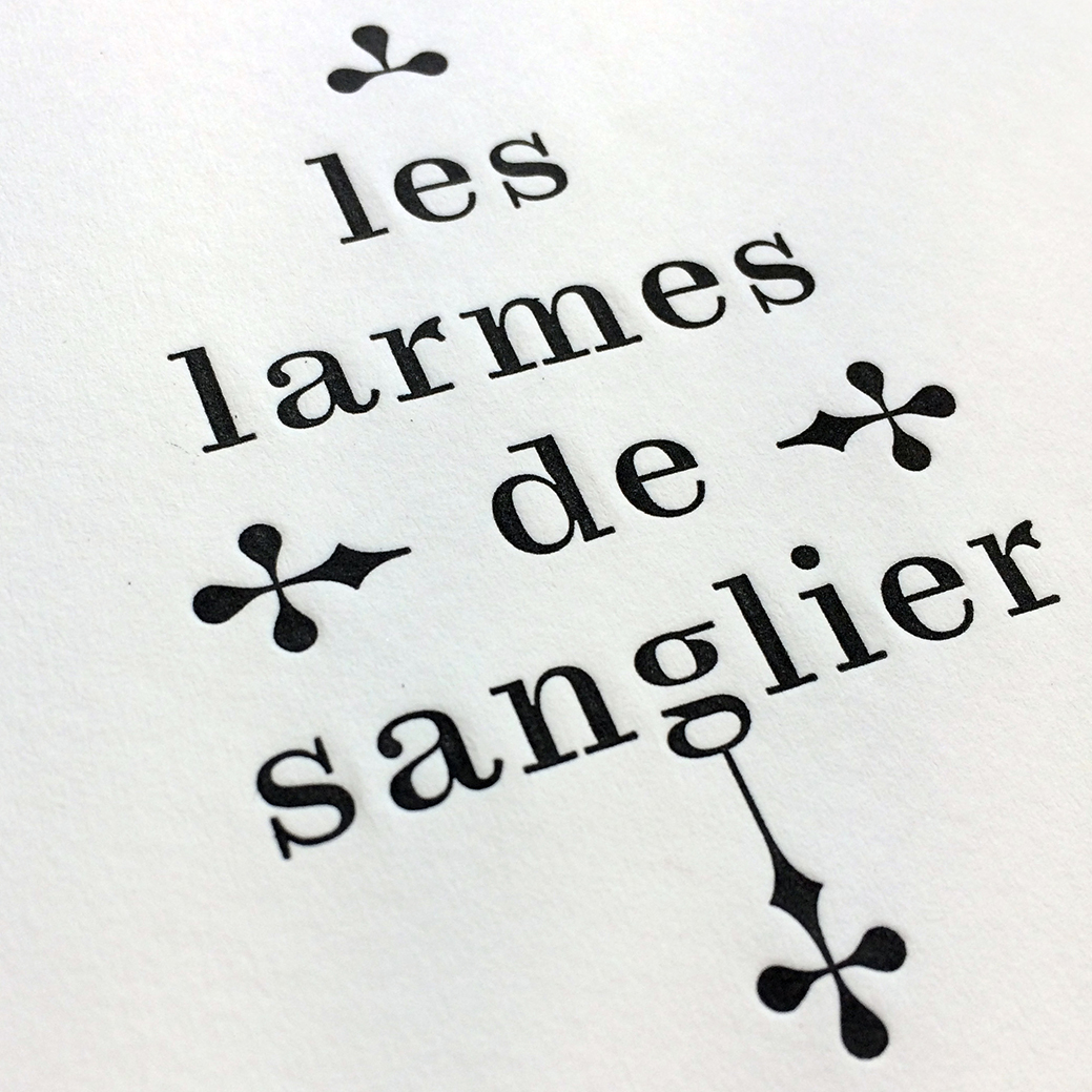
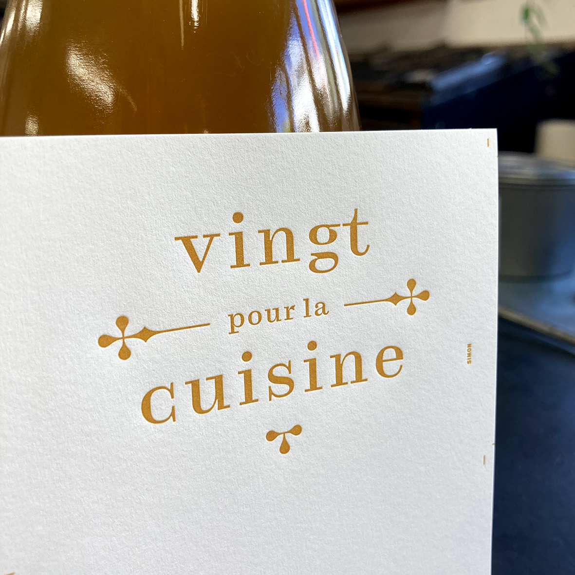
Domaine Le Bateleur is the vineyard of Gilles Azzoni, a winemaker in the Vallée du Rhône, France. He produces an organic wine named Les larmes de sanglier (“the boar’s tears”) and a vinegar titled Vingt pour la cuisine (“Twenty for the kitchen”). The labels were letterpress printed by La Petite Frappe, with beautiful rich black ink and slight debossing of the paper.
The chosen typeface is Petite Mort. It was drawn by Yoann Minet in 2017, as an offshoot of his Totentanz, optimized for small sizes. Designed for the tenth issue of La Perruque, the font was made available to the magazine’s subscribers for a limited time only. Petite Mort has a certain solemnity that made it a perfect match for this project. In order not to slide from the solemn to the ceremonial, I used it exclusively in lowercase letters. Thanks to the airy spacing, it lets the white flow particularly well, while bringing a more intimate feel to the whole. A graphic counterpoint is added by a typographic ornament in the form of a dagger, which shares the didone-like formal characteristics. Depending on the viewer’s imagination, it will evoke tears, grapes, or the marvelous silhouettes of medieval grave markers.


")


")


