Obodo logo, app and website
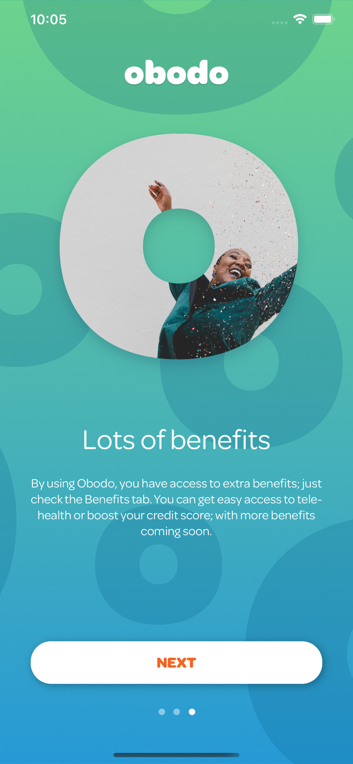
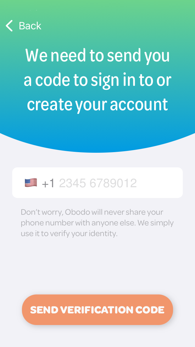
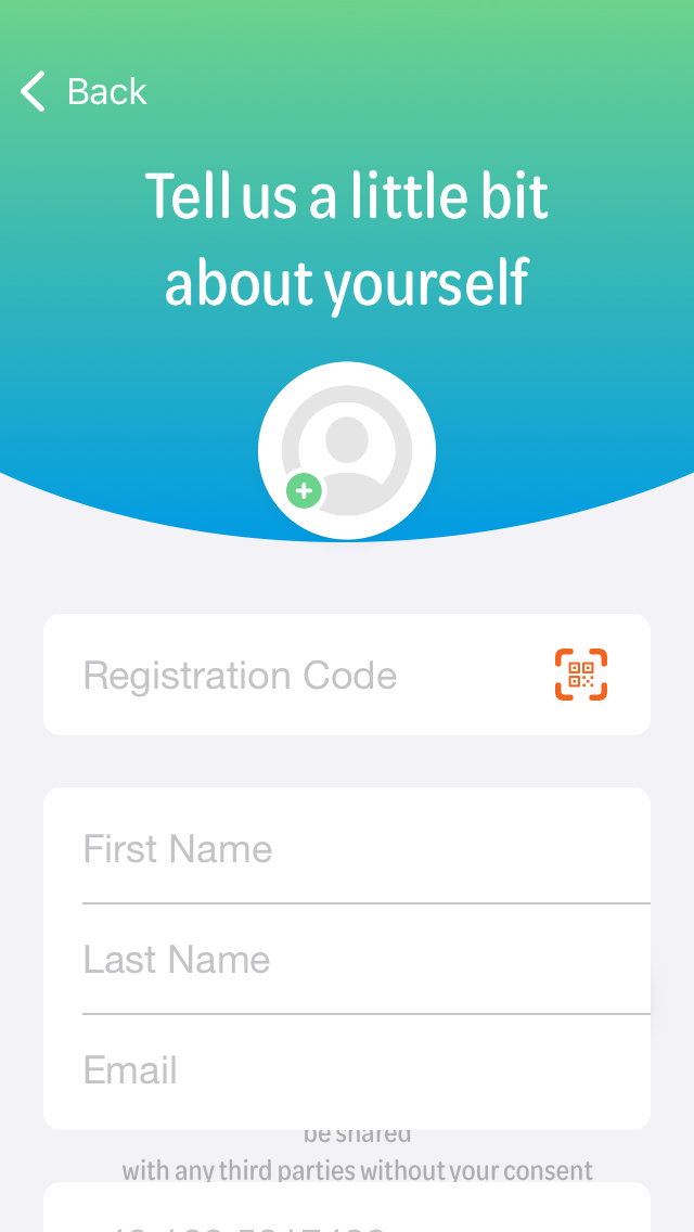
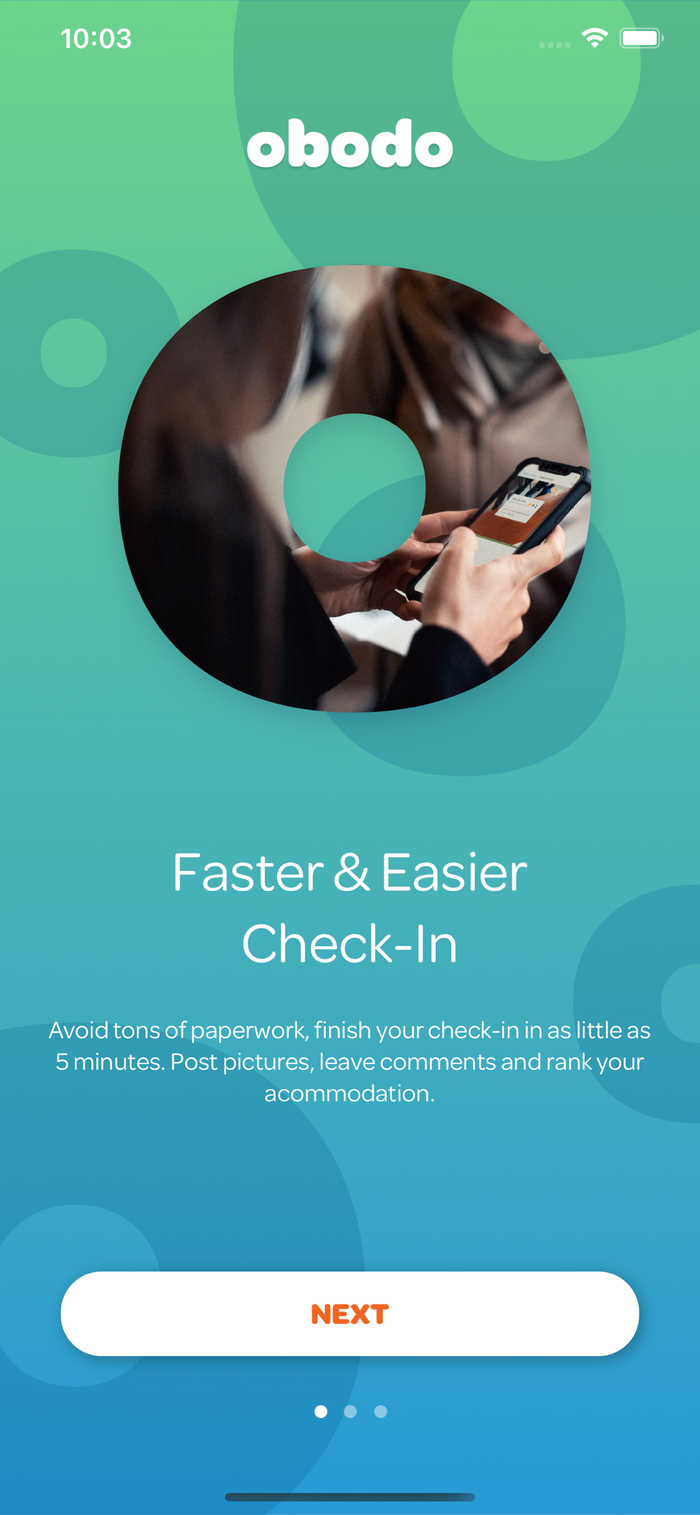
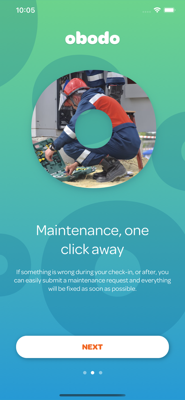
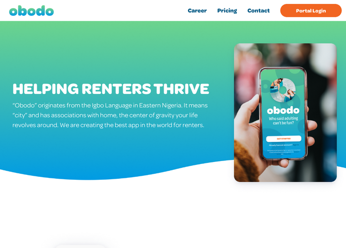
Omnes is the brand typeface of Obodo. Launched in 2022, the Obodo app connects renters with their property managers and facilitates things like check-in and maintenance.
The rounded sans by Darden Studio is used throughout the identity, from the logo in lowercase Omnes Black – with a flipped “fingernail” terminal in d for perfect symmetry – to the app and the website.
For the app interface, Obodo makes use of both the regular and the condensed widths of Omnes. The compactness of the latter allows them to present slogans and calls to action at a larger type size even when screen estate is limited. Originally released in a single Standard width, the Omnes family was enhanced with three narrower subfamilies (SemiCondensed, Condensed, Narrow) exactly for situations like this.
In addition to the two widths, Obodo taps into the wide range of weights offered by the Omnes family, in order to add more typographic nuance to the user interface. The extrabold letter o from the logo features as a decorative brand element, too, and serves as a container for photographic images.
Typefaces
Formats
- Web (3284)
- Branding/Identity (4744)
- Mobile (308)
Topics
- Services (844)
- Home/Interior (536)
- Travel (532)
Designers/Agencies
- Blankenship Workshop (1)
- Obodo (1)
Tagged with
- apps (101)
- iOS apps (45)
- vacation rental (11)
- identities (812)
- logos (2686)
- gradients (461)
- green and blue (74)
- modified typeface (1141)
- symmetry (19)
- user interfaces (UI design) (161)
- single glyphs (245)
- type with image fill (105)
- buttons (UI) (67)
- one typeface family (1077)
- multiple widths (293)
- multiple weights (232)
- type as pattern/ornament (129)
- center-aligned text (1163)
- websites (1348)
- menus (UI) (158)
- reversed type (1938)
- all lowercase logos (147)
Artwork location
- United States (6351)
- California (152)
- Greenville (2)
- South Carolina (7)


