
Dia Fall Gala
Dia Art Foundation is a contemporary arts organization that supports and exhibits amazing artwork both in its massive Beacon, NY location and at sites around the country.
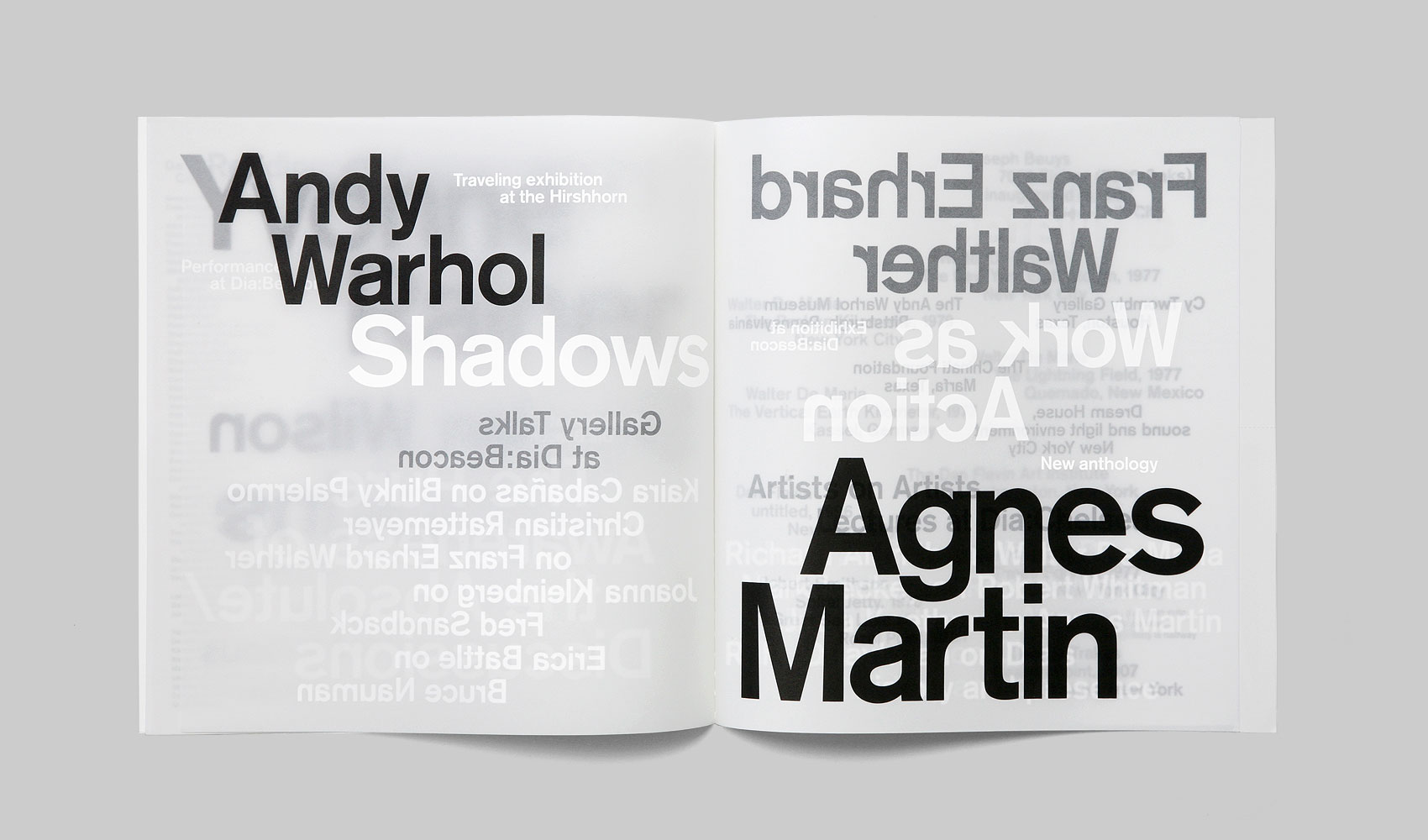
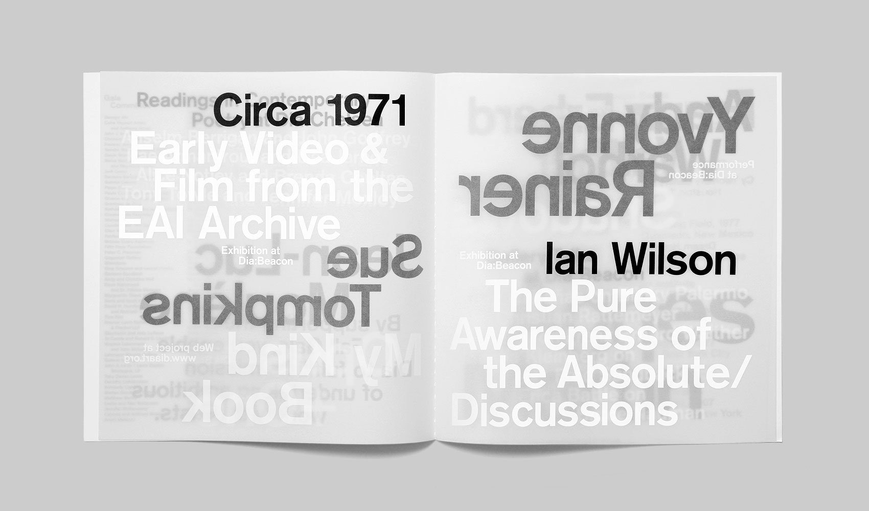
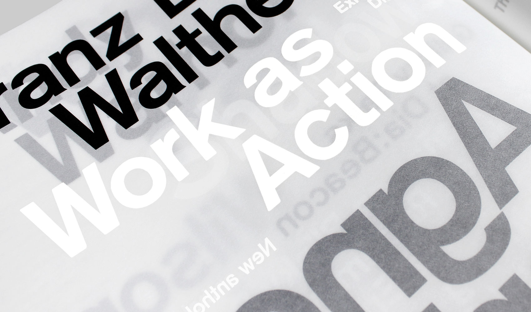
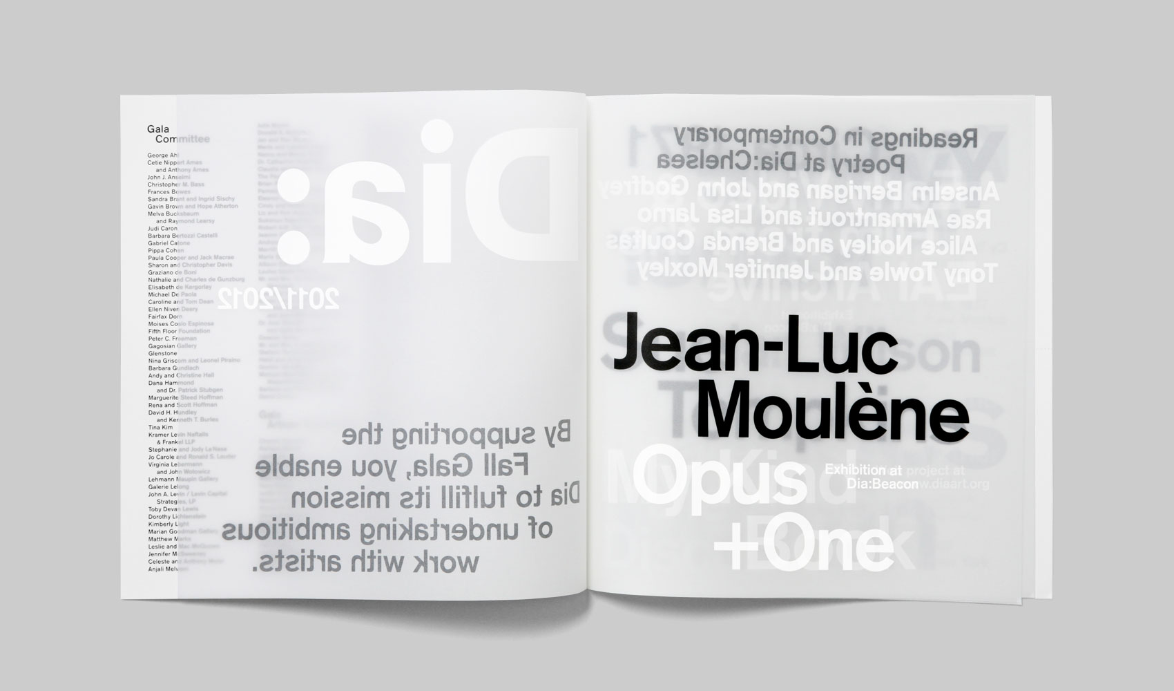
We were asked to create a publication which would track the future projects of the organization over the coming year. Dia in Greek means “through,” so we imagined a format where one could literally see through time to view upcoming events and exhibitions. This lead to a publication that was printed on translucent vellum, with a combination of white and black opaque text silkscreened onto the paper. As you flip through the future (represented through type only) goes from being hazy to focused and sharp.
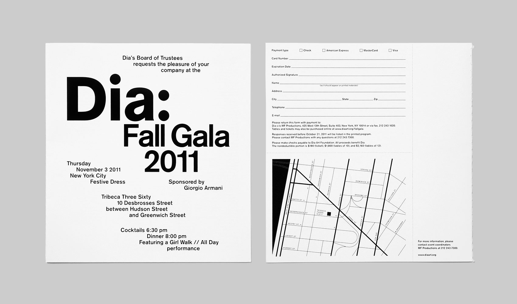
Akzidenz-Grotesk was chosen because it was the established corporate typeface for Dia. As a studio we have always been fans of “jogged” type. Centered type often feels too traditional, flush left can often come off as a little bit anal, but jogging type randomizes the structure of messages just enough to imbue them with an unpredictable free-spirited energy.


")


1 Comment on “Dia Fall Gala”
Beautiful