
David Carr Glover’s It’s Time for Boogie Woogie
Contributed by Bryson Stohr on Jul 22nd, 2022. Artwork published in
.
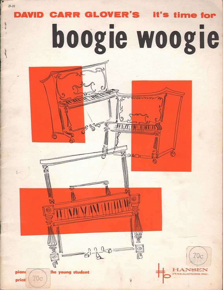
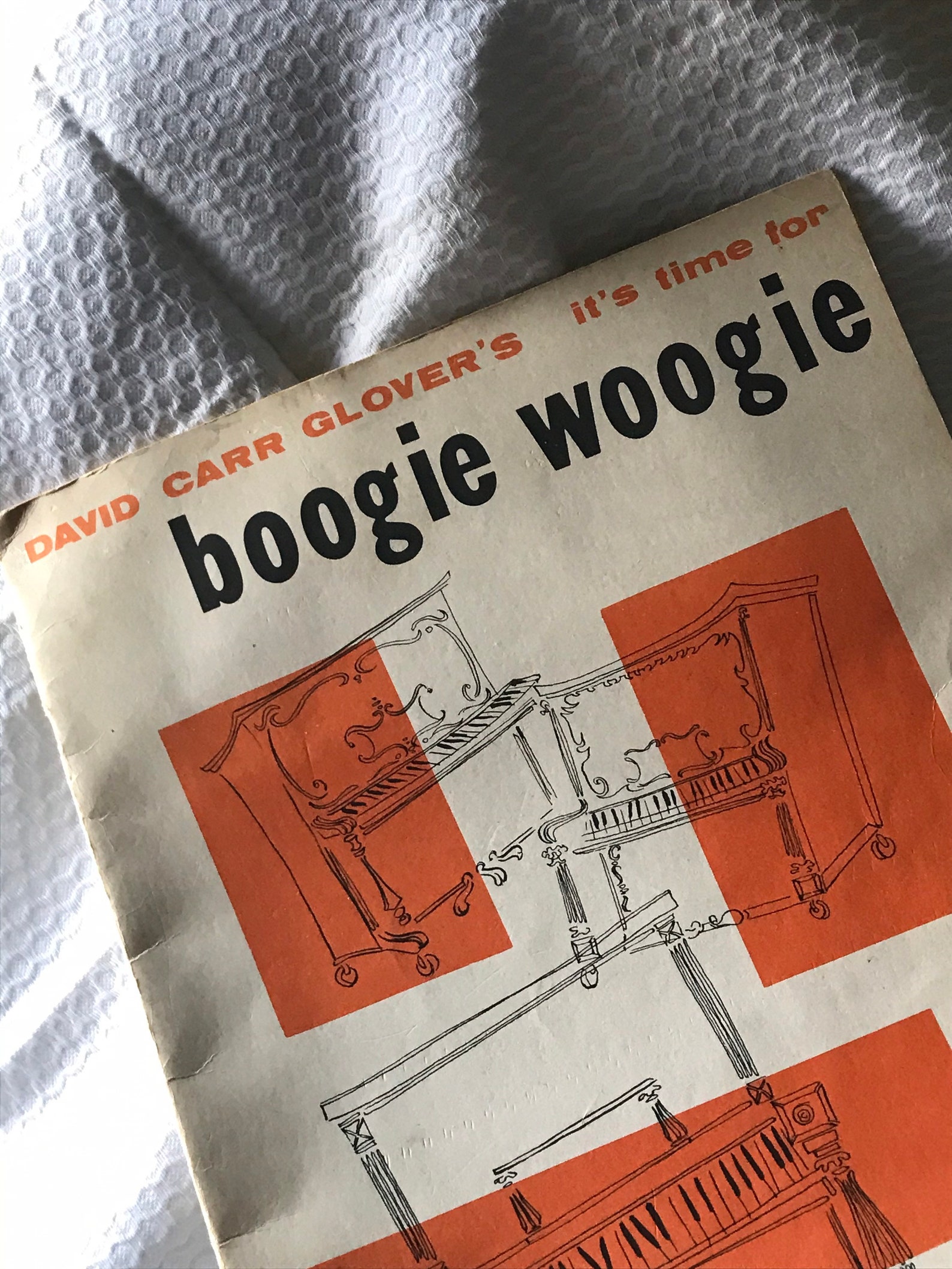
Cover for a booklet with sheet music by David Carr Glover (1925–1988), published by Hansen in 1956.
The top line uses Annonce / Aurora-Grotesk V, easily distinguishable here by its bearded G and r with a downwards descender. It’s paired with what looks like Tourist Gothic for “boogie woogie”. “Piano solos for the young students” is set in Tempo Heavy.
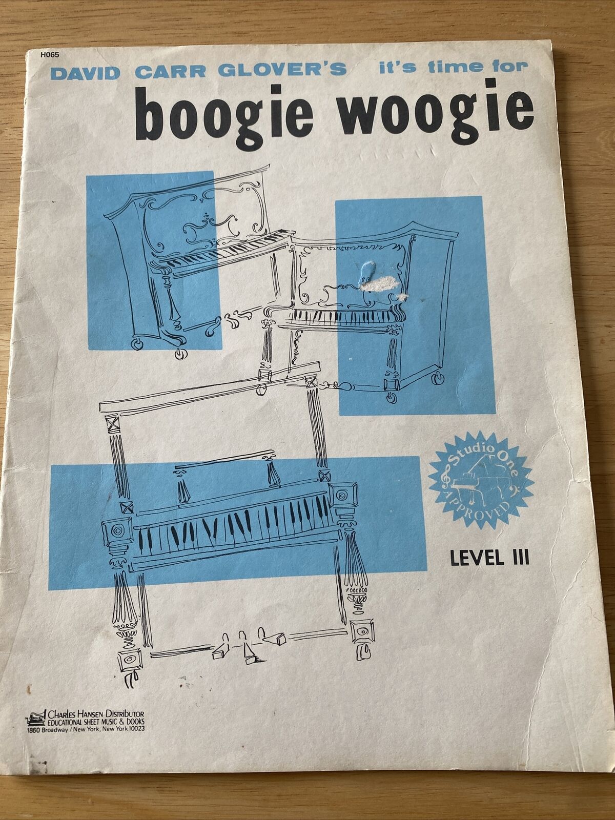
There was also a Level III edition for advanced students, printed in blue instead of red.


")


")
")


")

 movie logo and opening credits")


")


