
Ben Barry Design Portfolio
Contributed by Stephen Coles on Oct 4th, 2013. Artwork published in
.

Source: designforfun.com License: All Rights Reserved.
Ben Barry is a designer at Facebook. His portfolio site is typographically simple, but there was clearly thought put into the judicious selection of Alright Sans’ many weights to suit each level of content. Thin and Medium for large intro text, Light and Regular for secondary text, and Medium for the extra small all-caps labels and navigation.
Source: designforfun.com License: All Rights Reserved.
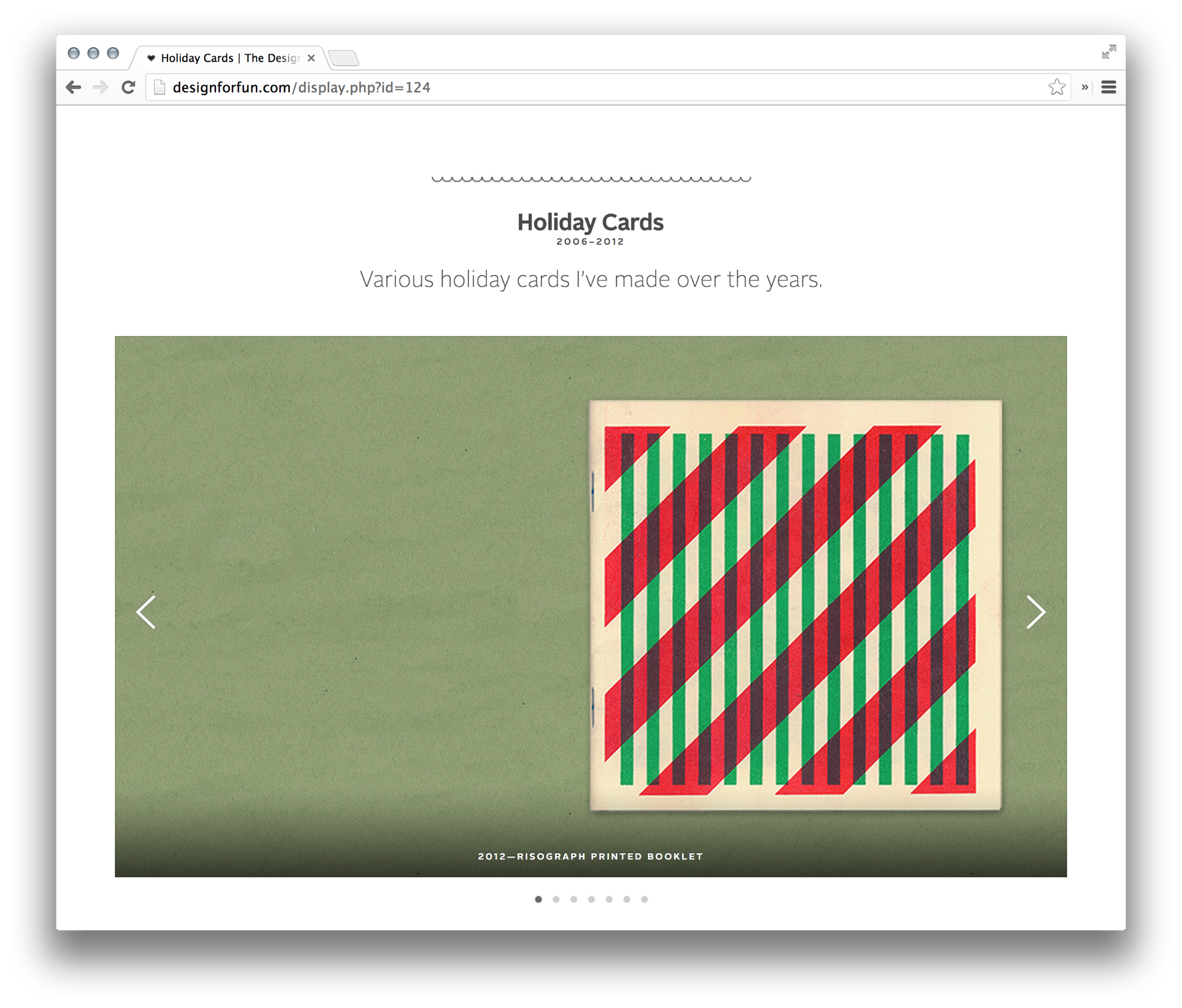
Source: designforfun.com License: All Rights Reserved.

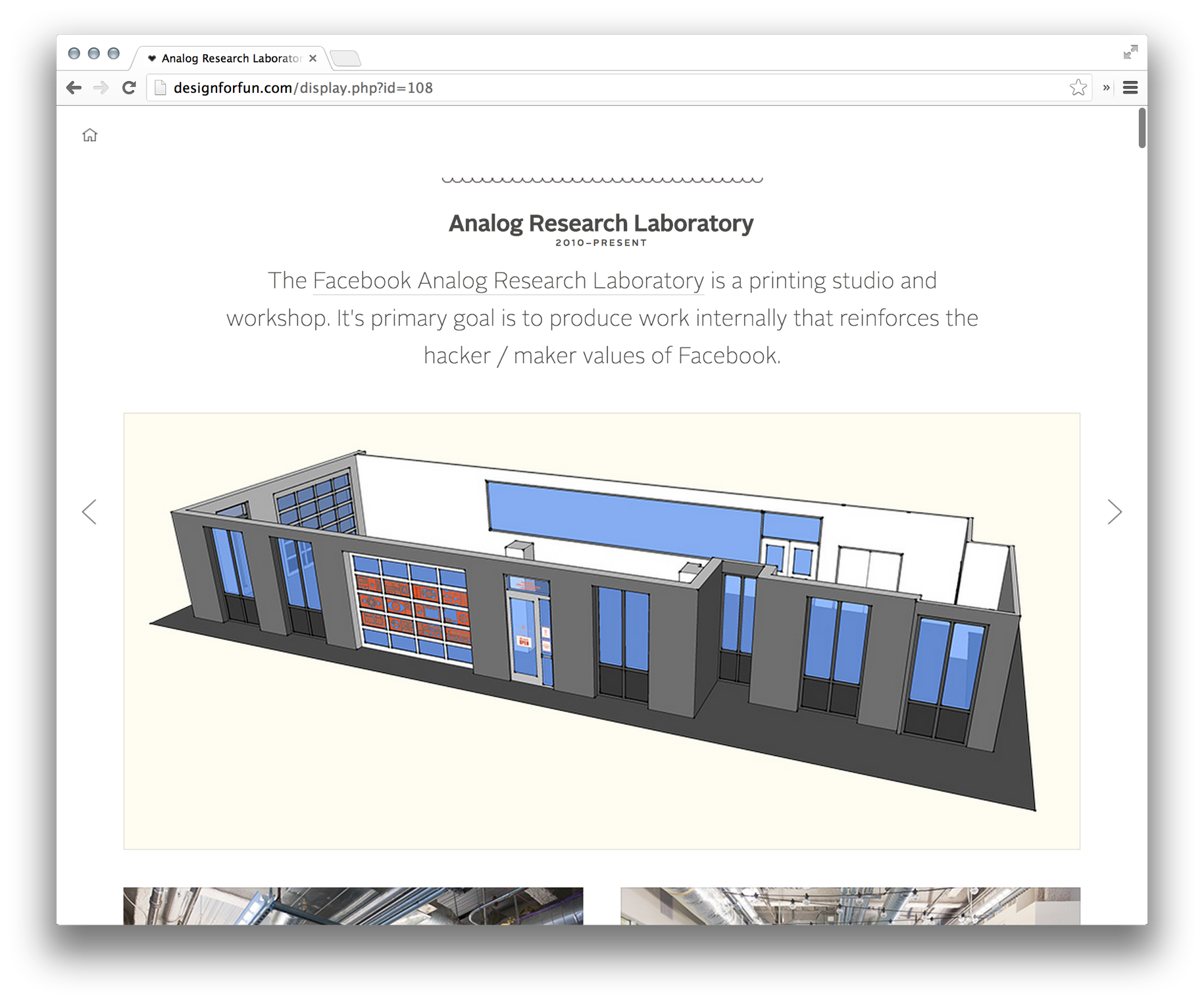
Source: designforfun.com License: All Rights Reserved.
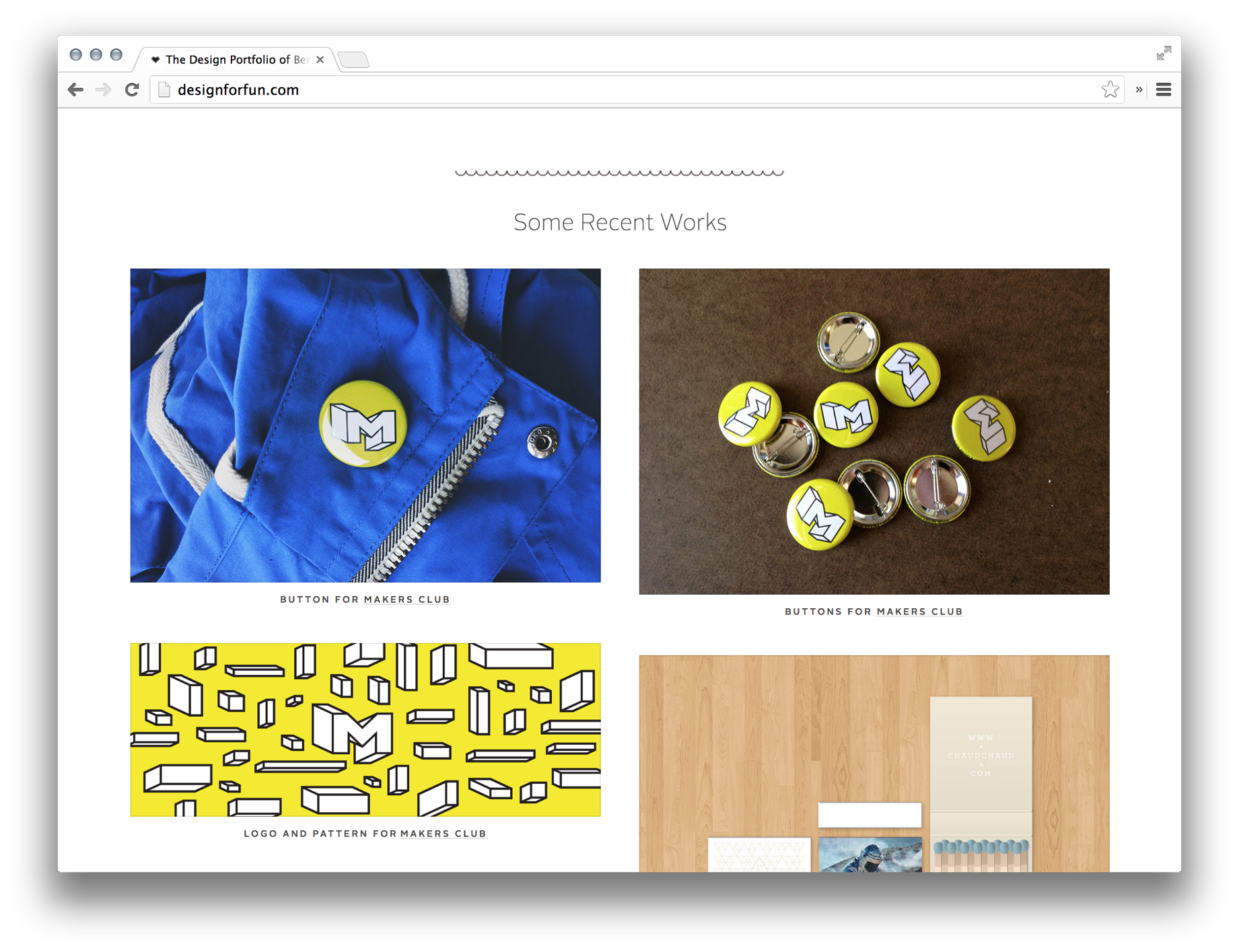
While the main intro text on all pages is set in Alright Sans Thin, secondary texts like this two-column chunk move up to the slightly heavier Light weight to maintain readability with the smaller type. The headline is in Regular.
License: All Rights Reserved.


")


