De Kreeft Door Sign Photo(s) by Pool Albert-Jan. Imported from Flickr on Oct 15, 2013. Like2Add to Set Source: www.flickr.com Uploaded to Flickr by Pool Albert-Jan and tagged with “trinité”. License: All Rights Reserved. 
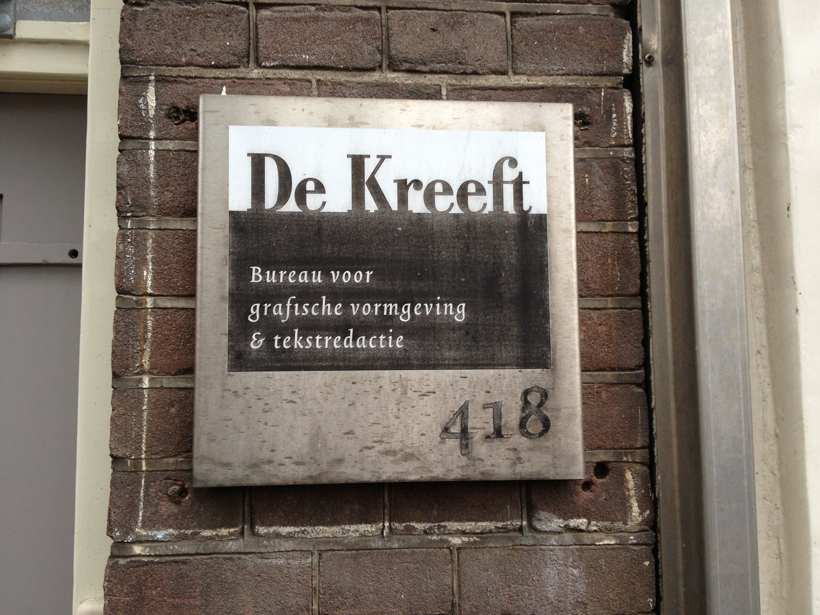
Door sign at Lex Peeter’s agency De Kreeft. Bodoni combined with Trinité, probably the most beautiful Dutch typeface ever made. Typefaces More about TrinitéGet Trinité More about BodoniGet Bodoni Formats Signs (1382) Topics Graphic Design (2155) Designers/Agencies De Kreeft (1) Tagged withdesign studios/agencies (266)editorial (19)door signs (1)signs (316)address numbers (27)numerals (566) Artwork location Netherlands (762) Amsterdam (277) 1 Comment on “De Kreeft Door Sign” Florian Hardwig says: Oct 16th, 2013 9:14 am Yes, white on black needs a little more space. However, here they have tracked the hell out of Trinité. Post a comment Name Email – will not be published Website Your response Submit Comment More Trinité in use Helmut Salden, lettertekenaar en boekverzorger exhibition2018CatapultAnke BroerenContributed by Matthijs Sluiter Staff Pick More about BrasilGet BrasilMore about TrinitéGet TrinitéMore about FaktGet Fakt Museum de Gevangenpoort 33Photo(s) by Florian Hardwig on Flickr.More about TrinitéGet Trinité Erasmusbrug Lettering1990Ben van BerkelContributed by Florian HardwigMore about TrinitéGet Trinité Sponsor More in Graphic Design Tim Brown, organized.2015Tim BrownContributed by Florian HardwigMore about MalloryGet MalloryMore about Adobe CaslonGet Adobe CaslonMore about VorticeGet Vortice Civilla redesign2021Jesse ReedOrderCivillaContributed by Jamie Otelsberg (OH no Type Co.)More about DegularGet DegularMore about Work SansGet Work Sans Eye magazine, Issue 99 vol. 25, 20192019Esterson AssociatesSimon EstersonHolly CatfordContributed by Sharp Type Staff Pick More about DoyleGet Doyle Swiss Pencil PackagingContributed by Indra Kupferschmid Staff Pick More about HelveticaGet Helvetica More in Signs Minneapolis Institute of Artidentity 20162016PentagramMichael BierutEmily ObermanContributed by Love Lagerkvist Staff Pick More about Post GroteskGet Post Grotesk Five Boroughs Brewing Co.c. 2017Studio No. 9Contributed by Fonts In Use StaffMore about PDUGet PDUMore about HelsinkiGet Helsinki Magasins Généraux window signs2016Building ParisAlaric GarnierT&P Work UNitContributed by Production Type Staff Pick More about MarsGet Mars Saarbrücker Wintermärchenwald2015Photo(s) by Michael Studt on Flickr.More about VivaldiGet Vivaldi More Fonts In Use Klaus exhibition, Yeo Workshop2016Melvin TanGideon Kong Wen DaCurrencyContributed by Production Type Staff Pick More about Minotaur SansGet Minotaur SansMore about Minotaur BeefGet Minotaur BeefMore about MinotaurGet Minotaur Heath Ceramics Website2012MethodAOE MediaContributed by Stephen Coles Staff Pick More about Benton SansGet Benton SansMore about GothamGet GothamMore about Monotype GrotesqueGet Monotype Grotesque Volksbühne Berlin season magazine 2013/20142013LSDLeonard NeumannLenore BlievernichtContributed by Florian Hardwig Staff Pick More about TannenbergGet TannenbergMore about National (Ludwig & Mayer)Get National (Ludwig & Mayer)More about PotsdamGet Potsdam NBA identity (2017–)2017Siegel+GaleThe Original Champions of DesignElizabeth Carey SmithContributed by Garrison Martin Staff Pick More about Action CondensedGet Action Condensed
1 Comment on “De Kreeft Door Sign”
Yes, white on black needs a little more space. However, here they have tracked the hell out of Trinité.