

Great Earth was started more than 35 years ago with the vision of a better world for both people and the planet. Their supplements are certified according to the industry’s guidelines for safe vitamins and minerals. Developed with a focus on being powerful, with ingredients of the absolute highest quality, to support your needs through all phases of life.
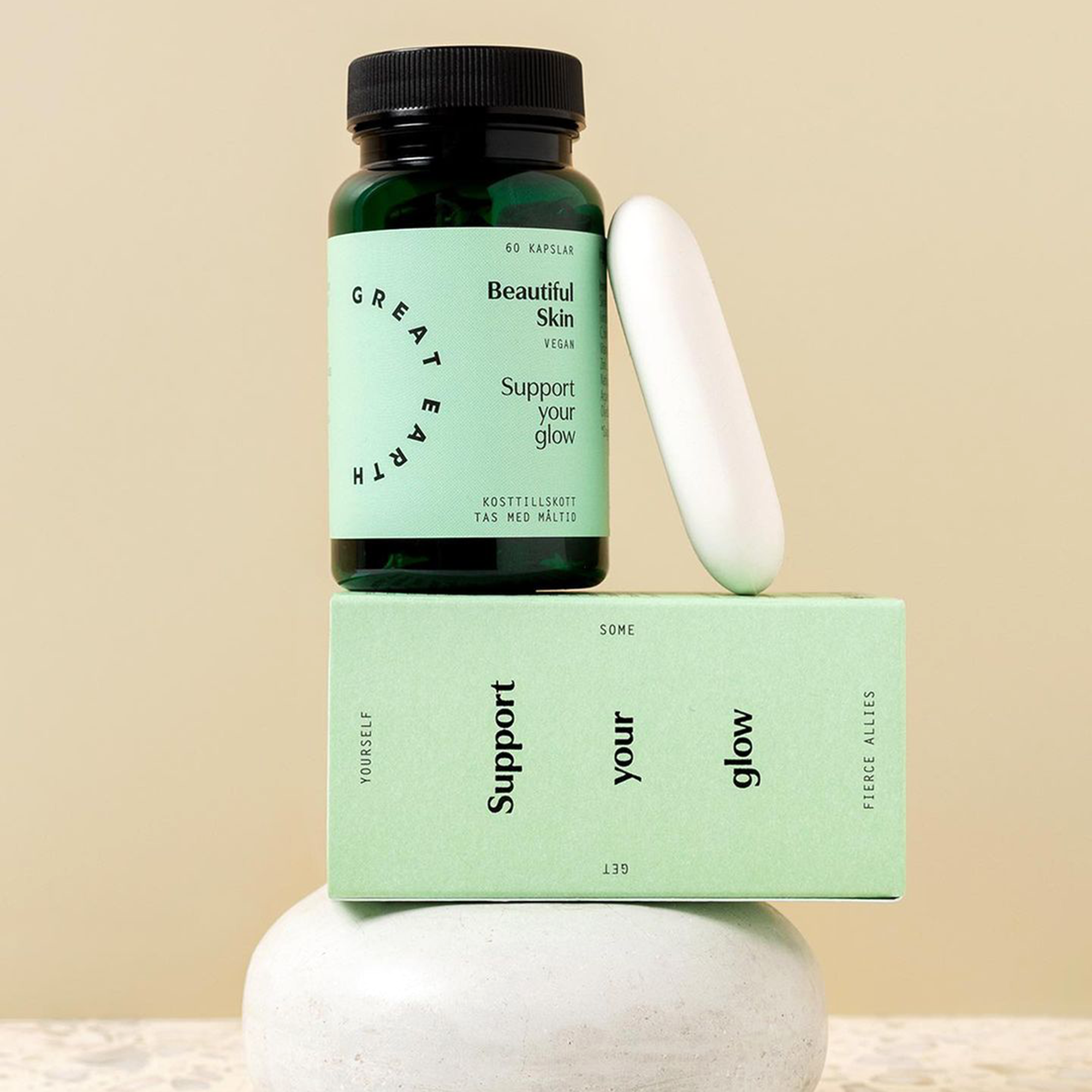
Together with Studio Ca/Bom, Art Director and in-house designer Nenne Ouma selected the Utile Display typeface family as part of a new and fresh branding system that embraces the vision of a healthy person in balance.
Utile Display is a modulated sans that pays tribute to the contrast of thick and thin, feeling right at home in title compositions with tighter letter spacing and re-proportioned designs. The contrasted sans promotes a timeless elegance and lively aesthetic that comes especially to light in larger sizes.
Utile and Utile Narrow are part of the larger-scale typeface family Utile.


")


