An independent archive of typography.
to participate.
Topics
Formats
Typefaces

tegut…

Good groceries deserve good typography.

Contributed by Indra Kupferschmid on Jun 7th, 2011.

    When was the last time you got psyched by a supermarket visit? Type-wise? For me, it was on a recent field trip to my hometown.
    The small city of Fulda, right in the middle of Germany, is the headquarters of the family-run, mid-sized Tegut company (officially spelled “tegut…”, an abbreviation of founder Theo Gutberlet). With over 300 supermarket branches, a bakery, butcher, and caterer, the company is big enough to afford professional branding by a renowned design studio but still independent enough to care for local and organic production, sustainability, and being selective about quality.

    Tegut was not only a frequent stop in my youth, it was also the first client on my plate during an internship at a local ad agency in the early 1990s. Back then, they hired Erik Spiekermann’s former company MetaDesign to develop a corporate design and packaging for their retail brands. The design evolved around the exclusive typeface tegut-Sans (based on Spiekermann’s Officina Sans) which was put to use as the primary element in logos, display, printed matter, and packaging. The starkly typographic design was daringly straightforward for a grocer and probably far ahead of its time. For example, I remember the yogurt containers (big white letters on elegant dark green) had to be changed shortly after launch because customers demanded their pink strawberries on a strawberry yogurt.

    A Tegut weekly newspaper ad from 1994. This kind of ad is called “Schweinebauchanzeige” (pork belly ad) in German agency slang and usually one of the most unloved jobs. But, for a type lover, not in this case. Click to enlarge.

    Last year, though highly successful and still not dated, Tegut felt the desire to rethink their design. Again they put a Spieker-team in charge — now his new studio Edenspiekermann, who cautiously updated the look of the company and its subdivisions.

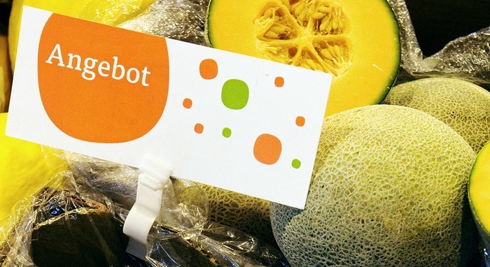
    “The house colour remains orange but all other elements of the corporate design have been carefully modernised and express the company philosophy: lively, meaningful, simple. The chief visual element is the superellipse […] it creates a cheerful and functional means of orientation and is a unique feature for Tegut” — Edenspiekermann

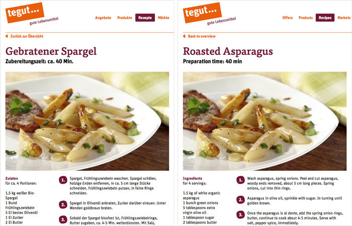
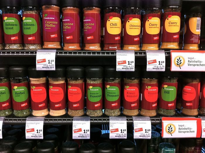
    And of course we find strong use of strong type again: the friendly FF Tisa by Mitja Miklavčič, accompanied by Erik Spiekermann’s own FF Unit Rounded, both instantly likable and approachable, yet striking enough to be the foundation of a complete packaging concept (designed by himbeerblau), for example. The two typefamilies are suitable for any substrate, big and small. Due to their open aperture and sturdiness they can withstand demanding production conditions like silkscreen printing of banners and signs and also work perfectly well on screen. The hand-hinted webfonts are used on the newly designed Tegut website and online shops.

    FF Tisa and FF Unit Rounded on tegut.com. The brand’s signature superellipse as a list item background image is a nice touch. With all text in HTML, using webfonts, the site content is resizable, selectable, and easy to edit. Right is the same page in English using Google Translate. Click to enlarge.

    This herzberger box is empty because I bought all the delicious hessian coarse rye bread.

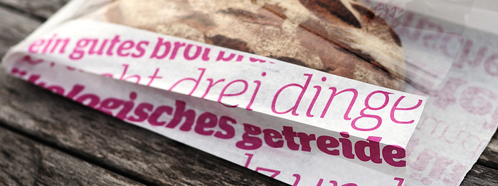
    The subbrand, herzberger bakery, is anchored by a bold use of Christian Schwartz’s typeface Stag in pink and brown. With beautiful big letters like these all over the bag it becomes hard to throw it away.


    Photographs by Tegut, Edenspiekermann, and Indra Kupferschmid (more here).

    Typefaces

    • FF Unit Rounded
    • FF Tisa

    Formats

    Topics

    In Sets

    7 Comments on “tegut…”

    1. Great type for a lovely redesign and system.

      The packaging system based on an irregular roundish shape reminds me of the system of my preferred supermarkets here in Italy (Coop); only, way way better executed - Coop packgings sport Trebuchet MS over shapes with awkward curves and shading.

      http://imageshack.us/photo/my-images/845/senzaolo1hz.jpg

      http://img854.imageshack.us/i/coop15836.jpg

    2. I like the irregular shapes. They give the brand flavor. Perfect circles (and other geometric shapes) can be sterile and might be more suited to more mechanical industries.

      The dark red works well on the packaging but I think it kind of fails when light red is contrasted. The type becomes somewhat lost. Also the white on yellow kind of fails in the same respect.

      The type chosen isn't bad but I don't think it's anything to get excited about either.

    3. Michael, the semi-optimal performance of the type on lighter red is primarily due to my less than semi-optimal mobile photography. Sorry about that, it’s not as bad in real life.

    4. Thanks for this great post. As I'm from Fulda I visit tegut quite regularly and I enjoy the well-executed design every time. Though I don't have an educational background in typography, I'm a sucker for good-looking type.

    5. Those floating biomorphic shapes call to mind Hans Arp.

      http://www.tate.org.uk/servlet/ViewWork?workid=591

    6. Lars Schwarz says:
      Jun 24th, 2011 3:48 am

      Regarding "Herzberger" (subbrand bakery): really like it - except for the heart... can't be spotted on Indra's photo above but here: http://www.herzberger-baeckerei.com

    7. erik spiekermann says:
      Dec 4th, 2011 1:51 pm

      That “irregular” shape is a mathematically well-defined superellipsis, first introduced to architecture by Danish architect Piet Hein in the early 50s. Today, Fritz Hansen make tables with that shape which is neither round nor square.

    Post a comment