
Slow & Low Navy Pier exhibition identity

Slow & Low co-founders and co-curators Lauren M. Pacheco and Peter Kepha brought design studio Span in to build upon their history and vision by designing the event’s visual identity, promotion materials, and supergraphic environmental signage. More than a car show, Slow & Low is a celebration of identity grounded in self-expression, social-change, master-craftsmanship and machinery. The opportunity to take over Chicago’s largest tourist destination came with a responsibility of placemaking. Together, we did so by celebrating the individuals of a community that mainstream cultures often overlook.
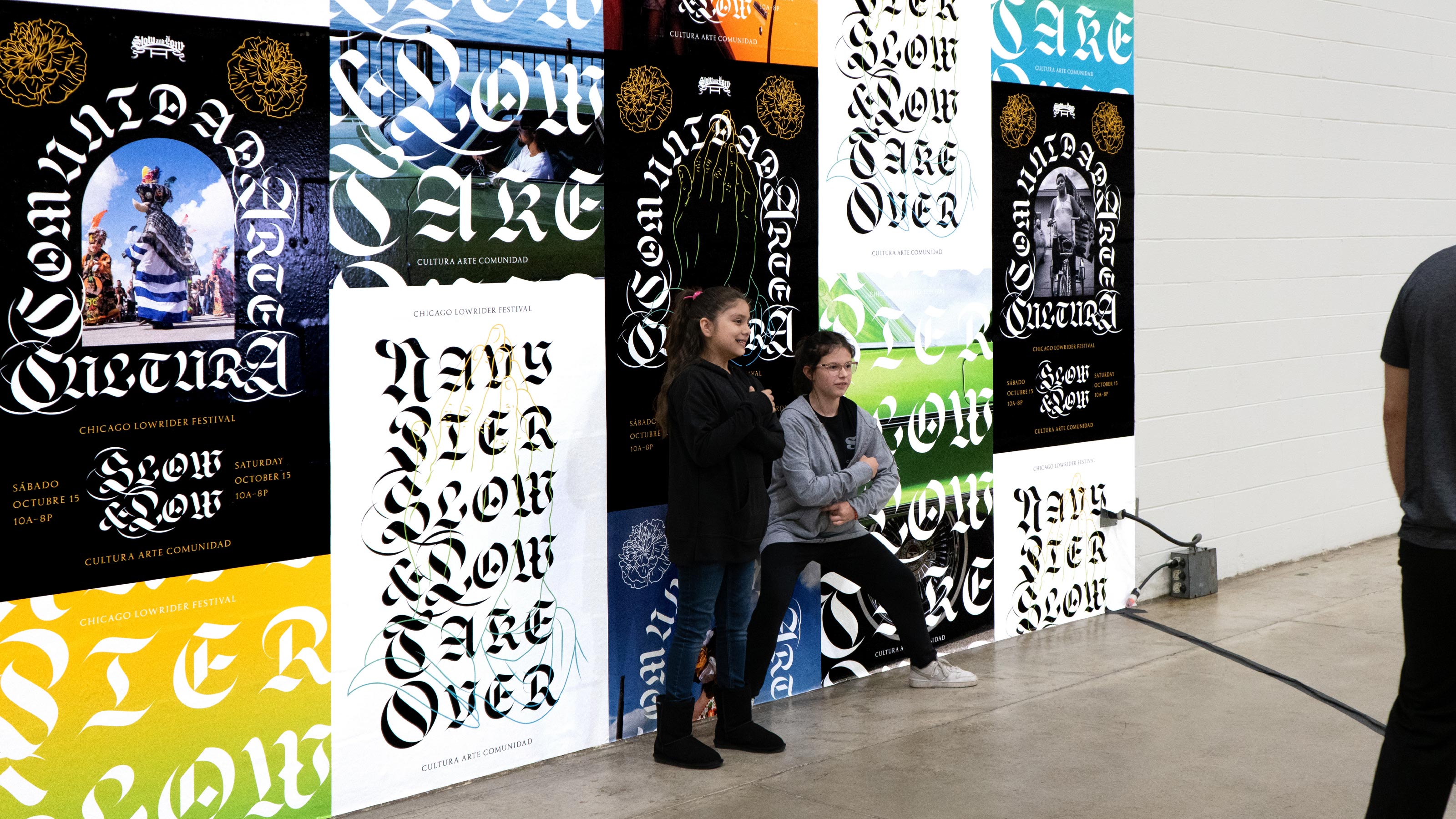
Typographically, the design system employs a highly expressive, showroom approach. Span assembled a suite of typefaces mirroring letterforms found on the eye-catching cars, the chromed plaques of the car clubs, and masthead of the classic Teen Angels publication. The star of the showroom is the swash capitals of Frida Medrano’s Jabin – a contemporary evolution of the Gutenberg bible’s blackletter. Jabin’s curves and contrast are paired with Sharp Type’s dramatic Respira Black, a reprisal of 15th century Spanish blackletter. The supportive type is Archivio Tipografico’s version of Aldo Novarese’s Nova Augustea. This over-the-top, eclectic range of type is united in flamboyant beauty and in holding key roles in history. These qualities – beauty and history – are principles in the artistry and aesthetic of Lowrider culture.
Beyond letterforms, symbolically, the design system embraces an omnipresence of arches, marigolds, and praying hands – religious iconography important to Pacheco and Kepha given their prominence throughout Chicano and lowrider culture symbolizing a celebration of faith, life, and death. The visual identity comes to life with purpose by featuring Slow & Low’s world-renowned and emerging photographers. The photography gave the design system power, by going beyond showing the stunning, lowrider cars and spotlighting the individuals in Chicago’s lowrider community.


")


")

