

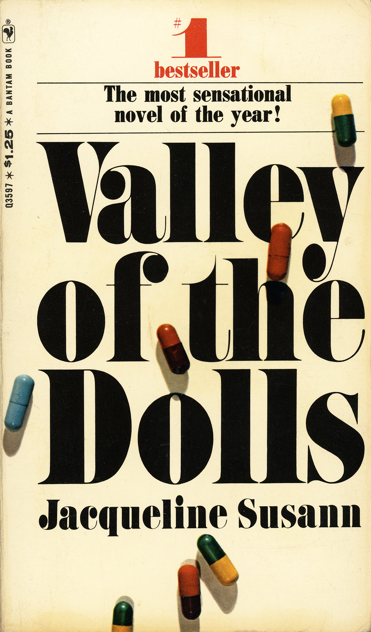
Valley of the Dolls, Bantam edition
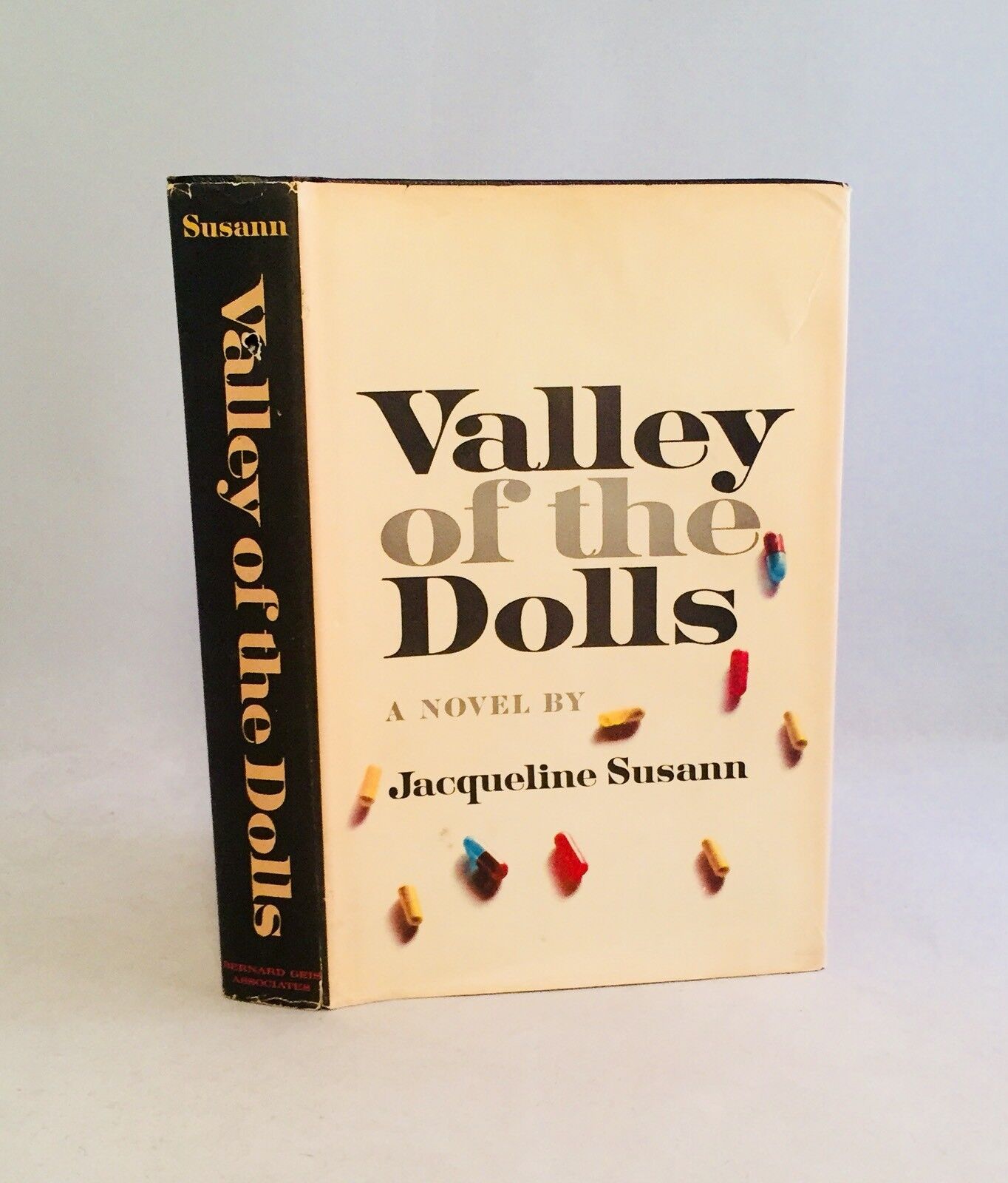
Bernard Geis Associates Inc. first edition jacket designed by Wladislaw Finne, 1966.
The Bantam paperback edition of Jacqueline Susann’s bestselling Valley of the Dolls took a cue from the first edition jacket with its evocative pills that cast shadows over the title. Yet the type in the paperback, while still in the fat face style, is much bigger, making the title as large as possible in the smaller softcover format. The type is bolder, too, filling up as much white space as possible, thanks to the extra heavy Benguiat Montage Condensed. For some reason, a very similar but different font was selected for the small type at top: Ultra Bodoni Condensed. Perhaps it was deemed to be slightly more readable at that size since its hairlines are slightly thicker than Montage’s.
The designer of this Bantam cover is uncredited, as was often the case with paperbacks.
When House Industries revived Ed Benguiat’s Photo-Lettering typeface in 2019, they asked him to record a promotional voiceover. Valley of the Dolls got a beauty shot and a mention.


")


")


")

")


")


</cite>")


