
Switch

Visual identity and website design for Switch, “the artificial intelligence platform that improves urban mobility through data.”
Excerpt from Carosello Lab’s website:
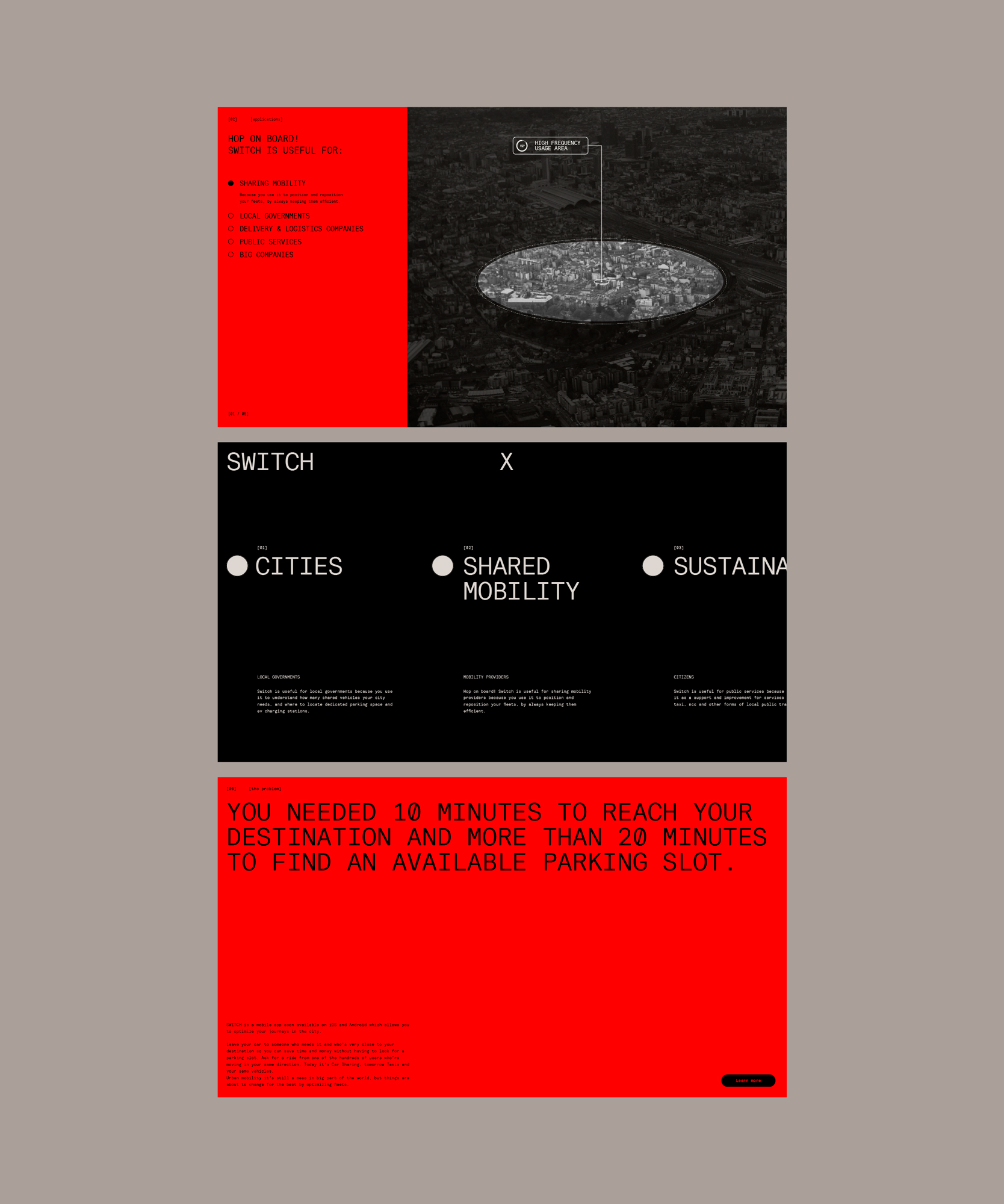
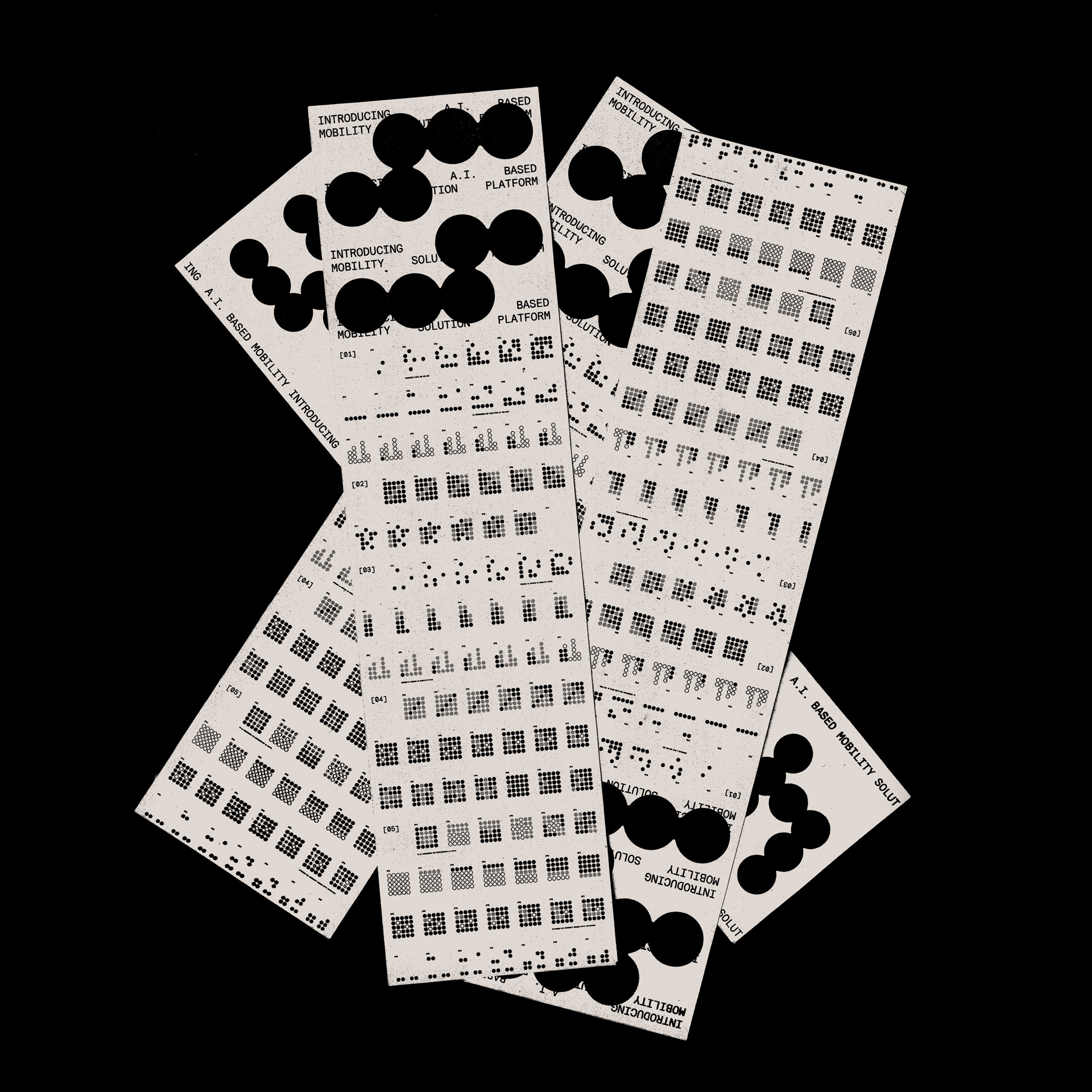
In September 2022 we faced a last minute challenge: to help the startup Switch creating a new visual identity to be presented 30 days later, in a funding event. We immediately aimed for a sleek, hyper contemporary tech look: minimal, geometrical but rich in small details.
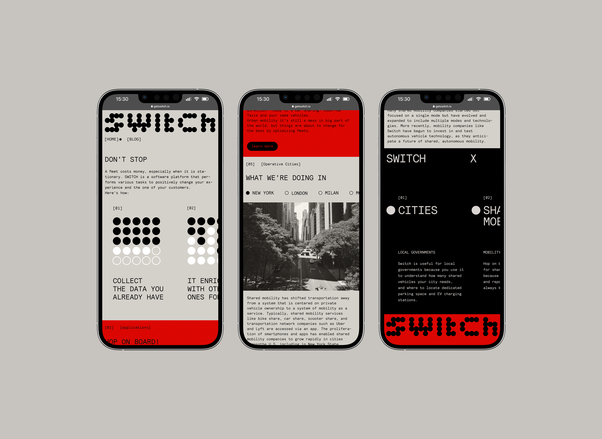
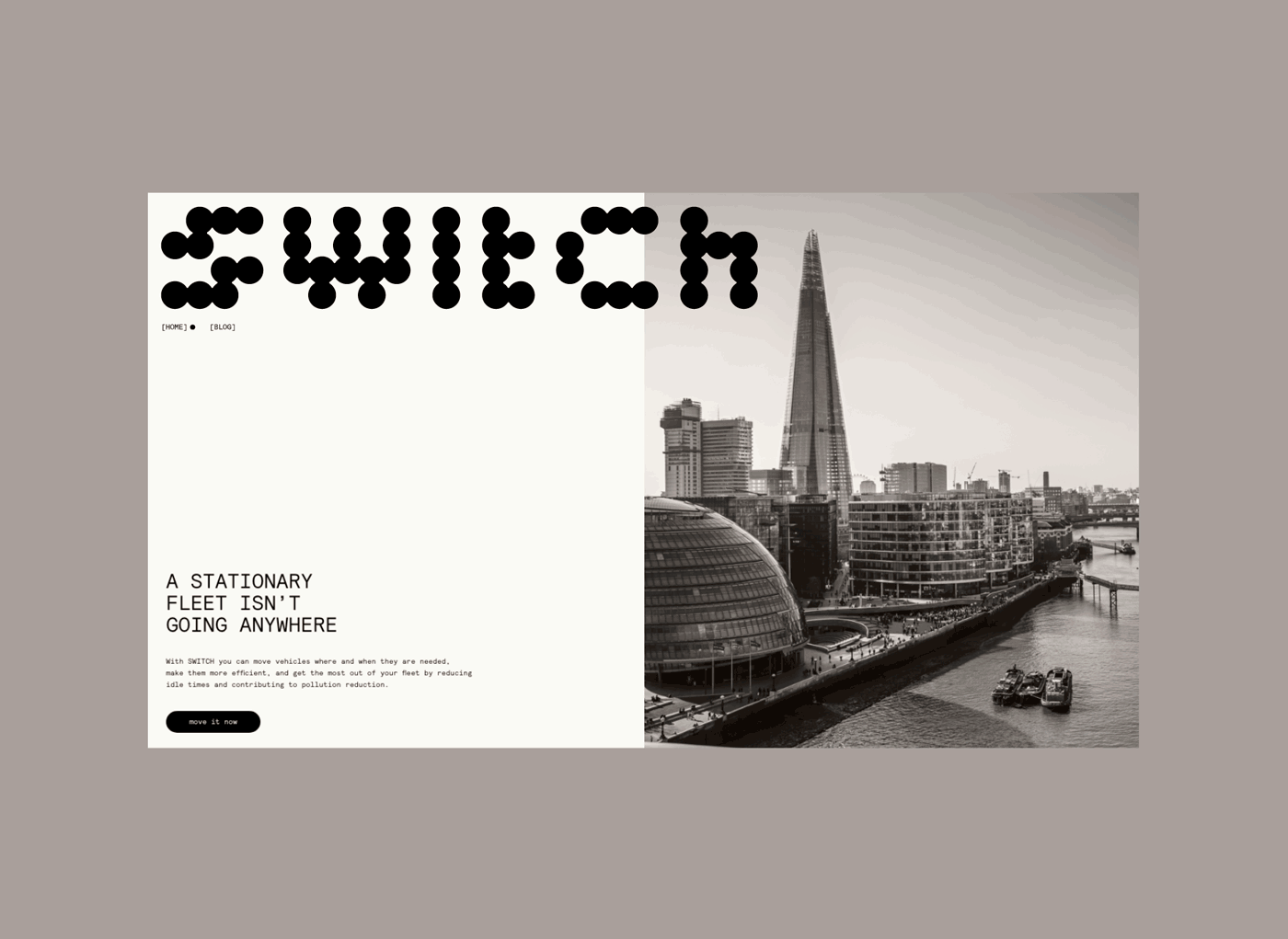
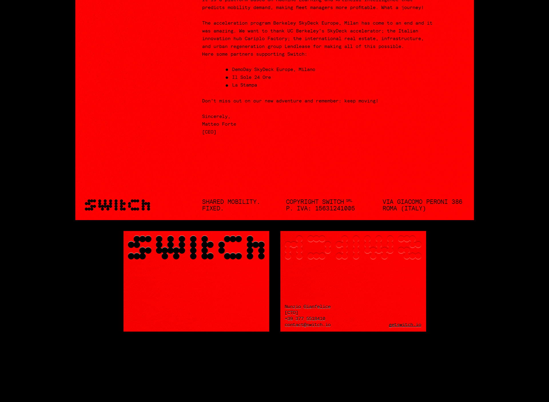
The logo takes inspiration from the circular areas that the company uses to delimit portions of the city, according to various and specific parameters. The use of circles is the recurring mantra of Switch’s brand identity, starting from the logo: a custom lettering drawn on a 4 units tall grid.
The website reflects the brand personality: a self-confident, accurate and young startup.


")


1 Comment on “Switch”
The live website at getswitch.io uses Roboto Mono, not Relative Mono, as you mention and show in the post. Is the design using Relative Mono unrealized, or not yet implemented? Generally, note that with Fonts In Use, we aim to document the actual fonts used, not what’s been suggested in a proposal.