
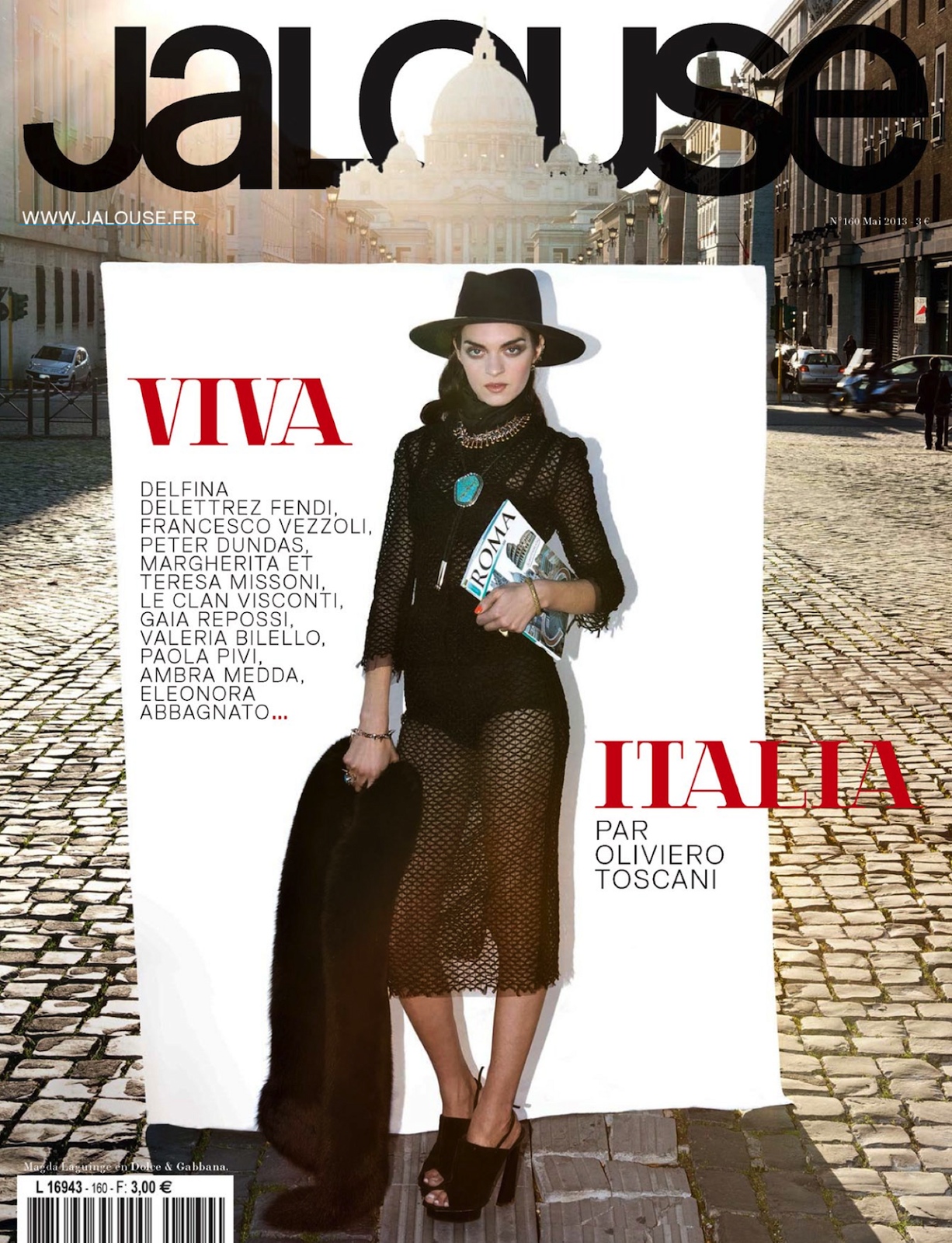
Jalouse, 2012–13
Contributed by Stephen Coles on Nov 4th, 2013. Artwork published in
.

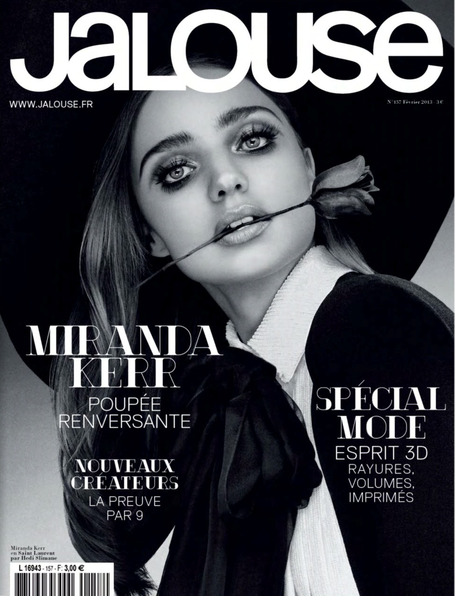
Source: www.jalouse.fr License: All Rights Reserved.
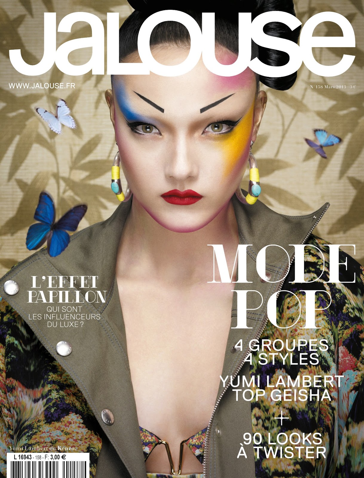
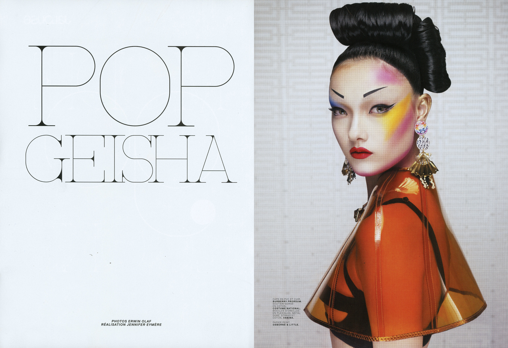
Source: www.jalouse.fr License: All Rights Reserved.
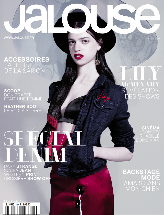
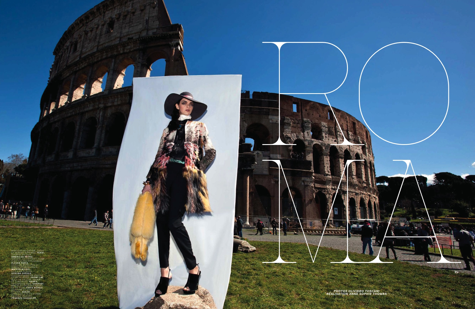
Source: www.jalouse.fr License: All Rights Reserved.
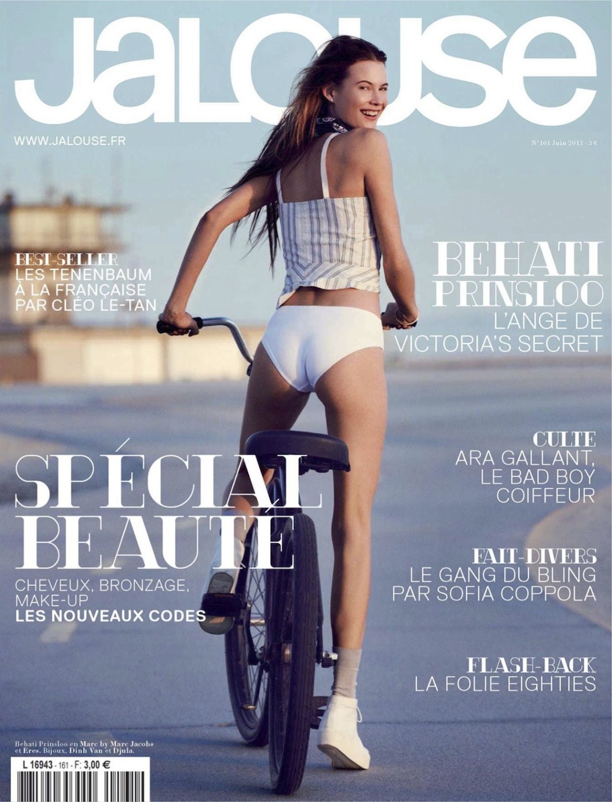
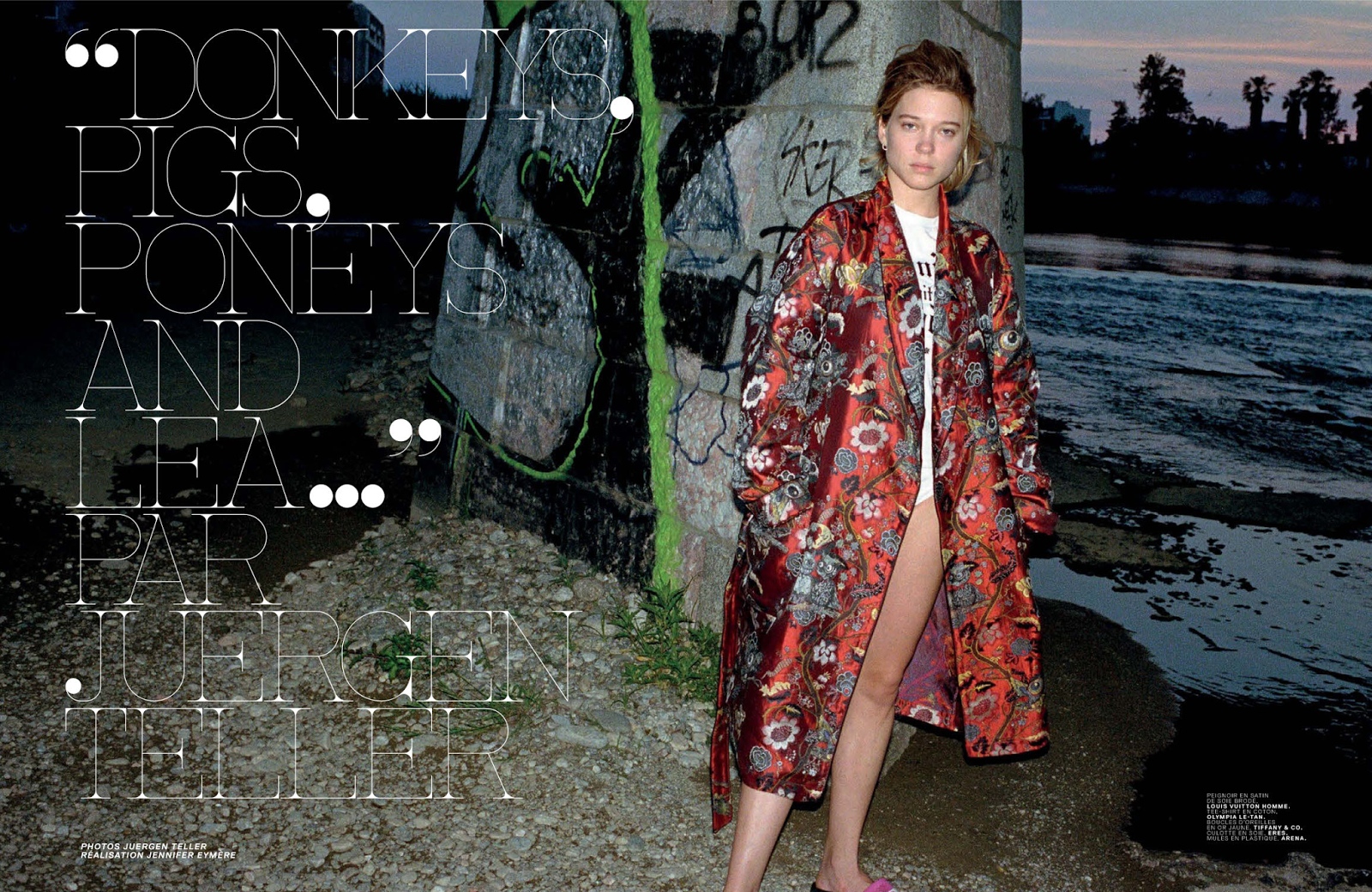
Source: www.jalouse.fr License: All Rights Reserved.
Source: www.jalouse.fr License: All Rights Reserved.
Source: www.jalouse.fr License: All Rights Reserved.

Source: www.jalouse.fr License: All Rights Reserved.
Source: www.jalouse.fr License: All Rights Reserved.

Source: www.jalouse.fr License: All Rights Reserved.

Source: www.jalouse.fr License: All Rights Reserved.
Source: www.jalouse.fr License: All Rights Reserved.
Source: www.jalouse.fr License: All Rights Reserved.

Source: www.jalouse.fr License: All Rights Reserved.
Source: www.jalouse.fr License: All Rights Reserved.
Source: www.jalouse.fr License: All Rights Reserved.
Source: www.jalouse.fr License: All Rights Reserved.
Source: www.jalouse.fr License: All Rights Reserved.
Source: www.jalouse.fr License: All Rights Reserved.

Source: www.jalouse.fr License: All Rights Reserved.
Source: www.jalouse.fr License: All Rights Reserved.
Source: www.jalouse.fr License: All Rights Reserved.
Source: www.jalouse.fr License: All Rights Reserved.
Source: www.jalouse.fr License: All Rights Reserved.


")


")


2 Comments on “Jalouse, 2012–13”
Are you sure that this is Replica? After looking into the typeface I noticed that the lowercase ‘a’ and the lowercase ‘e’ aren’t matching up. Were these altered for the magazine?
Marie, Replica is used for the coverlines and interior text. Perhaps you’re referring to the Jalouse logo? This is most likely custom lettering, not a font. It combines elements of Vectora and Akzidenz-Grotesk.