British Embassy Logos Contributed by Stephen Coles on Nov 9th, 2013. Like1Add to Set License: All Rights Reserved. License: All Rights Reserved. License: All Rights Reserved. License: All Rights Reserved. License: All Rights Reserved. Typefaces More about FF DaxGet FF Dax Formats Branding/Identity (4748) Topics Governmental/Civic (450) Tagged withlogos (2687)Britain (25)embassy (1) Artwork location United Kingdom (2129) In Sets 5 Comments on “British Embassy Logos” Florian Hardwig says: Nov 9th, 2013 12:09 pm That’s not what they used for the lettering on the British embassy in Berlin. This style looks more like a Futura derivative: Florian Hardwig says: Nov 9th, 2013 12:26 pm By the way, the United States present themselves in faux small caps from a generic grotesque: Photo: CC Håkan Dahlström The French went for the quintessential French typeface — “Europe”: And the Dutch? Painted Arial, what else! Photo: © Frank Grießhammer Stephen Coles says: Nov 9th, 2013 7:43 pm That’s not what they used for the lettering on the British embassy in Berlin. I stumbled on these Dax logos in a search for something else. They seem fairly new and not universally used. Perhaps it’s a rebrand in transition. What a high standard that has been set by the world’s embassies! “Europe”? Is that a typo or joke I don’t get? Florian Hardwig says: Nov 9th, 2013 8:45 pm In France, Deberny & Peignot possessed the rights to distribute Futura. They renamed it to Europe — according to Fernand Baudin, in order to mask its German origins. Kerry says: Nov 10th, 2013 1:34 am I am particularly disappointed by the Dutch embassy’s use of Arial, although the American embassy’s faux small caps come rather close. Post a comment Name Email – will not be published Website Your response Submit Comment More FF Dax in use National Foods Ginger and Garlic PasteunknownPhoto(s) by Joe Clark on Flickr.More about PeignotGet PeignotMore about FF DaxGet FF DaxMore about unidentified typefaceGet unidentified typeface Rama CremefineContributed by Florian HardwigMore about Verona (Genzsch & Heyse)Get Verona (Genzsch & Heyse)More about FF DaxGet FF DaxMore about FF AdvertGet FF Advert Ovomaltine2012Contributed by Stephen ColesMore about FF DaxGet FF Dax Sponsor More in Governmental/Civic St Catherine’s Hospice2016SomeOneContributed by Tamasin HandleyMore about FS SammyGet FS SammyMore about FS MeGet FS MeMore about Mr Eaves SansGet Mr Eaves Sans Cișmigiu Gardens signsc. 2021Andrei BoghițăContributed by Andrei BoghițăMore about Schmalfette GroteskGet Schmalfette GroteskMore about HaettenschweilerGet Haettenschweiler Code for America website2014ClearleftContributed by WebtypeMore about InterstateGet InterstateMore about Freight TextGet Freight Text Hamburg town plan and major sights (1952)1952Hans-Günther BaassBruno KarbergPhoto(s) by mikeyashworth on Flickr.More about Forum IGet Forum IMore about Futura CondensedGet Futura CondensedMore about FuturaGet Futura More in Branding/Identity yedi70 branding2015Begum BahcecikContributed by begum bahcecikMore about BreeGet BreeMore about AdelleGet AdelleMore about Adelle SansGet Adelle Sans Late Night With Jimmy Fallon (NBC, 2009–2014)2009Emily ObermanBonnie SieglerNumber SeventeenContributed by Garrison MartinMore about Bureau GrotGet Bureau Grot 西洋書法年展:流行與藝術 Western Calligraphy Annual Exhibition: Pop & Artc. 2021Indego DesignContributed by Nikolas Wrobel Staff Pick More about Grand SlangGet Grand SlangMore about Nostra StreamGet Nostra StreamMore about AeonikGet Aeonik MoFi2018Duft WattersonContributed by Darden StudioMore about Halyard DisplayGet Halyard Display More Fonts In Use London Transport ad: Edward Johnston1937London TransportPhoto(s) by mikeyashworth on Flickr. Staff Pick More about JohnstonGet Johnston 2019 Mailchimp Year in Review2020MailchimpChris SandlinRoss ZietzContributed by James Edmondson (OH no Type Co.) Staff Pick More about BeastlyGet BeastlyMore about HobeauxGet HobeauxMore about ObviouslyGet Obviously Entertainment Weekly magazine, #1547/1548 “Oscar!”, 20192019Entertainment WeeklyChuck KerrErica BonkowskiContributed by Juan Parra Staff Pick More about Beatrice DisplayGet Beatrice DisplayMore about GraphikGet GraphikMore about Graphik CondensedGet Graphik Condensed Les Misérables (Musical and Film) Logo1985IgnitionRuss EglinContributed by Stephen Coles Staff Pick More about Caslon AntiqueGet Caslon Antique
5 Comments on “British Embassy Logos”
That’s not what they used for the lettering on the British embassy in Berlin. This style looks more like a Futura derivative:
By the way, the United States present themselves in faux small caps from a generic grotesque:
Photo: CC Håkan Dahlström
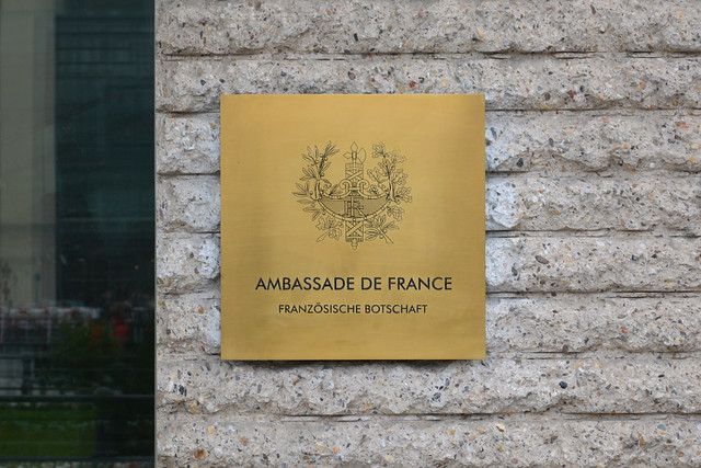
The French went for the quintessential French typeface — “Europe”:
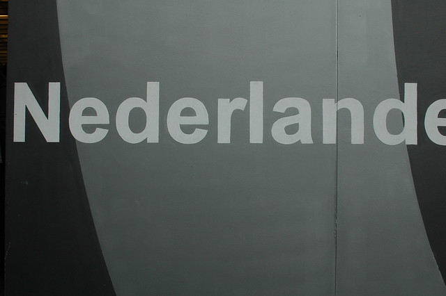
And the Dutch? Painted Arial, what else!
Photo: © Frank Grießhammer
I stumbled on these Dax logos in a search for something else. They seem fairly new and not universally used. Perhaps it’s a rebrand in transition.
What a high standard that has been set by the world’s embassies!
“Europe”? Is that a typo or joke I don’t get?
In France, Deberny & Peignot possessed the rights to distribute Futura. They renamed it to Europe — according to Fernand Baudin, in order to mask its German origins.
I am particularly disappointed by the Dutch embassy’s use of Arial, although the American embassy’s faux small caps come rather close.