Ernesto Pevere labels (1920–1940s)
Contributed by René Villeaux on Oct 21st, 2023. Artwork published in
circa 1924
.
Topics▼ |
Formats▼ |
Typefaces▼ |
15 Comments on “Ernesto Pevere labels (1920–1940s)”
Inkunabula is an interesting typeface. According to Claudio Piccinini, it was the first original typeface to be designed in Italy in the 20th century. Raffaello Bertieri based his design on the types cut by Erhard Ratdolt in the late 15th century.
Our current sample is derived from a (too) small showing and doesn’t do it justice. Here is the cover of a specimen by the Nebiolo foundry, digitized by Archivio Tipografico:
Bertieri himself showed it in a publication from 1933 titled 20 Alfabeti Brevemente Illustrati:
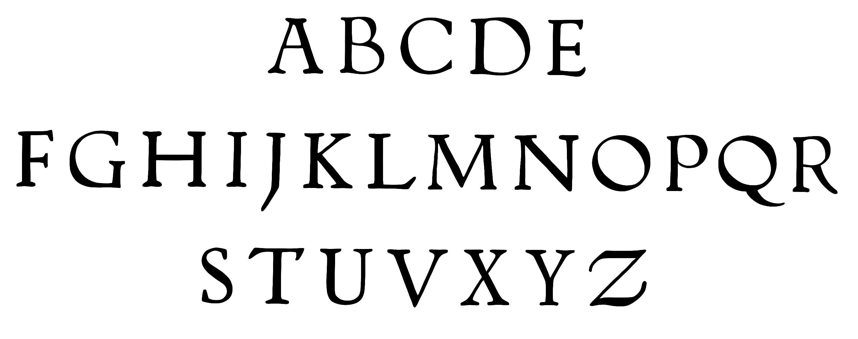
René provided two more images, traced from pages of a Nebiolo specimen hosted by Luc Devroye:
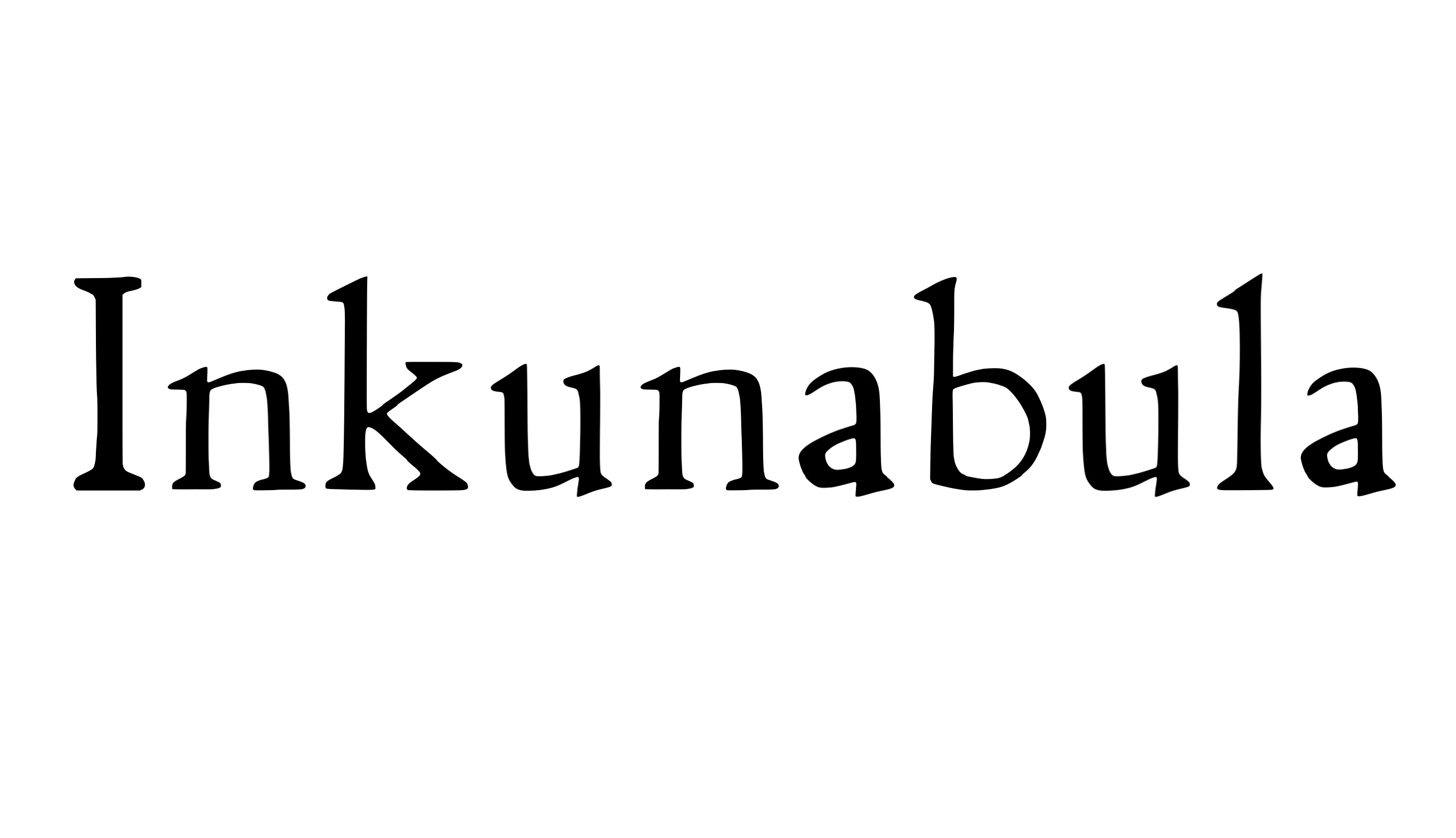
As I said, the result of tracing smaller-sized samples won’t be very good, but I attempted to trace the samples you provided in your comment and managed to cobble together the word “Inkunabula” from the shown letters. Unfortunately, the quality is quite poor and rough. Anyway, very interesting typeface, and I wish somebody will revive it one day:-)


I jump into the conversation to thank Florian for his usual attention and care and to notify that, in the process of finally setting up my type foundry, during 2022 I worked intensively on Inkunabula and have to a good degree of finish a very accurate digital version, sourced from tons of original magazines and material.
I am going to postpone its release, however, as I have decided to finish a design of mine and release this and De Vinne (which I did in 2021–22) as my first releases.
But I can’t say for certain when it will happen.
At any rate, I fully designed the optical master for 14pt, as it was the form in which Inkunabula was cut at the beginning, and then I worked on an optical axis to provide cuts up to display sizes, based on the larger samples (36 to 48) from the “Inkunabula Intestazione” larger cuts. These had the caps only, so I was guess estimating the lowercase et al. — but I have yet to finish the larger optical master. :-)
Here’s some preliminary samples from a proof document (settings still use the 14pt cut as a “placeholder”, but titles and larger headlines will be re-set in the largest optical master cut).
The Italic cut is the work of Alessandro Butti, while the original was sourced from Johannes Müller’s “Kalendarium”, basically unaltered, under the art direction of Raffaello Bertieri (but not actually “drawn” by him, as he was not a designer, as uncorrectly reported by many sources: the drawings were probably done by someone other, I seem to recall I found proof that they may be of renowned italian illustrator and engraver Giulio Cisari, but I have not been able to prove so).
Hi Claudio, thank you so much for your dedication and hard work on the revival of Inkunabula! I’m genuinely excited about its release, especially considering it’s going to be the very first one of Inkunabula.
I was wondering if there might be an opportunity to obtain a copy of your astonishing revival when it’s ready. I understand that it’s going to be a commercial release, and I fully respect the value of your delicate craft. If there’s a possibility, I would be incredibly grateful.
Thank you again for your contributions to this beautiful nearly forgotten design, and I look forward to witnessing the launch of your impressive creations.
Best regards.
Hi René, thanks for the compliments.
What is your occupation, if I may ask? :-)
Thank you for chiming in, Claudio, and for sharing more information! Nice to see how your digital interpretation is coming along.
Claudio kindly sent a sample for Inkunabula, using the 14pt size of his digitization, which we now show on the typeface page.
Thank you Florian! Release date for Inkunabula Corsivo (the Italic) should be 1927, I will check but I am pretty sure. It was used relatively little compared to the original Regular cut.
I posted a comment on one of your other entries. :)