“The Länd” campaign for Baden-Württemberg
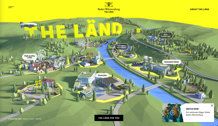
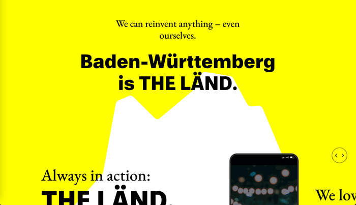
Baden-Württemberg is a German state (Land) in Southwest Germany, east of the Rhine, which forms the southern part of Germany’s western border with France. The Department of State Marketing and Events held a competition for promoting the Baden-Württemberg, and the contract was won by local agency Jung von Matt/NECKAR, who, in October 2021, launched the identity, website, and slogan: “The Länd”.
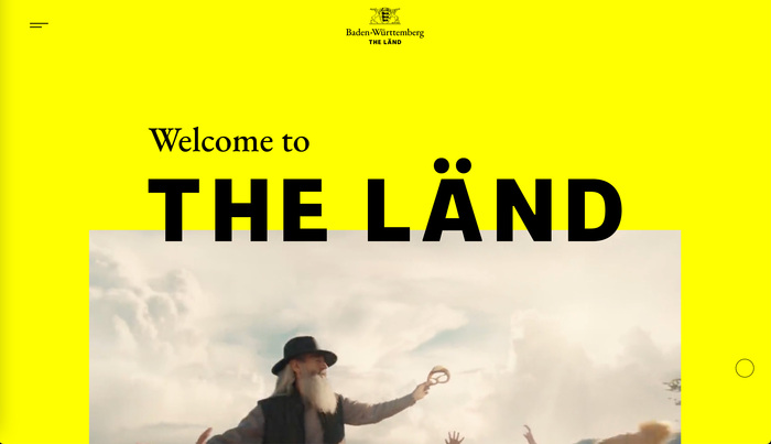
In a discussion about the non-linguistic use of diacritics, Jens Kutilek described the tongue-in-cheek spelling of the campaign:
In case of “The Länd”, it works for me (and is actually somewhat funny) because Land is written the same way in German and English, and adding the diaeresis actually causes German readers to pronounce the word as they would speaking English, i.e. [lɑnt] → [lent]. And the land Baden-Württemberg is called “Ländle” [ˈlɛntlə] (a diminutive) in the local dialect. Trying to transfer that dialect nickname onto the big international stage of English is a bit of self-deprecating humour.
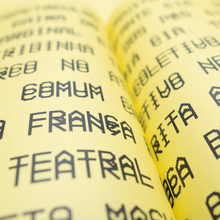
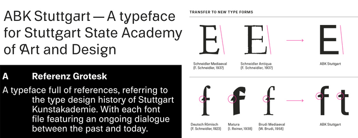
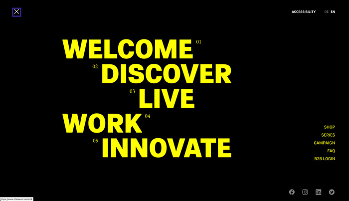
The core typeface that Jung von Matt chose is quite local, too: Referenz Grotesk, designed by Stuttgart-based Stefanie Schwarz and Dirk Wachowiak and issued the year before the campaign by Sudtipos (a unusual German release from the South American foundry). Referenz is derived from ABK Stuttgart, their custom typeface for the Stuttgart State Academy of Art and Design, which referenced over a century of type related to the school, especially the work of F.H. Ernst Schneidler and Imre Reiner. A callback to the stair-step ‘E’ in Schneidler and Schneider-Antiqua can be seen in “THE LÄND”.
The supporting typeface, EB Garamond, isn’t home grown. They could have picked the very similar Sabon, from German designer Jan Tschichold, but the convenience of an open source font may have won out over a type palette with fully local connections.
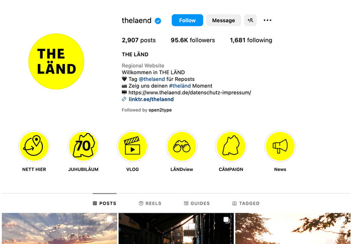
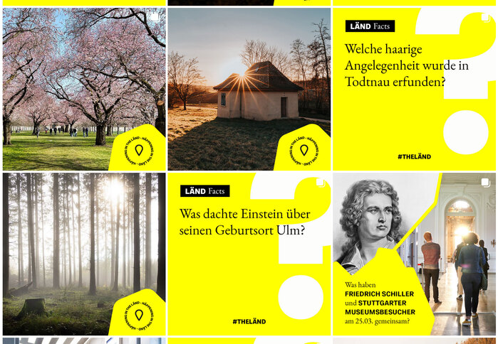
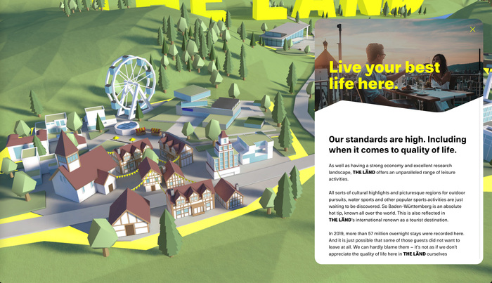
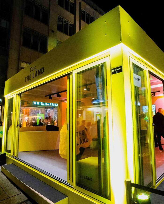
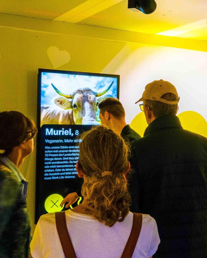
Both typefaces, combined with a consistent yellow and black color scheme, form a strong visual identity that pervades the website, merchandise, social media graphics, printed signs, and pop-up kiosks.
Formats
- Web (4670)
- Branding/Identity (6881)
Topics
- Travel (692)
- Local (1251)
- Governmental/Civic (619)
Designers/Agencies
- Jung von Matt (4)
Tagged with
- Baden-Württemberg (2)
- Stuttgart (8)
- yellow and black (405)
- social media (728)
- 3D effects (263)
- local type (214)
- diacritics (138)
- umlauts (66)
- German (language) (2006)
- English (language) (1876)
- early uses (1771)
- multilingual (2023)
- type integrated with image (380)
- faux diacritics (10)
Artwork location
- Germany (3334)
- Stuttgart (95)
- Baden-Württemberg (3)


