Pointless Suffering
Back in the spring of 2016 Kaisa and I had a brilliant idea.
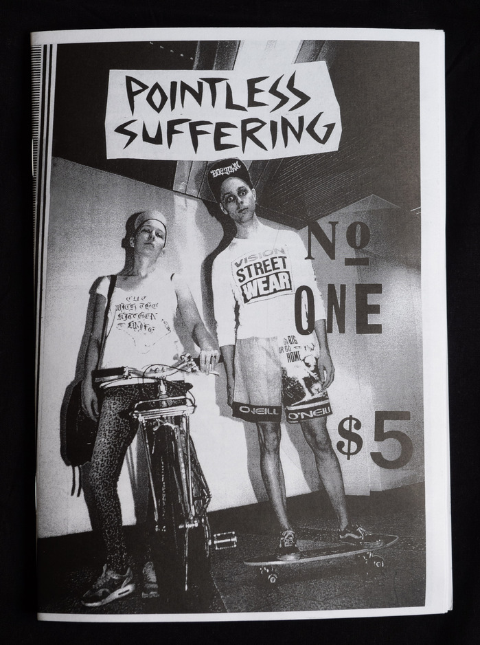
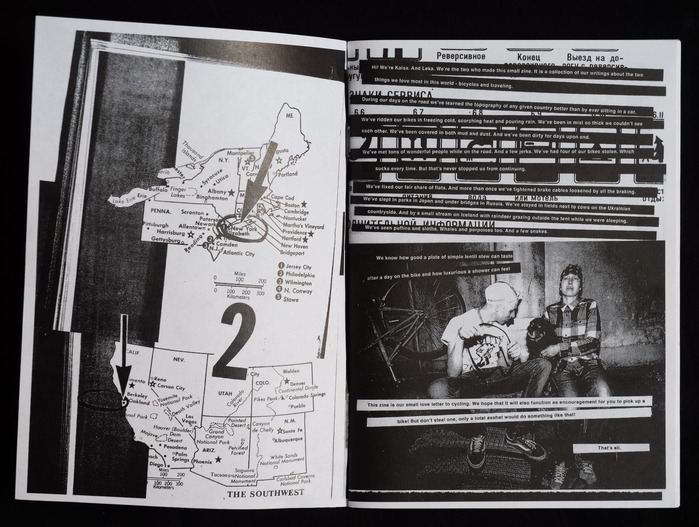
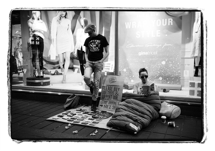
Well, actually we had two brilliant ideas. They were 1. To ride our bikes across North America, from East to West, and 2. To raise money for the trip by making and selling a punk zine about bike travel.
”But why a punk zine of all things? There can’t be much money in that”, you might exclaim. And you would be absolutely right. But doing things that are rational has rarely been a guiding principle for the two of us. So yes, a punk zine it was to be.
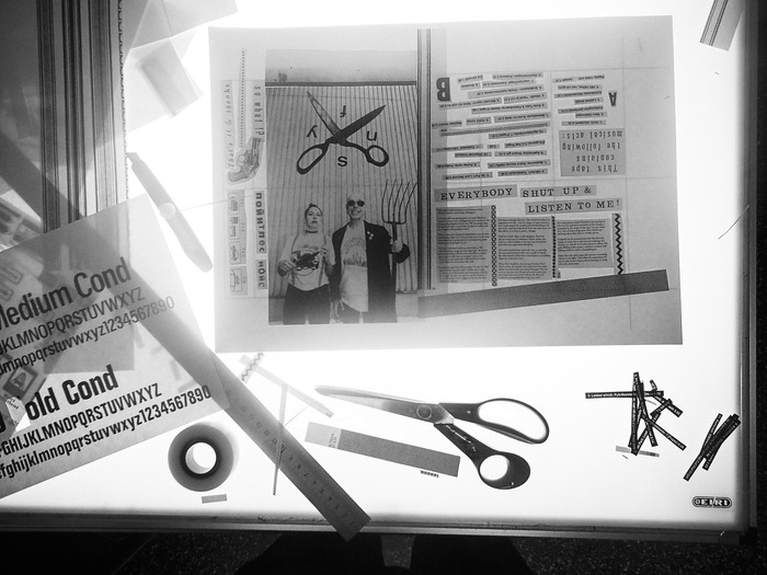
At this point I had also grown somewhat tired of the meticulous perfectionism that came with desktop publishing. There was a small part of the otherwise so very pedantic me that viewed such an ability to fully control the visual environment as both sterile and impersonal. And while I know this isn’t a very original observation to make I still longed for the more tactile ways of designing.
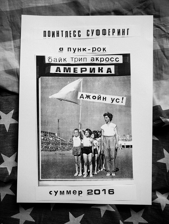
This project offered me the ideal opportunity to make use of all the old type catalogues and printed ephemera I had amassed during decades of unorganized and mostly stochastic collecting and turn them into something new. In the process I also ended up spending a hundred euros on an old Xerox machine our school was going to ditch anyway, and to the dismay of my brother placing it in his garage.
I began by whipping out my old Letraset catalogue and starting to blow up the typefaces I thought I could use in the project. Turns out this included almost all of the typefaces presented. As for the Letraset catalogue, this was the very book that incidentally ignited my love for typography when I first came across it in 1986. I simply couldn’t believe that so many wonderful letterforms existed in this world. An insight I still cling onto some three decades later.
In making the zine I set up a couple of rules for myself: 1. All type (with the exception of the body copy) would be set by hand, meaning it would be cut and pasted, and 2. The tools used would be analogue (with the exception of a concession I made enabling me to use digital cameras when needed), 3. No rulers or other measuring devices would be allowed, everything had to be eyeballed, 4. Fonts would be used to one’s heart’s content and combined without too much thought or prejudice, and finally 5. Everything would be in black and white, because, well, punk is black and white!
With these simple guidelines I sat down and began designing, allowing the process and the mistakes I made along the way guide me towards some form of an end result. The fun part was that for once I had no clear picture in my mind of what was to happen. Working in this way was intuitive and liberating, but even more importantly helped me realize how much of the transparency we associate with computer-generated design is illusory. The tool always controls its user whether they are aware of it or not. And if that’s not a punk rock insight then I don’t know what would be!
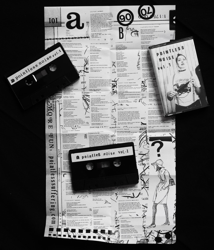
While working on the zine we realized that the project wasn’t as difficult or time-consuming as we had thought, so we decided to up our game: There would be a tape to go along with the zine! The problem was neither of us played any instruments or sang. (You’d be hard pressed to find a more musically challenged person than myself!)
So we wrote a ton of letters to bands that we thought would be cool to work with, and to our great joy almost all of them responded with enthusiasm and a promise to participate. This was turning out to be way easier than we would have anticipated!
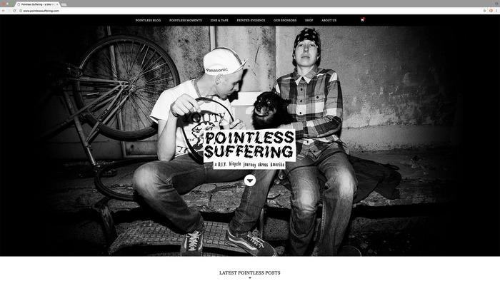
The full tape can still be listened to over on the otherwise slightly less well-functioning project site, should you feel the need to hear some phenomenal Finnish punk and hardcore.
Next question to sort out was who on Earth would still produce tapes in 2016? Well, through some obscure connections we got in touch with a lay Christian preacher who had a small tape production facility set up in his basement in the suburbs of East Helsinki. He would mainly record his own sermons, but he also occasionally sold his services to outsiders. And we were definitely as outsiders as it gets!
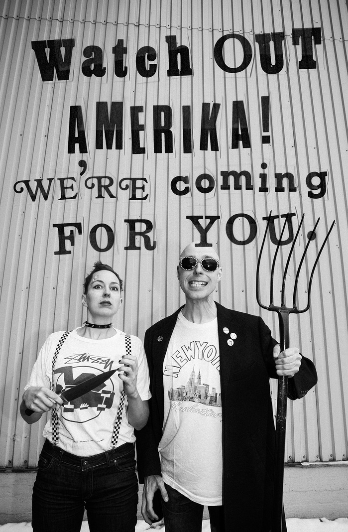
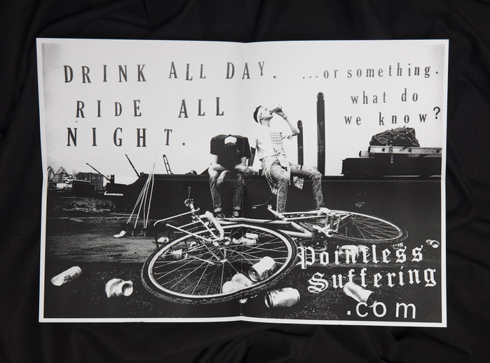
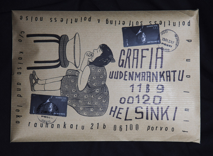
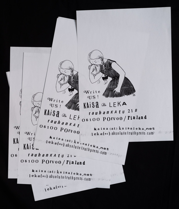
And while we’re coming up with new stuff, why not include a poster? And some envelopes to keep all the things together! And some stationery, should we want to write someone. Once again our initially somewhat reasonable project began, somewhat unsurprisingly, to snowball.
But all of a sudden it was all done! We printed up some 300 copies of both the zine and the tape, and I don’t think we’ve ever sold out anything we produced as quickly. Yay! Unfortunately our goal to collect funds for our trip was a a non-starter as the production costs far exceeded what we had hoped for.
So realistically we probably ended up losing more money than we made on this venture. But even this is not certain, as we really didn’t keep track of our finances. Still, the whole project should still be considered a grand success, because we had a ton of fun doing it!
Formats
- Web (4319)
- Magazines/Periodicals (1571)
- Posters/Flyers (4510)
Designers/Agencies
- Christoffer Leka (9)
- Kaisa Leka (9)
- Anni Laivoranta (1)
- Anna Kiuru (1)
- Niclas Warius (1)
Tagged with
- typographic eclecticism (232)
- ransom notes (8)
- bicycling (77)
- zines (112)
- design reference/imitation (220)
- handmade (49)
- collage (181)
- black and white (1727)
- punk rock (64)
- lettering (515)
- multiscript (641)
- English (language) (1693)
- Cyrillic (script) (367)
- Latin (script) (473)
- multilingual (1832)
- Finnish (language) (37)
- compact cassettes (133)
- self-published (228)
- process (112)
- DIY (86)
- faux Russian (1)
- repurposed glyphs (179)
- fundraisers (69)
- self-initiated projects (329)
- bouncing baseline (278)
- numero (№) (23)
- websites (2326)
- posters (1000)
- envelopes (180)
- 1980s style (77)
- photocopied (15)
Artwork location
- Finland (145)

