
The Best of Fonts In Use in 2013
We mark our third anniversary by honoring some of
our favorite typography from the year that was.
The Fonts In Use Collection
By the Numbers
3,220
Uses
258
Contributors
1,764
Typefaces
100s
of Foundries
Fonts In Use just turned three. That seems young, but it’s something like a teenager in internet years, right? Regardless, the more significant milestone came in mid-2012 when we launched the Collection, opening the archive to public submissions. Since then, we’ve experienced a growth spurt: the site now documents and discusses* over 3,200 designs using at least one of over 1,700 typeface families from hundreds of foundries. (*I use the present tense because Fonts In Use is a living archive — one in which entries of any age are easily accessible, cross-referenced, and with comment threads that are always open for new insights and discussion.)
Ok, numbers are nice, but what thrills us most about the new platform is what it can do. Over the last few months we improved our typeface pages, adding high-resolution samples, space for biographical information, and links to sources and related typefaces. We gave account holders the ability to create Sets and “Like” Uses. We expanded the Collection pages so they show more Uses and take advantage of wide screens. And we deployed an bunch of other enhancements that are best covered in another post.
We also welcomed new writers to the Blog so we can publish more frequent typographic histories, observations, and critiques.
Today, we celebrate our birthday with a few party favors. Introducing the first of an annual awards show. What follows is the “best of Fonts In Use in 2013”, as dictated by our editorial staff. This list of font uses and users is a glimpse into contemporary type-driven graphic design. We hope it surfaces content from the collection that you may have missed, and sparks you to contribute your own work — or work you admire — to the growing archive.
Uses of the Year
To us, great typography means thoughtful type choices used in skillful or unusual ways. The work below reached the pinnacle of that standard in 2013. The winners include designs from a range of formats, from exhibition and poster design to websites and book covers. They represent designers and studios from around the globe. And they span the gamut of typeface styles, both old and new, from over a dozen different foundries.
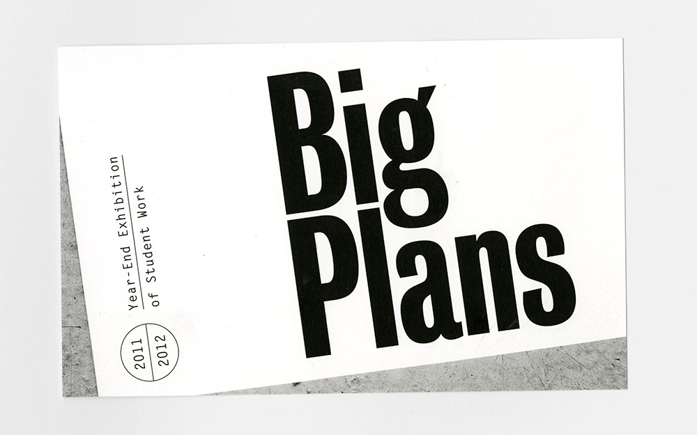
Big Plans Exhibition Design
Designed by Jessica Svendsen and Julia Novitch
Using Bureau Grot and Letter Gothic

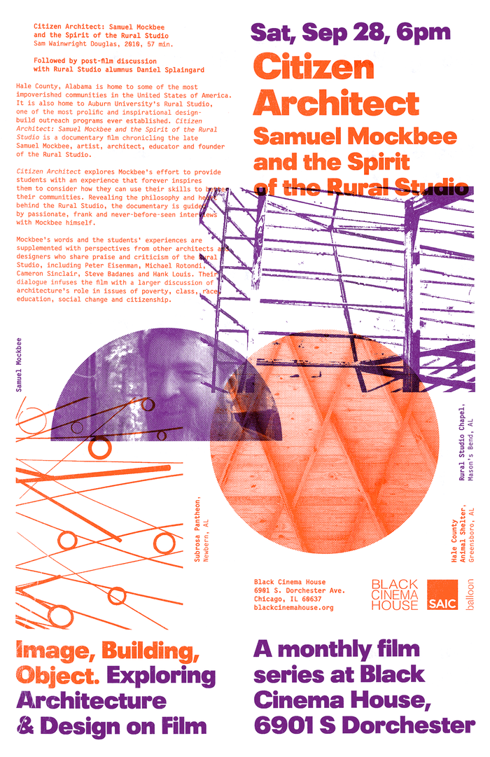
Image, Building, Object Film Series Posters
Designed by James Goggin
Using Plak and an unreleased typeface by Laurenz Brunner

The Bling Ring Trailer and Posters
Designed by P+A and Silenzio Communication
Using Dom
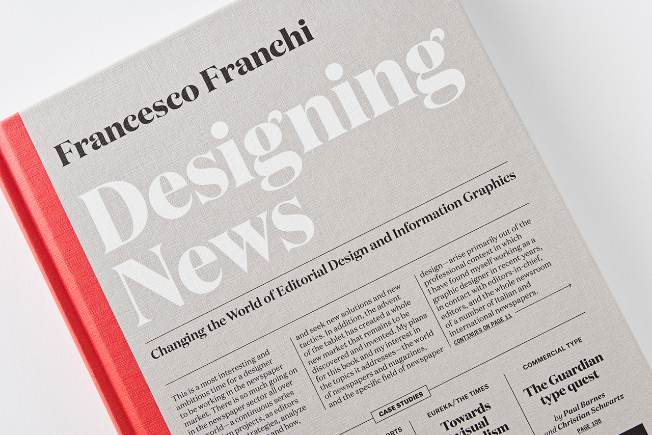
Designing News
Designed by Francesco Franchi
Using Domaine, Atlas Grotesk, and Atlas Typewriter
Uses of the Year
Honorable Mentions


")


Users of the Year
These graphic designers and studios produced several pieces that our staff recognized as exceptional typography. For this award we looked at all the Uses in the Collection credited to a designer, not just the work produced in 2013. (When we say “Users” we mean “font users”. The best users of the site are honored in the next section: “Contributors of the Year”.)
Pentagram


This storied New York-based studio is well represented in our collection not just because they are famous or produce so much newsworthy, visible work, but because they obviously love type. Pentagram makes good use of a wide range of typefaces and they document that work well, writing about their type selection and giving credit to the font makers.
Nina Stössinger

“Zu bürgerlicher Eintracht und Vertraulichkeit”


Nina Stössinger is a Swiss designer of books and identities who uses a variety of typefaces (many of them very new) from various sources and lucidly articulates her choices on her site and Fonts In Use. We recognize her here not for her 2013 work, but for her rich contributions over the last three years. She can be excused for using less type recently because she’s been quite busy learning more about how to make it: Stössinger is currently a Type and Media graduate student at KABK in The Hague. She writes about that experience too.
Solo


Solo is a Barcelona studio founded in 2011 by Óscar Germade. Their work for a range of luxury brands and editorial publications is characterized by restraint, setting stages in which the type itself is the focal point.
Studio Laucke Siebein

Angewandt Exhibition Materials


Like Stössinger, this nod to Studio Laucke Siebein is more of a multi-year achievement award. Dirk Laucke (Amsterdam) and Johanna Siebein (Berlin) give new life to unusual and forgotten typefaces in their decidedly modern work.
Users of the Year
Honorable Mentions


")


Contributors of the Year
Since we opened the site to public submissions in mid-2012, these Fonts In Use visitors contributed the most interesting and discussion-provoking Uses to the Collection. Not only did they upload good images of great work, but bonus points were awarded for adding insight, commentary, or critique.
Chris Purcell
After over 30 years as a designer and lettering artist at Hallmark Cards, Chris Purcell retired in 2012. Their loss is our gain: Chris has been a voracious contributor to Fonts In Use since then, adding over 40 Uses to the Collection. His submissions are broad ranging, covering many different industries, formats, and periods. The examples are sometimes from his own collection or documented with his own photography. And many of them are more than a simple image upload: they include his commentary, which often generates further discussion.
")

")
Maurice Meilleur
Along with some of his own fine work, Maurice Meilleur has contributed several pieces by other designers. Maurice is an MFA student in graphic design at the University of Illinois, and his literate, academic approach is very welcome among our ranks. We’re grateful for Maurice’s extra effort in spotting interesting work, writing a useful description, and producing good imagery, either from his own photos or images generated from PDFs.


Patch Hofweber
Patch Hofweber is a American ex-pat living in Malmö, Sweden. His contributions number over 20 to date, and focus on web and identity design, two areas of his own multidisciplinary expertise. He sometimes supplements his submissions with a bit of typographic critique, an attribute that served him well as one of our rare guest writers on the Fonts In Use Blog.


Contributors of the Year
Honorable Mentions
")
")

Contributors of the Year
Font Foundries & Providers


Contributions of the Year
This is a placeholder for a future award, meant for those non-staff contributions that are exceptional in their visual documentation, critical analysis, and/or historical research. To get that ball rolling for 2014, here are a few Uses that were popular or controversial from last year:


 Film Promotion")

Fonts In Frequent Use


In addition to the typefaces represented by our featured Uses and Users of the Year (most of which are shown in the main sidebar at the top of the page), the font families shown at right appeared most frequently in 2013 designs posted to Fonts In Use. This list only represents work in our Collection, so these certainly aren’t the most prevalent typefaces in all design today — that would be overlooking system/app bundled fonts, Core Web fonts, freebies, other perennially popular typefaces like Gotham, Interstate, and Neutraface, and revivals of classics like Caslon and Garamond. Yet they do reflect part of the current design zeitgeist: all sans serifs, most (except Alright Sans) are firmly in the static Gothic, Grotesque, or Geometric models. An odd outlier is ITC Serif Gothic. Nick Sherman has discovered that Lubalin and Di Spigna’s 1972 design is seeing a curious revival.
Early Users
Our observant co-editor Florian also noted these early adopters of typefaces newly released in 2013 or late 2012: Macula for Colin Smith, Audree for AwardsLine, Berlingske for A-Magasinet, Line for Rodeo, Domaine for Designing News, Magasin for Elle Decoration, MVB Solitaire for Assembly, FF Quixo for Publishing Design syllabus, FF Mark for Bench, Baton for L’Histoire du Diable, FF Dora for Gewone Letters, Landmark for Parc Olympique, Vinter for Queensland Ballet, and LL Circular for a number of uses.
What did we miss? With over 2,000 Uses added to the site in 2013, there is surely more typography worth honoring. What were your favorite font uses of 2013? Link ’em up in the comments below. And if your favorite design is not already in the Collection, now is the time to contribute. Your participation is vital to this endeavor.


")

")


 signs")


2 Comments on “The Best of Fonts In Use in 2013”
I must say the inclusion of the “Messages by Dillon Francis” truly baffles me. It looks ugly, cheap and unconsidered. It definitely does not fit in with the quality of other work on display here.
Mick, with this overview, we aimed to cover the range of interesting typography in 2013, and also the variety in taste of our various staff members, to some extent. Of course it is a subjective selection, and you are free to disagree and welcome to name your own personal favorites here. “Messages” is unusual on a conceptual level, in that the music clip is exclusively made up of characters from Apple Color Emoji. Being multicolored and animated, it may not look like that, but it’s in fact a purely typographical video. We found that remarkable — and funny.