
NAVE Estácio de Sá
Contributed by Rodrigo Saiani on Mar 19th, 2014. Artwork published in
March 2014
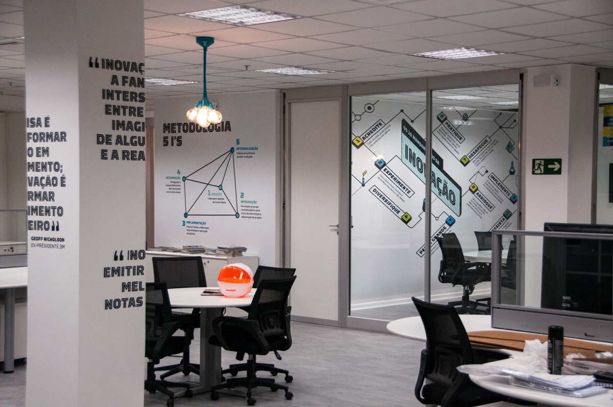
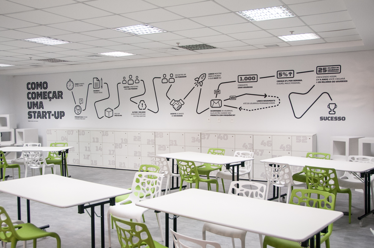
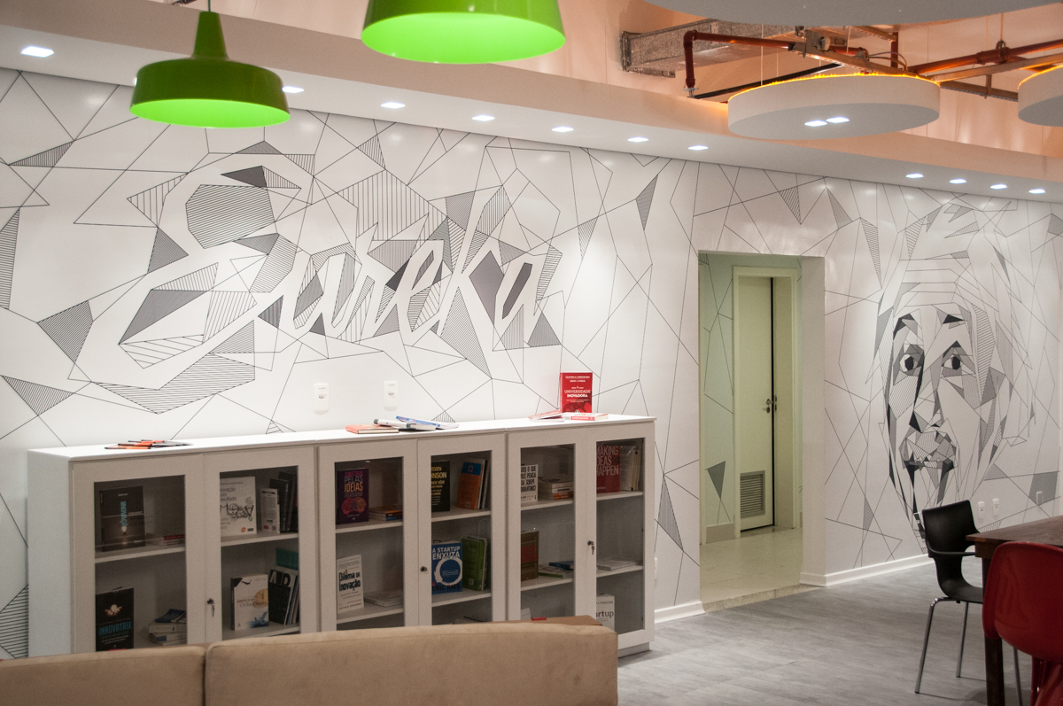
.Estácio University planned a new flagship innovation floor at their main headquarters.
Our challenge was to unify different purpose spaces in one unique design voice. We did that by using a single typeface, the excellent Torque by Type Supply and keeping the color palette simple and on brand.
We designed information graphics, pictograms, quotes from known educators and innovators in a way that either grabbed attention or receded, depending on each room’s objective. All based on the shapes and personality of Torque.


")


3 Comments on “NAVE Estácio de Sá”
Torque is a great font! Inline fonts have so much character and Torque adds a unique addition to headline fonts. Is Torque available for sale on the MyFonts site? I ask because I didn’t see it listed in a Google search.
Michael, as shown on our Torque page, the font family is available only from the foundry (Type Supply) and its sole distributor (Village).
Indeed Michael, really great character. And we didn’t even use the amazing scy-fi alternates. It showed great flexibility on our use and the regular weights are very readable even with very distinct features.