
Der Film exhibition poster and catalog
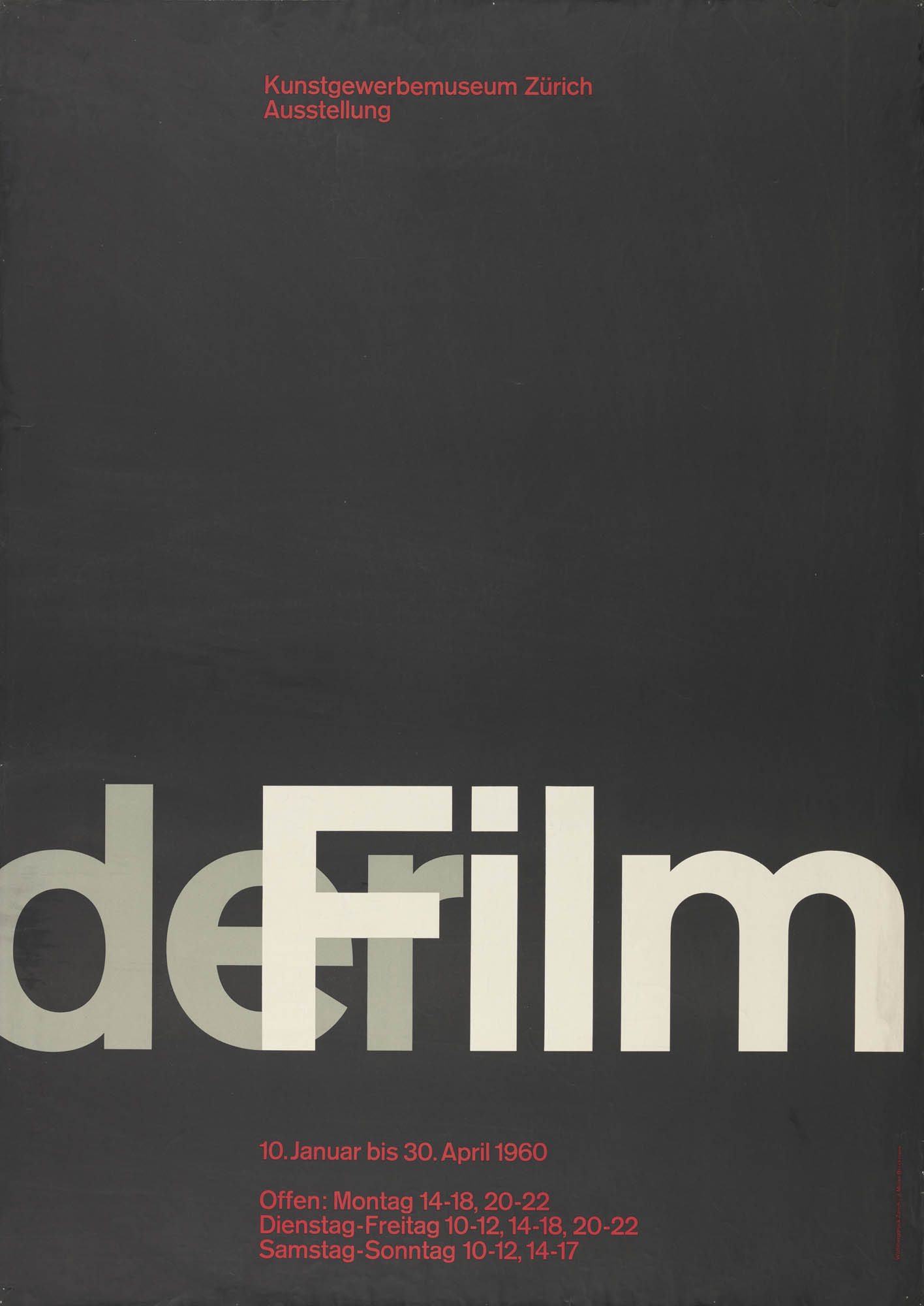
Der Film was an exhibition shown at the Kunstgewerbemuseum Zürich in 1960. For the poster, Josef Müller-Brockmann opted for a purely typographic design, using Akzidenz-Grotesk. Barbara Junod comments:
He exposed the poster title, set in Akzidenz-Grotesk type, on photographic paper in various positions and degrees of sharpness and overpainted it with opaque white until he achieved the desired effect of a horizontally moving film title sequence. This could be easily integrated into the structured surface of the poster.
See the website of the Museum für Gestaltung Zürich / ZHdK for preliminary sketches and design variations.
The same treatment was also used for the cover of the exhibition catalog. There, the cinematic effect caused by the overlapping semi-transparent words is even stronger. The small line at the top is set in Grotesque Bold 216.

Exhibition catalog, Kunstgewerbemuseum Zürich, 1960. Designed by Josef Müller-Brockmann together with Jörg Hamburger and Serge Stauffer.


")


3 Comments on “Der Film exhibition poster and catalog”
I wonder if the letters for the main title on the poster may have been drawn instead of being “straight” lead type : I’m not sure that such big sizes were available for AG at the time — and the fact that the dot on top of the i shows a height which is exactly the same as the thickness of the upper arm of F may also suggest that the letters were subtly altered for aesthetic effect.
I would think so, yes. In this period, designers generally didn’t bother with physical type for large sizes, but rather relied on photographic or manual enlargements. This was the case here, too, as the quote from Barbara Junod’s text implies. Typically this involved subsequent edits, from minor retouching like sharpening to more substantial optimizations like reproportioning arms.
Having said that, Akzidenz-Grotesk was available in pretty large sizes, in synthetic resin (“Plakadur”) up to 20 cicero, according to Berthold’s Specimen Nr. 476 from 1976. This size was already shown in the Specimen Nr. 468 from the 1960s. Such a font is available at the p98a letterpress workshop. In some sizes of AG (but not in all), the i dot is aligned with the top bar of F. Here’s a detail from a specimen for the halbfett in 28pt.
This just because I was curious myself – I, too, believe that the letters in the application were tinkered with, for a more pleasing result.
It may even have been linocut, as was very often the case at the time — see the Armin Hofmann poster below, from the Museum für Gestaltung collection.