

Smith & Forge Hard Cider
Brothers is frequently used for the faux vintage style we have deemed “Hip Traditional”. The typeface’s designer witnessed an example of this first-hand yesterday:
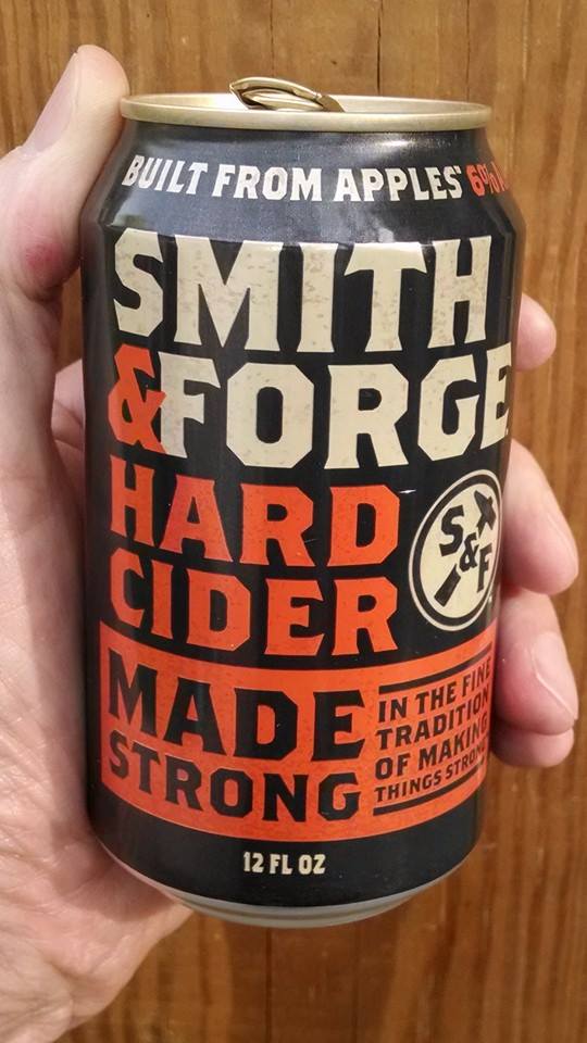
“Found this beverage today while I was at the supermarket. Bought a 12-pack for good luck.” — John Downer
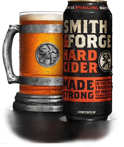
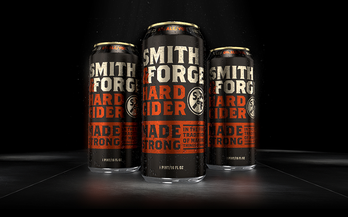
Smith & Forge was developed in 2014 by MillerCoors (though the company attempts to bury that fact as it wants the beverage to be seen as a microbrew). The pseudo-historical nature of the Smith & Forge brand is clearly tongue-in-cheek, even to the point of being a self-aware example of extreme Hip Traditionalism. The design is by Chicago-area firm Soulsight, who describes the look thusly:
“Smith & Forge™ is a brand whose essence is rooted in strength. It is masculine and hyperbolic in tone. From its look and feel to the way it communicates, it is a brand forged with strength from inception. Named to evoke the idea of blacksmiths forging steel and designed with masculinity in mind, Smith & Forge™ is made strong in the fine tradition of making things strong.”


")


