
American Manhood covers
Contributed by Stephen Coles on Jul 8th, 2014. Artwork published in
.

Source: www.ihpra.org License: All Rights Reserved.
May 1953
The logo for this beefcake magazine of the early 1950s could have been hand lettered, or perhaps it used another typeface, but it very closely resembles Directors Gothic from Lettering Inc., one of the earliest examples of phototype.
I love these teaser headlines:
The five most dangerous animals to hunt
You don’t have to be weak and underweight
The truth about venereal disease
You can cure constipation … without drugs!
My personal jungle adventures

Source: pulpcovers.com License: All Rights Reserved.
April 1953
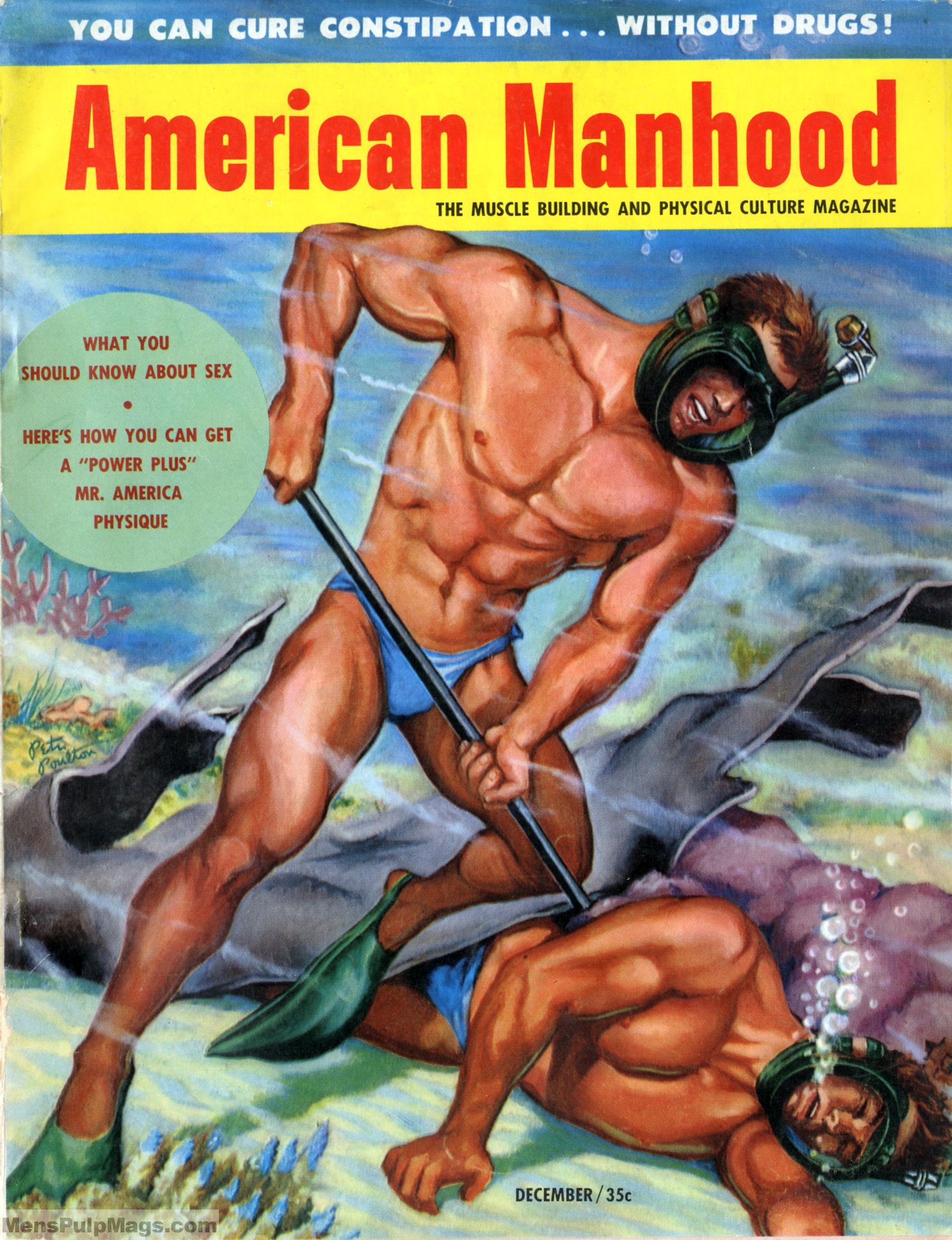
December 1952


June 1953. The line at the top of the cover is in Tempo Extra Black.


")
")


")


![<cite>Brasilia</cite> #3—“Warten [Waiting]”](https://assets.fontsinuse.com/static/use-media-items/99/98548/thumb/5db7014c/@2x/12409c40223647-577bec55d57d7.webp "<cite>Brasilia</cite> #3—“Warten [Waiting]”")


2 Comments on “American Manhood covers”
I knew these looked familiar:
store.mcsweeneys.net/produc…
Here’s Directors Gothic 210 Black (top) compared to Filmotype Ginger (bottom). At least of these digital versions, neither is a perfect match. While Ginger comes closer in some details, especially the vertical proportions, it’s dated 1954, and hence too late for this use. The spacing of the digital Directors Gothic isn’t convincing – overall too loose and also not even.