
Popote’s
Contributed by Stephen Coles on Oct 9th, 2014. Artwork published in
.
Source: violaineetjeremy.fr License: All Rights Reserved.
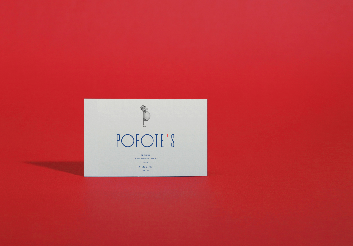
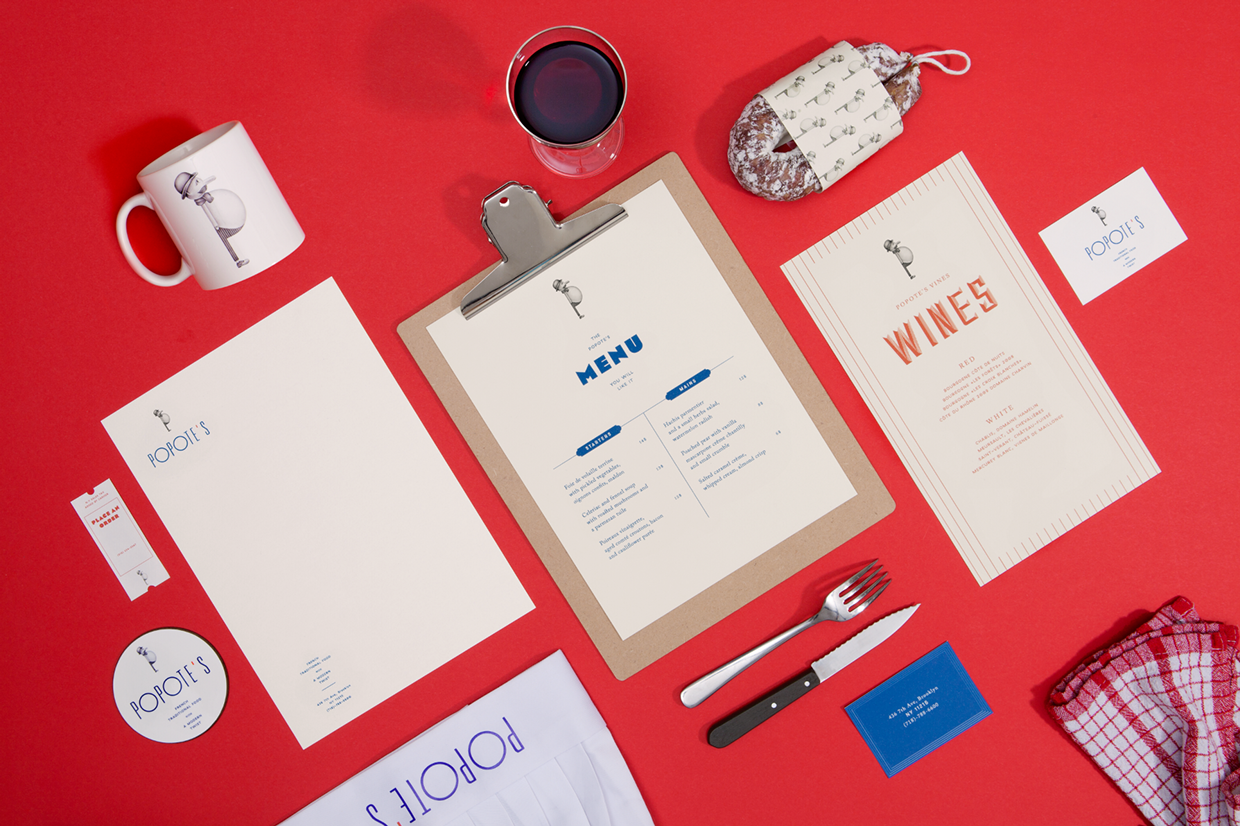
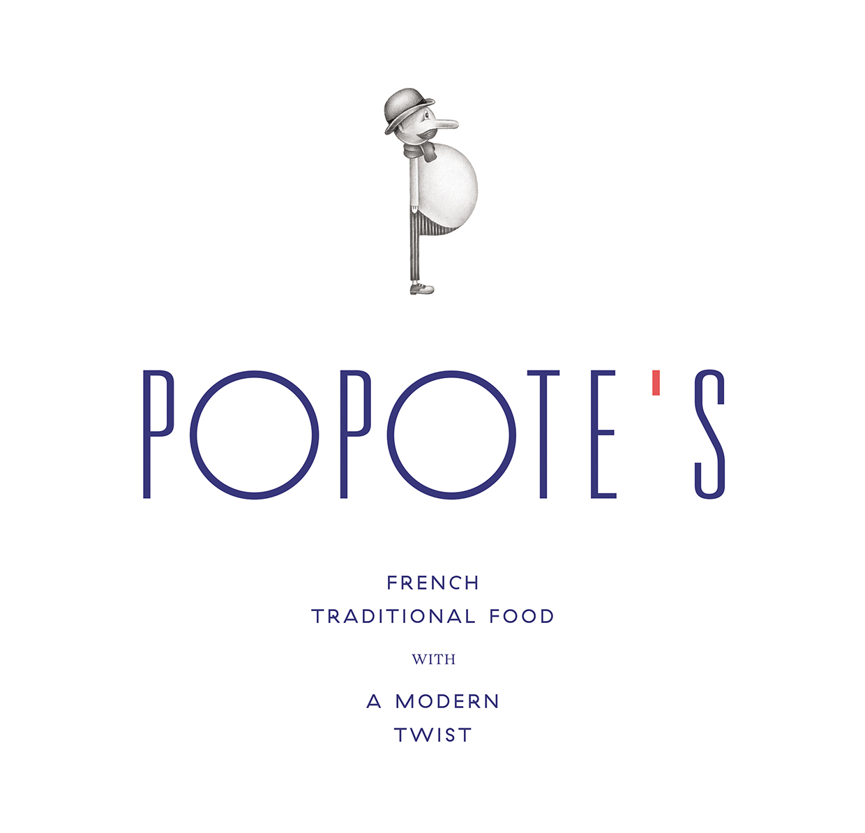
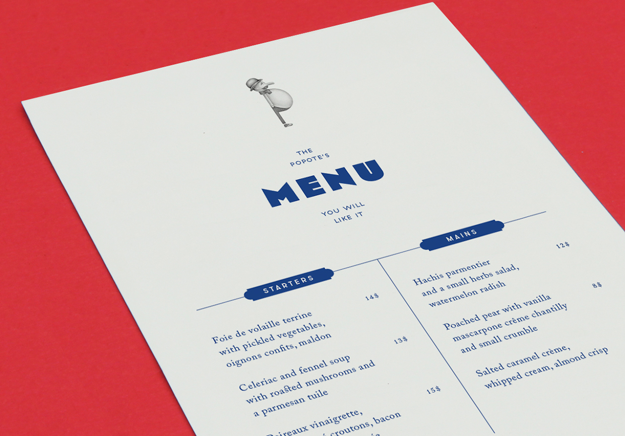
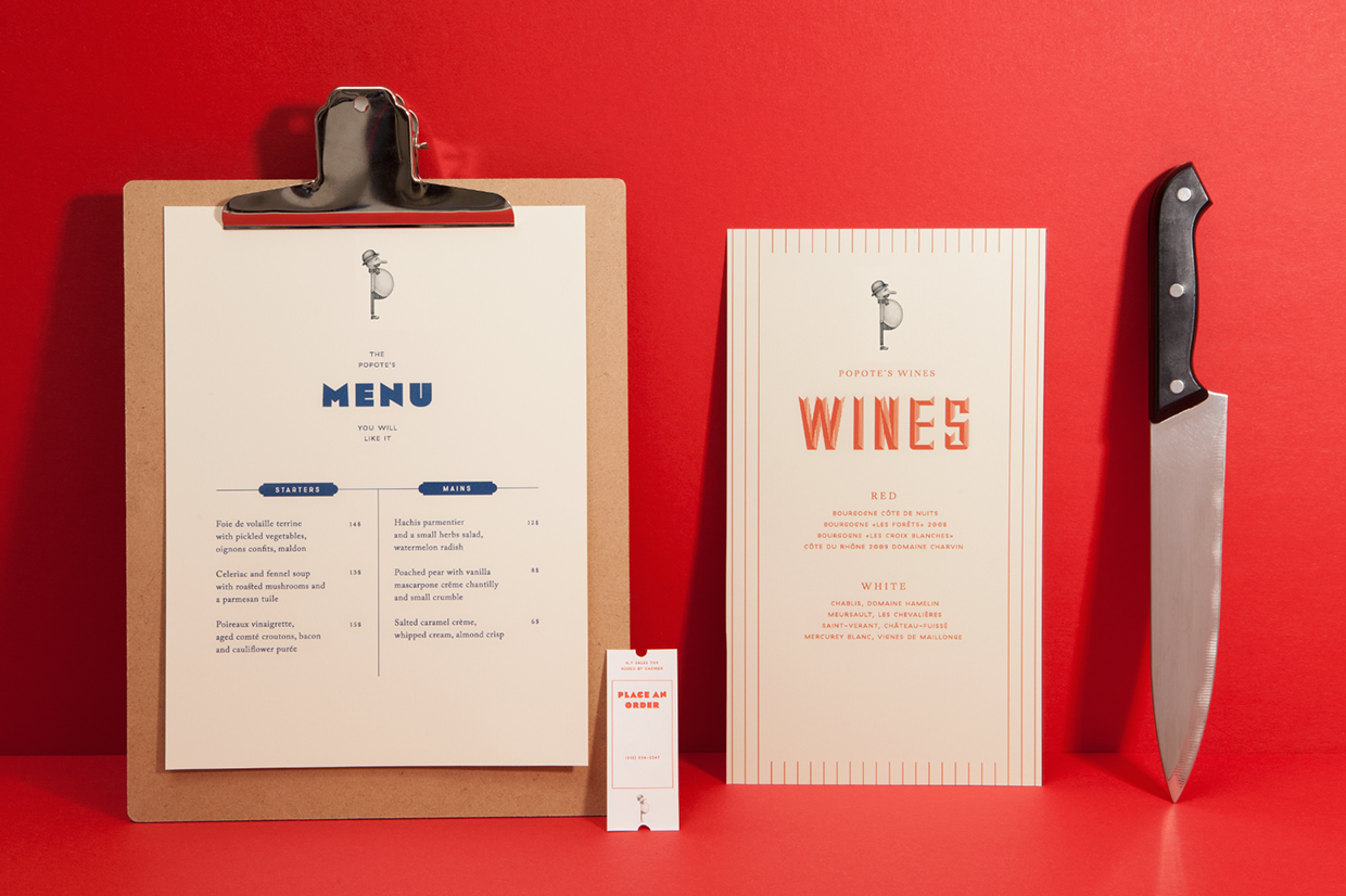
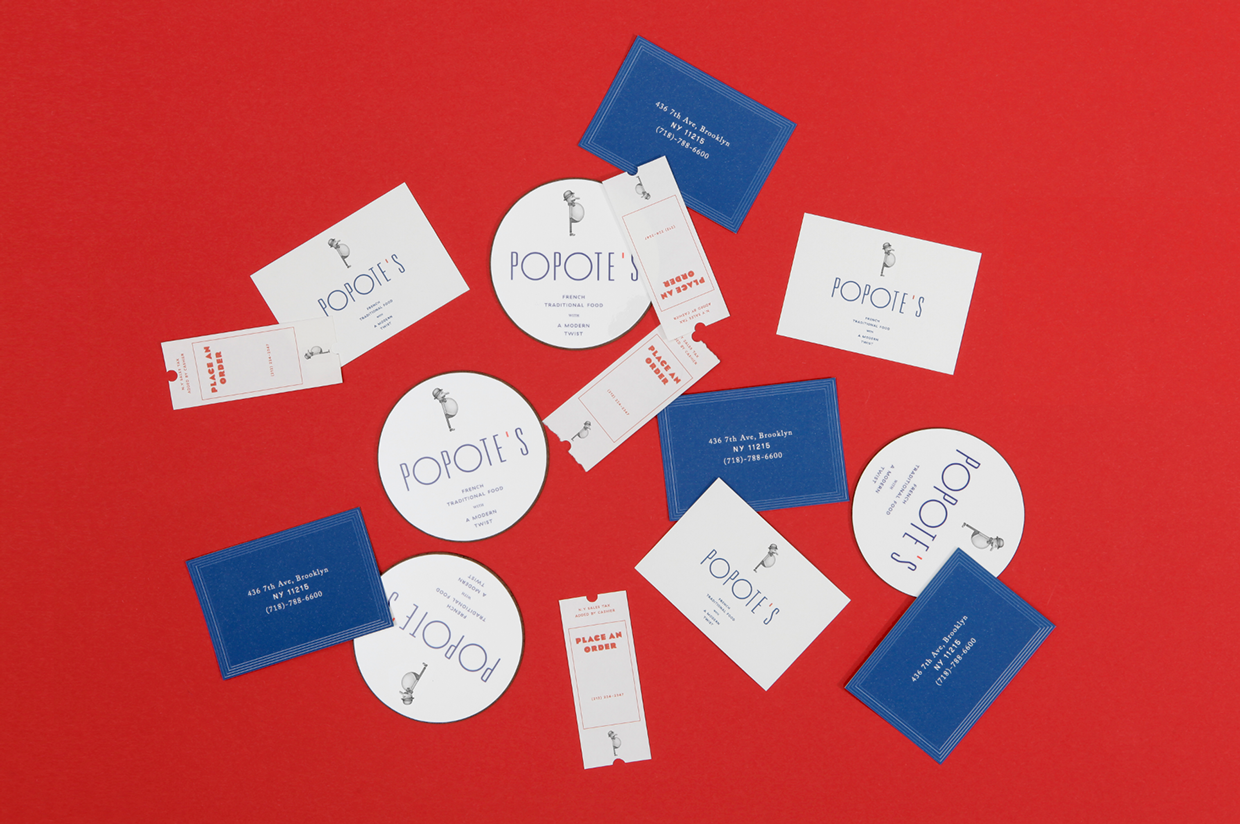
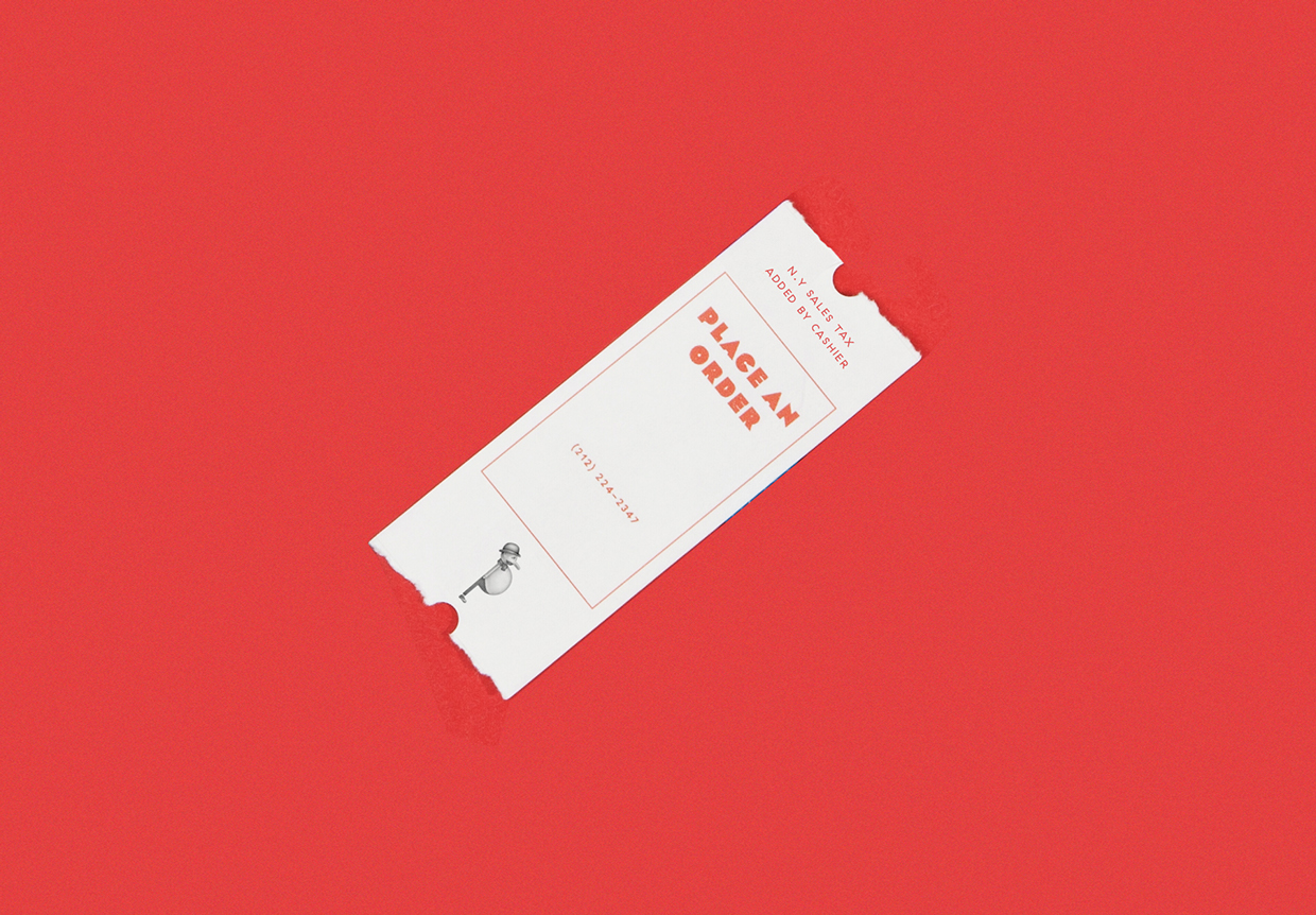
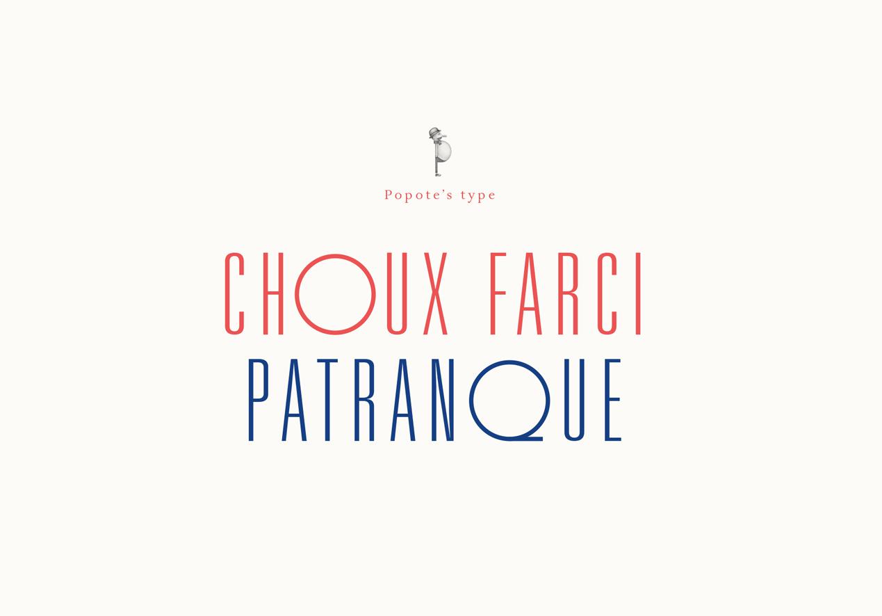
Paris-based Violaine & Jérémy designed this identity system for Popote’s, a French restaurant in Brooklyn. The logo Univers Ultra Condensed Thin with circles replacing the ‘O’s. It references a 1930s modernist aesthetic while also following the restaurant’s slogan: “French traditional food with a modern twist”. GT Haptik, an unusual geometric sans adds another twist and Eagle continues the Art Deco vibe. I’m unable to identify the serif type.
Source: violaineetjeremy.fr License: All Rights Reserved.
Source: violaineetjeremy.fr License: All Rights Reserved.
Source: violaineetjeremy.fr License: All Rights Reserved.
Source: violaineetjeremy.fr License: All Rights Reserved.
Source: violaineetjeremy.fr License: All Rights Reserved.

Source: violaineetjeremy.fr License: All Rights Reserved.
Source: violaineetjeremy.fr License: All Rights Reserved.


")


