

License: All Rights Reserved.
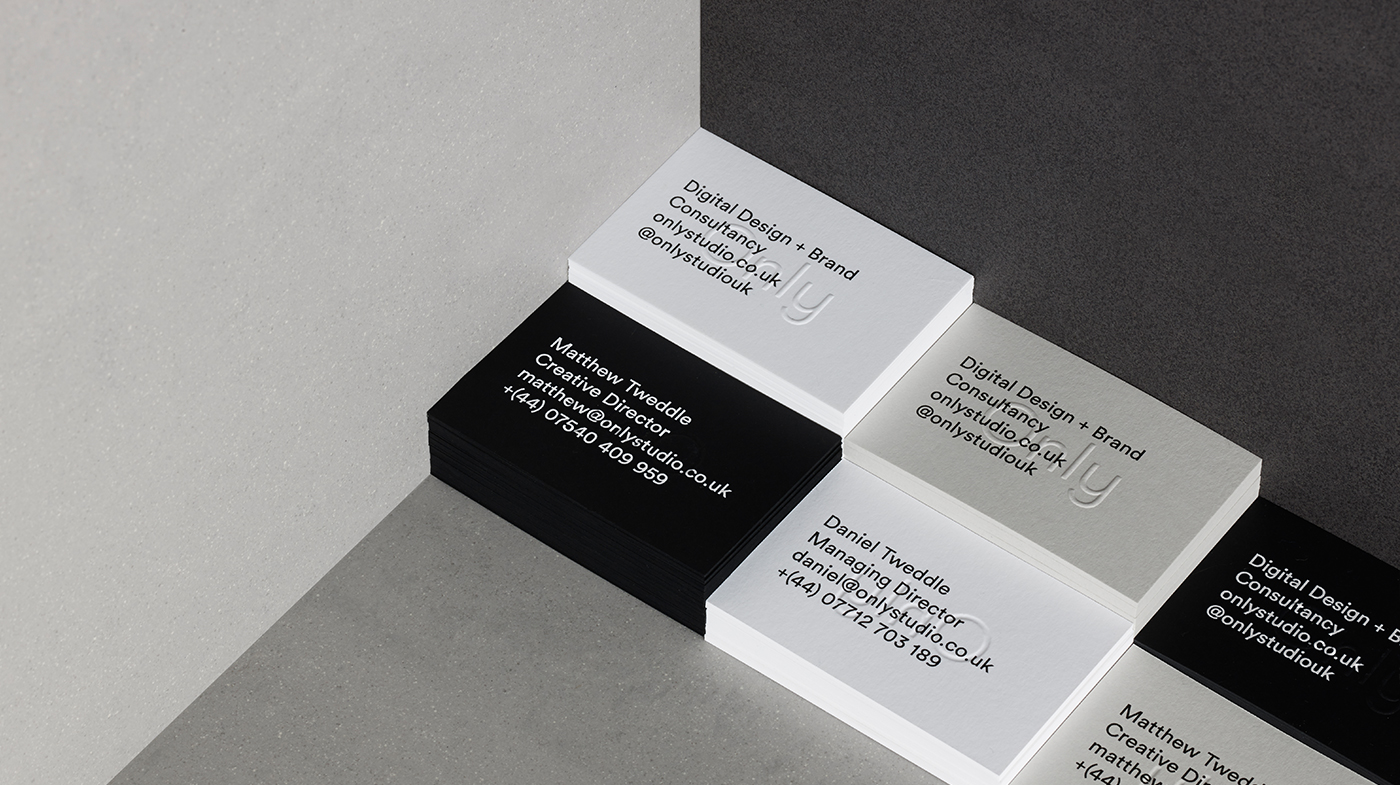
Only is a new digital design and brand consultancy.
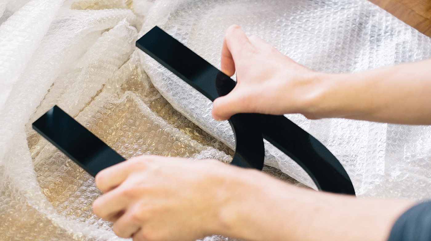
The logotype uses a bespoke version of Buenos Aires that sees the lowercase ‘L’ adjusted to have no tail. The result is a simple logotype with subtle character and unmistakable personality — the playfulness of the ‘y’ balancing adjacent characters to soften the sentiment of the word.
The rest of the identity uses LL Circular — a more useable geometric with similar values, in a single weight across website and business cards.
License: All Rights Reserved.

License: All Rights Reserved.
License: All Rights Reserved.

License: All Rights Reserved.


1 Comment on “Only identity”
Circular is a beautiful font. It’s used in the new TV branding for France4.
(Sorry for my bad English, I’m French.)