

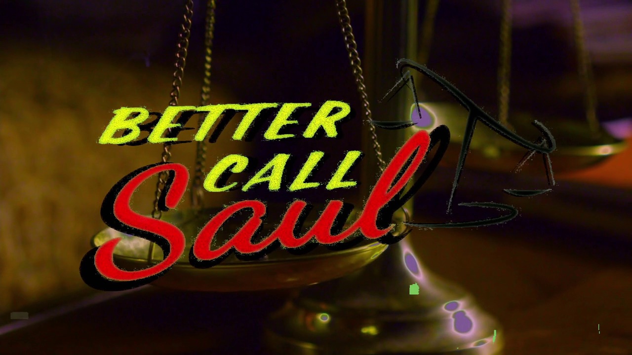
Better Call Saul logo and opening titles
Better Call Saul is an American television drama series that premiered on AMC on February 8, 2015. The series premiere was the biggest in cable history, drawing 6.9 million viewers.
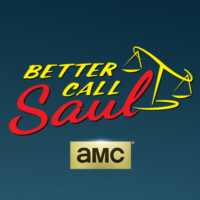
The character of Saul Goodman is a two-bit lawyer whose boisterous ads are typical of the injury law firms that appear on American billboards and local television: garish and tacky. The typefaces for the TV series logo, then, were well chosen. Two low-rent scripts are slapped into place: “BETTER CALL” is the kind of script brushed onto a wall by a signpainter in a hurry, and “Saul” is the kind of script found on drugstore greeting cards. The brushy scales of justice could be clip art from the hard disk of a budget designer, or from the shady pits of 99designs. It all fits Saul’s style perfectly.
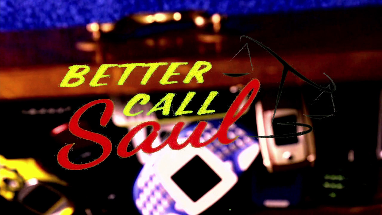
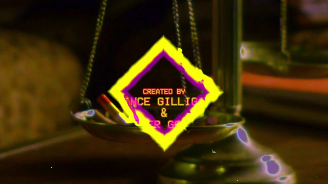
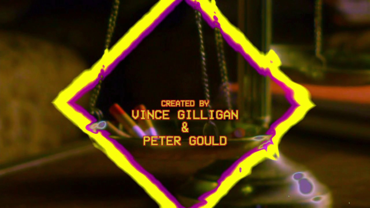
The opening title sequence overlays the logo on a different scene in each episode. The low-fi, dirty video effect is a reference to the pilot episode in which McGill (AKA Goodman) watches old VHS tapes of his ads. The logo is followed by the creators’ credit set in a classic bitmap font familiar to any of us who had an early ’90s camcorder with a timestamp/label function.
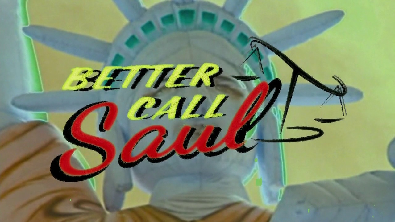
Main opening title from Episode 1.
Main opening title from Episode 4.
Main opening title from Episode 3.


")


 by Piet Schreuders")


6 Comments on “Better Call Saul logo and opening titles”
Bjorn Johansson’s Camcorder is a digital version of the bitmap fonts as seen in old consumer electronics. I wouldn’t be surprised if it had been used here as well.
Thank you, Riciery! I’ve amended the typeface credits.
Thanks for the font. Regarding the image of the scales – how would you describe that art style? Any other examples but not as scales… maybe like kitchen utensils or tools or a house etc. Is that an artstyle?
Informal brush illustration? ’90s clipart core?